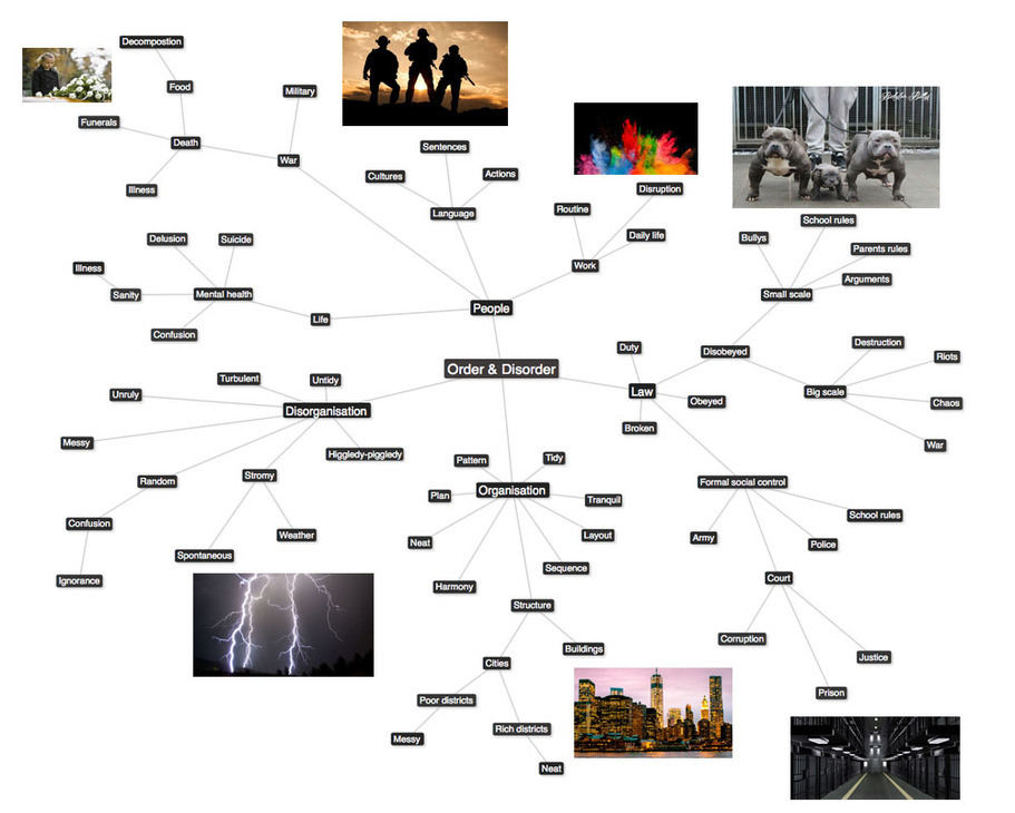
ORDER AND DISORDER
Order and disorder designates the presence or absence of some symmetry or correlation in a many-particle system.
MINDMAP OF ORDER AND DISORDER:
Below are all my initial thoughts and ideas when presented with the concept of order and disorder. I will continue to use this throughout this section in order to help and inspire me with my work and responses.
FIRST RESPONSE TO ORDER AND DISORDER
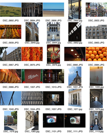
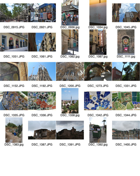
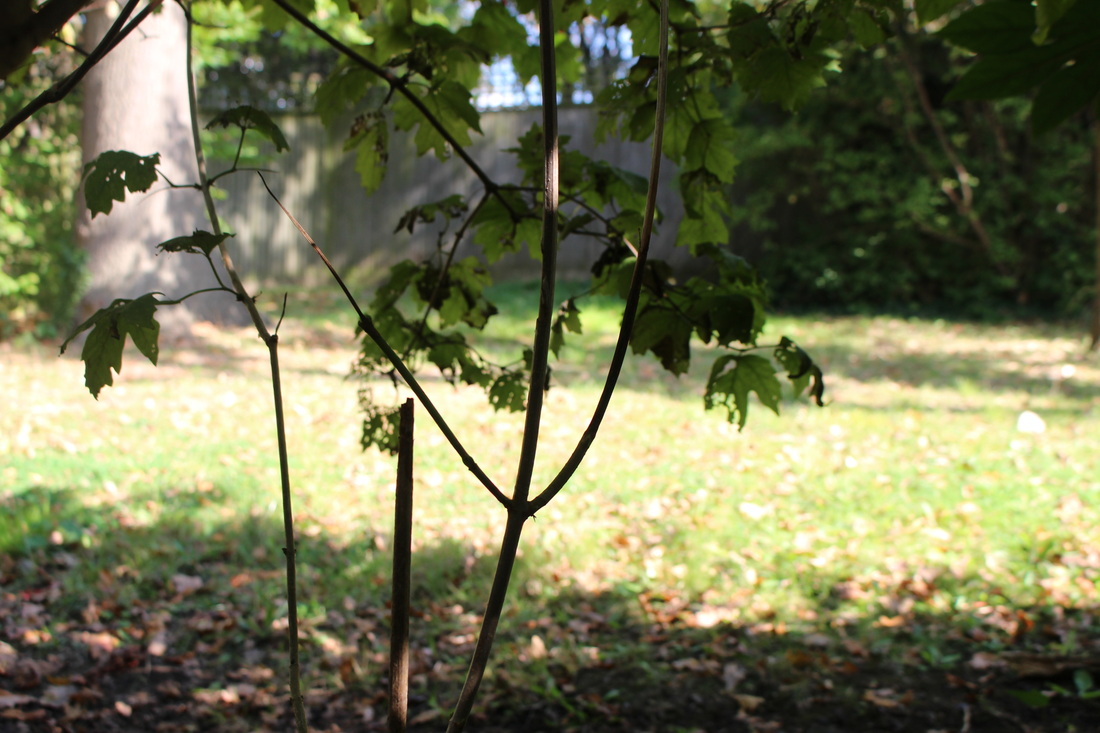
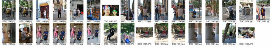
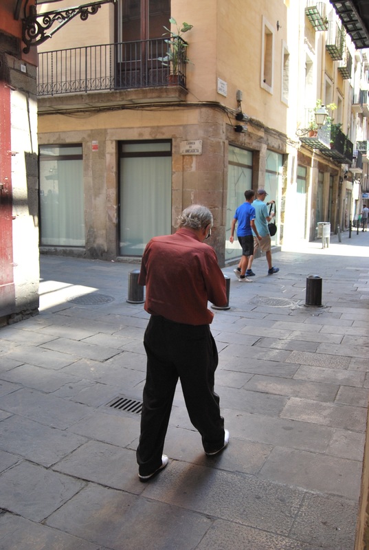
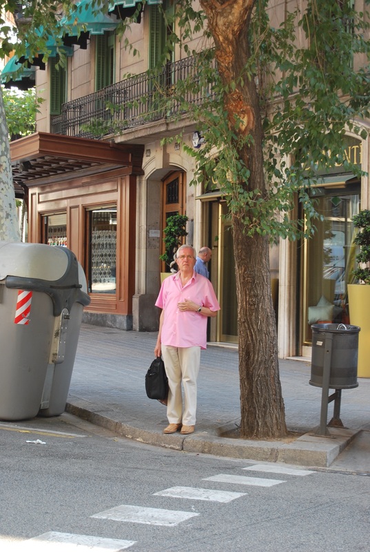
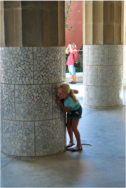
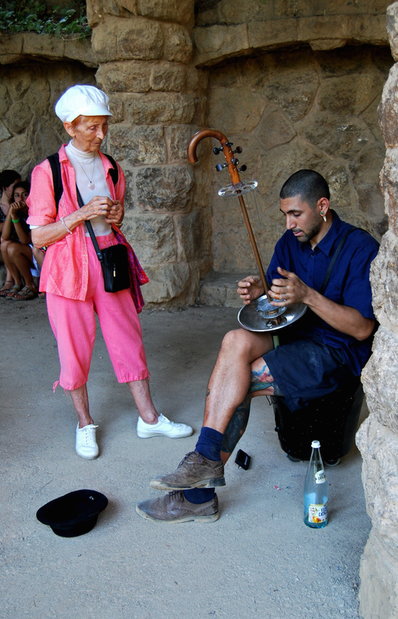
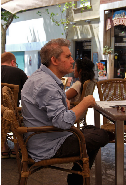
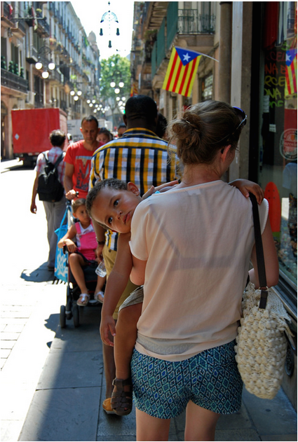
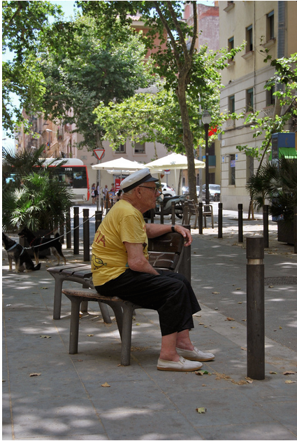
During the summer holidays, I was set a task to capture images presenting oder and disorder. Most of my images were taken in Spain, particularly in Barcelona, where I went on holiday to. I have separated the photos of order and disorder so you can view the difference.
|
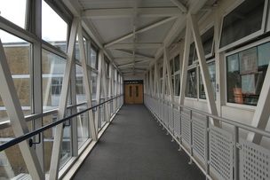
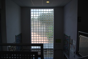
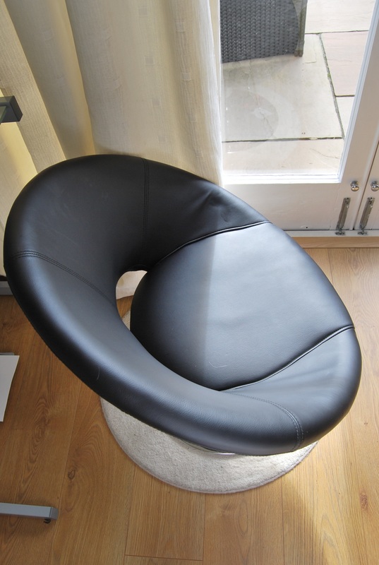
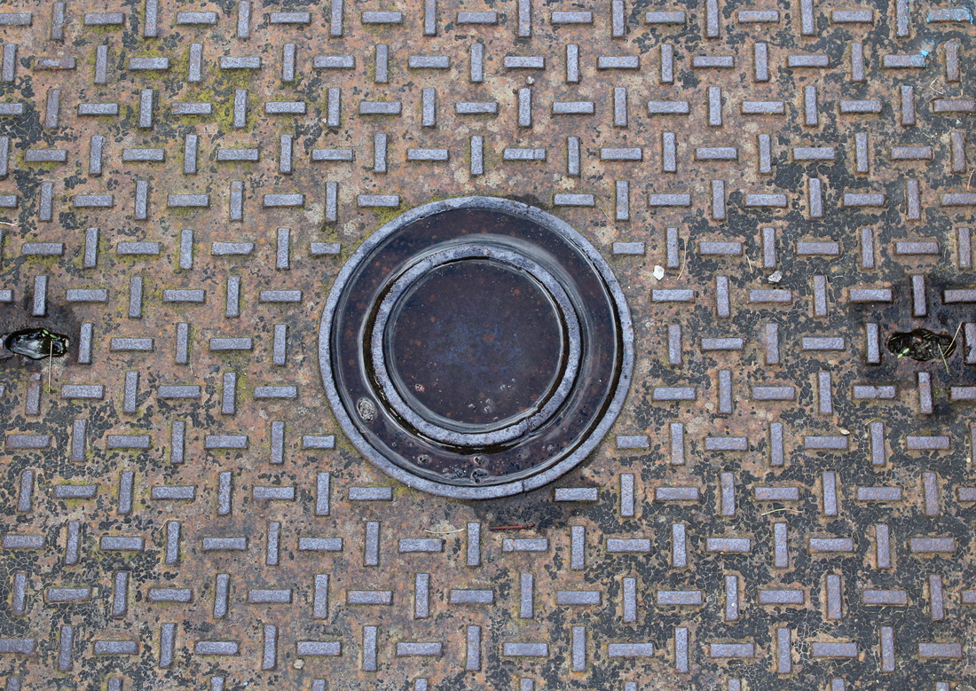
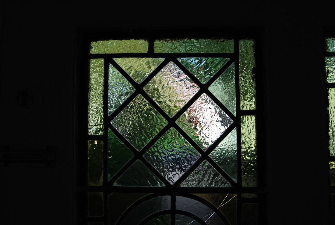
ORDER
SELECTED IMAGES:
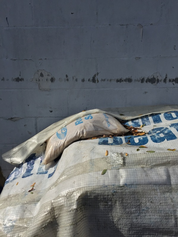
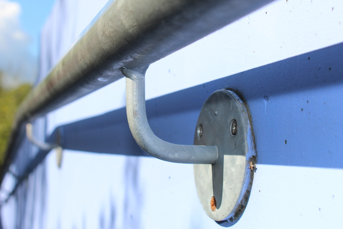
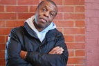
I chose these images because of their strong focus on order. Order can be found almost anywhere and in knowledge of this I decided to focus on images were it is blantant. My first image of the chilli's was taken in the Barcelona market, in which I particularly liked due to the strong contrast between the red and green. In my second image i used the element of sunlight by photographing a shadow created by the sun. In my last image, just like the second image, I have used the advantage of sunlight to capture an effective image by changing the iOS to create an almost black and white representation.
|
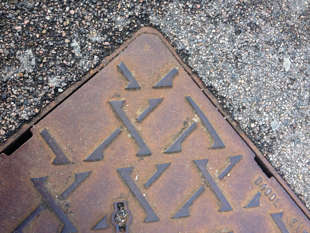
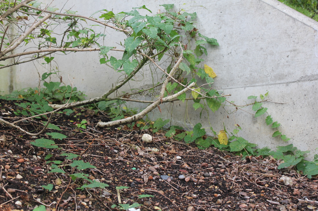
DISORDER
SELECTED IMIAGES:
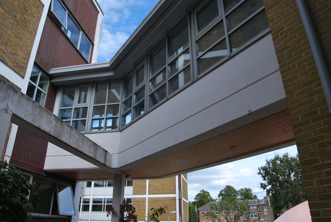
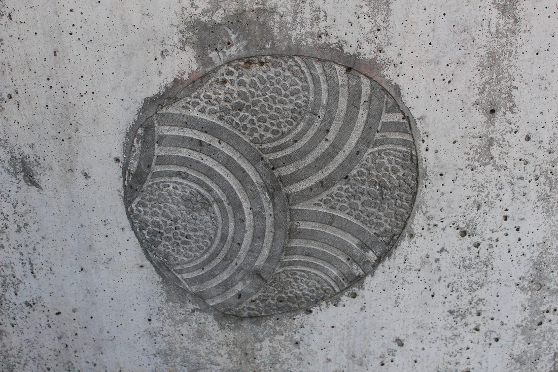
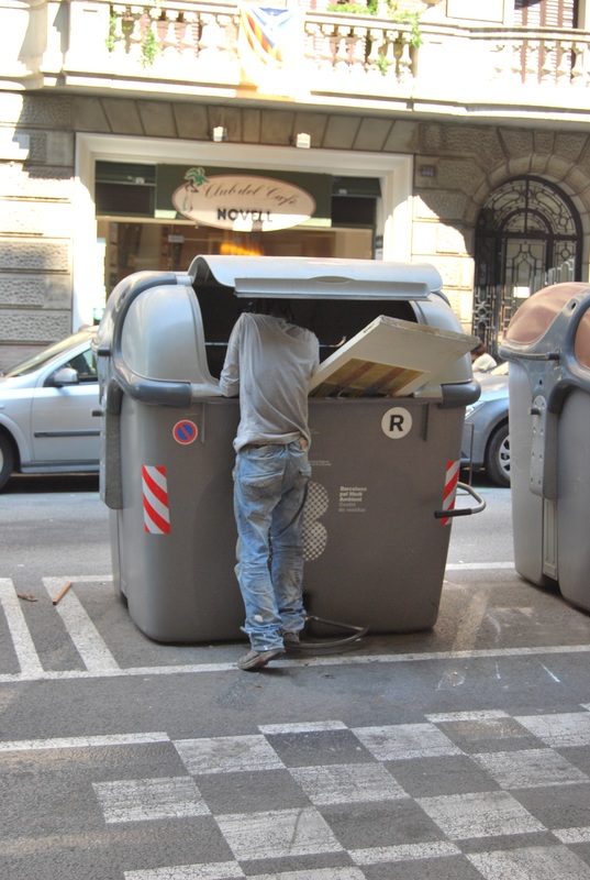
Above i have selected the best photos showing disorder through architecture, daily life and patterns. In the first image it is demonstrating daily life and its natural disorderly chaos. Whereas, the second image is showing a pattern from a Goudi park in which I visited during my stay in Barcelona, disorder is shown through the disrupted pattern. In the last image the disorder is presented by the different architecture of each building situated in the same area. I think my favourite image here is the first due its natural element of chaos.
|
ARTIST ANALYSIS:
ANDREAS GURKSY
Known for his large format architectural and landscape colour photography, Andreas Gursky is a German photographer with a great talent at capturing specific images in captivating detail. Gursky often composes his photographs from high points of view and of everyday situations/subjects to draw attention to the viewer and also to relate to all audiences in a creative form. He often heightens his work through digital manipulation via scale, detail and colour.
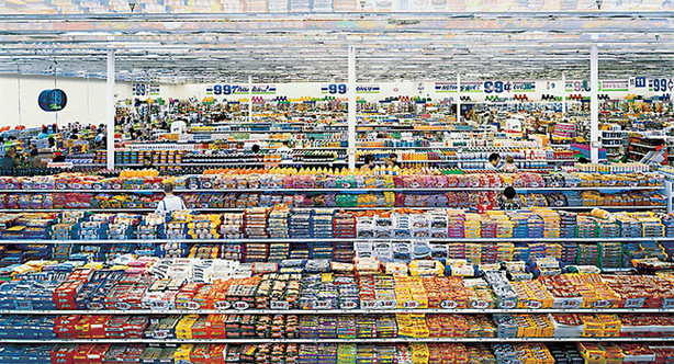
Above- This photograph is presenting order in a typical natural environment, a place in which most people encounter in their daily lives. At first glance, I was immediately struck by the vivid colours, presented in many different forms and variations, this being one of Gursky's famous styles of photographing; to indulge the viewer deeper into the photograph. Also, I speculated that the isles presented in the photograph create an interesting effect due to the angle they were taken from, thus adding the element of layers and complexity to the image. I chose to include this image as part of my inspiration for order and disorder, due its major neat and perfect form, not only for the way it has been composed but this is mirrored throughout the whole picture. My favourite element of this image is the fact that within its immaculate presentation and form, there is the occasional person disrupting this order.
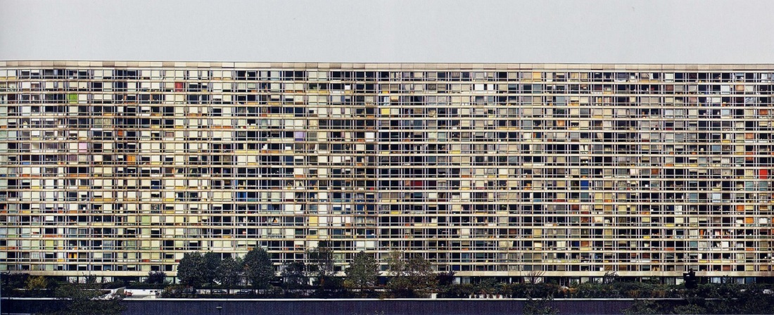
Above- This image is very powerful in many senses. The first being physically, for its immense scale spanning across the whole horizon smothering all aspects featured. Secondly, being again the variation in colour and shapes presented by the many windows. I also liked the fact that there are many window as this almost represents how different people order their lives, some with precicity and others with chaos; this will be heavily reflected on the living conditions of the variations in individuals shown by the presentation of their flats. I chose to feature this image as part of my analysis as I really liked the compostion and the meaning that comes with it, this is something I will try to interpret into my own work.
MY RESPONSE:
For my response, I focused on finding orderly elements around London. So, i visited popular tourist hotspots as I knew they would have particularly bright colours, like Gurksy's style. I also visited supermarkets, like the image above that i chose to analyse as I wanted to really capture Gurksy's form. I edited these images on photoshop enhancing the colours and cropping the image to focus on the item that it contains.
THOMAS LINDAHL ROBINSON
Born in 1968, Los Angles, Thomas Lindahl Robinson grew up in a background which enabled him to develop a strong visual imagination, which now has contributed to his work later on in his life. As he got older, his artistic expression and enthusiam deepened as he began to work with artist who specialed in conceptual oriented works, fine prints and documentary photography with the influence of Rogers Minick. After pursing a MA degree in Contemporary Art Theory and Critisim at NYU, he began to form his remarkable line of work captured in Asia, Cuba and America. Below I am using images from his "Spread your Wings" and "New Shanghai."
|
|
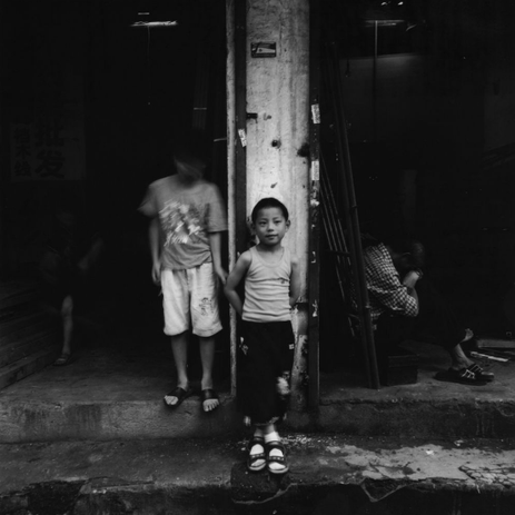
Left-This image is taken from his "New Shanghai" section, I included it due to it's strong representation of the conditions this child is enduring. Although the composition suggests an orderly nature with the focus being the boy, center stage and the column mirroring the boy's structure/position, I believe this photograph is disorder. This is because of many aspects, one being the young child standing left of the boy, his head completely blurred which suggests a crowded, messy lifestyle, filled with uncertainty and disorder. I also believe this is of a chaotic topic due the man on the right side of the boy, his head hangs low caressed by his arms, his attitude implies that he is going through a difficult, tough phase suggesting disorder in his life. Furthermore, this image not only shows disorder through a emotional aspect but also physical, the conditions of the environment in which they are situated in proves contaminated with litter and dirt.
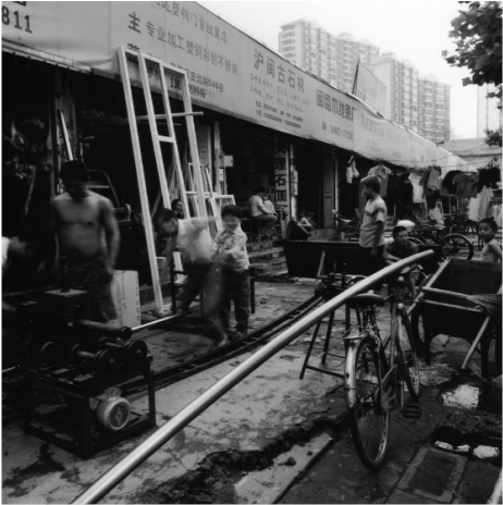
Right- This photograph is once again from "New Shanghai" and is quite blatantly disrupted thus implying disorder throughout the image. The foreground presents a chaotic atmosphere of many workers in their messy environment with various specialised equipment dotted around, showing the physical element of disorder. However, it strongly suggests at issues such as the working conditions and fair pay of these workers, especially due to the country this is located in (China, a developing country), where multinational companies tend to exploit the economical state of a country and use this to pay worker smaller wages. This problematic issue implies an emotional disorder in the worker's lifestyle and how they are generally treated. I decided to include this image as, at first glance, the composition/ style of the image has no disorderly elements, such as blur/movement of people and /or objects, which is why I thought it was particularly interesting. When I am creating my responses I can include factors that will make all aspects of the photograph disorderly.
Right- This photograph is once again from "New Shanghai" and is quite blatantly disrupted thus implying disorder throughout the image. The foreground presents a chaotic atmosphere of many workers in their messy environment with various specialised equipment dotted around, showing the physical element of disorder. However, it strongly suggests at issues such as the working conditions and fair pay of these workers, especially due to the country this is located in (China, a developing country), where multinational companies tend to exploit the economical state of a country and use this to pay worker smaller wages. This problematic issue implies an emotional disorder in the worker's lifestyle and how they are generally treated. I decided to include this image as, at first glance, the composition/ style of the image has no disorderly elements, such as blur/movement of people and /or objects, which is why I thought it was particularly interesting. When I am creating my responses I can include factors that will make all aspects of the photograph disorderly.

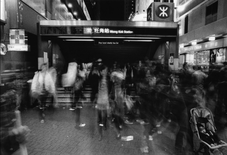
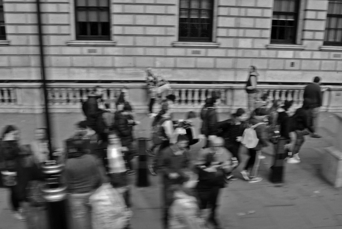
Above- This is one of my favourite images of Thomas Lindahl Robinson's, as i was particularly drawn to the image as a whole, the constant flow of disorder is something i will attempt to incorporate when composing and capturing my images. I really liked the blur of people across the photograph which shows the real effect of rush hour and the sheer population in one city. Thomas Lindahl Robinson has cleverly composed this image by using the natural light from the city and surroundings and a long shutter speed to create the moving disruption.The most interesting feature and what I was strongly drawn to, was the baby in the push chair, ( bottom right-hand corner ) this struck me as a very dramatic aspect, with someone so young and innocent to be stuck in a mass of chaos questions ideas of how her human condition is and what her lifestyle she has to come of. It also suggests that because she is so adolescent that she is naive to what her city beholds which could explains why she is not inclusive with the disruption or the reason for her being still is for a contrast, a focus to capture the congregation, the fact that she is so peacefully sleeping definitely acts as a strong comparison to the rest of the disarray of the city. This image is showing disorder, as I mentioned before, but in a physical and emotional form which is a commodity i will enforce into my work.
MY RESPONSE:
For this response, I noticed Thomas Lindahl Robinson's images were taken in busy scenarios, typically cities, so I took my images in central London. I thought this was a particular effective place to chose as not only is it heavily populated but there is the major rush of people attempting to reach their chosen place in time, therefore I could really imitate his work, particularly the last image I analysed. I took the images from a higher perspective so the viewer could really see the density of people and I also put a slow shutter speed so the image would present a blurred photograph to add to the element of rushing, so the viewer could really identify the sheer size of the city and it's flow. Below, on the left is the Artist's work and then right, my response.
|
Thomas Lindahl Robinson's work:
|
My work:
|
GREGOR SCHNEIDER
Gregor Schneider is a thought to be one of Germany's most important contemporary artists and photographers, with him famous for his practice of photographing constructed rooms. I couldn't find lots of information about him as most of it was in German. However, I did find out that he was worked in various places since 1985 and continues to produce very dramatic and thought provoking images.
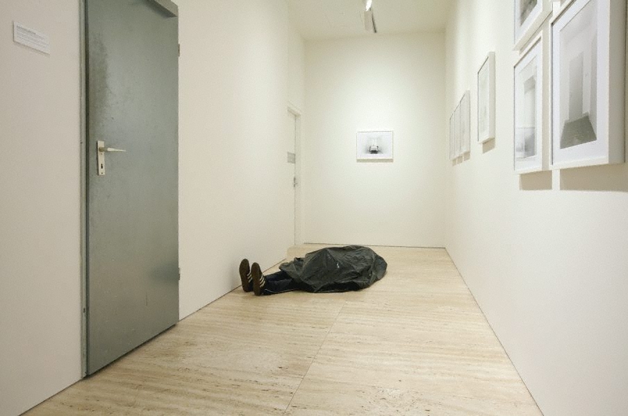
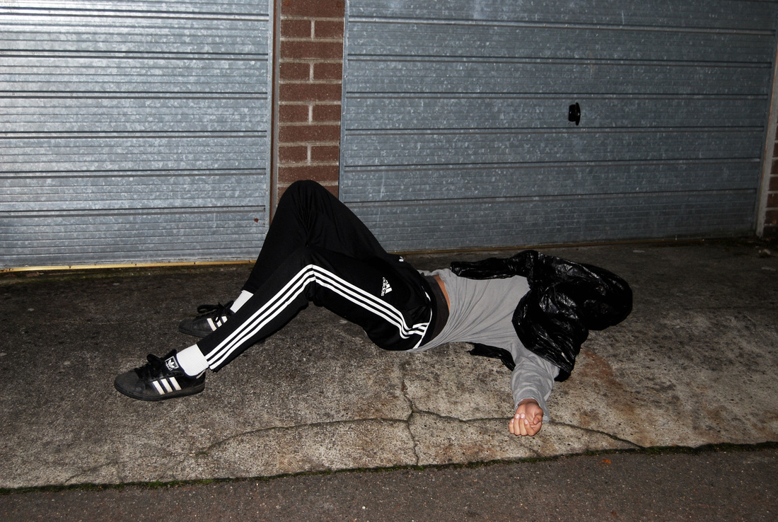
Left- I chose to include this image, firstly because of its typically style of Schneider's, with the plain blank white background acting as a canvas highlighting the person lying on the floor. The fact that the model is positioned on the floor in a black plastic bag contrasts to the rest of the environment, creating a focus for the photograph. The colours used in the image reflect the emotion enforced on the audience, a very stark uncomfortable response. I feel this image strongly relates to order and disorder in the disorderly element by expressing a dark, unhomly effect. I will attempt to enforce this style into my own work in an effort to respond effectively.
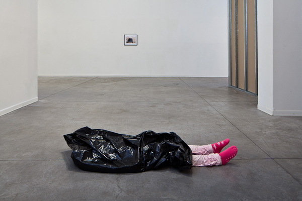
Right- This image is very controversial. It is menacing in all senses, primarily for the fact that the model is a child. The black plastic rubbish bag placed over her head creates a quite uncomfortable tragic response. This clearly represents disorder in a blatant presentation, thus this is something I will try and incorporate into my work.
Right- This image is very controversial. It is menacing in all senses, primarily for the fact that the model is a child. The black plastic rubbish bag placed over her head creates a quite uncomfortable tragic response. This clearly represents disorder in a blatant presentation, thus this is something I will try and incorporate into my work.
MY RESPONSE:
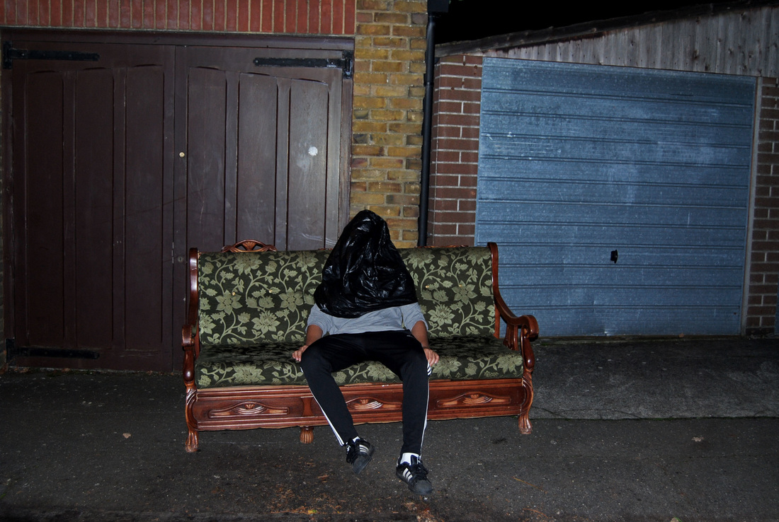
For my response, I chose to imitate Gregor Schneider's use of the black plastic rubbish bag totally emorsing the human structure, but with my response i wanted to capture something that had more of an urban, gritty surrounding, rather than his chosen blank white backgrounds. Although, in his images, the focus is strongly drawn to the body and the surrounding add to the mysertious, menacing feel given off, I decided to go against this.
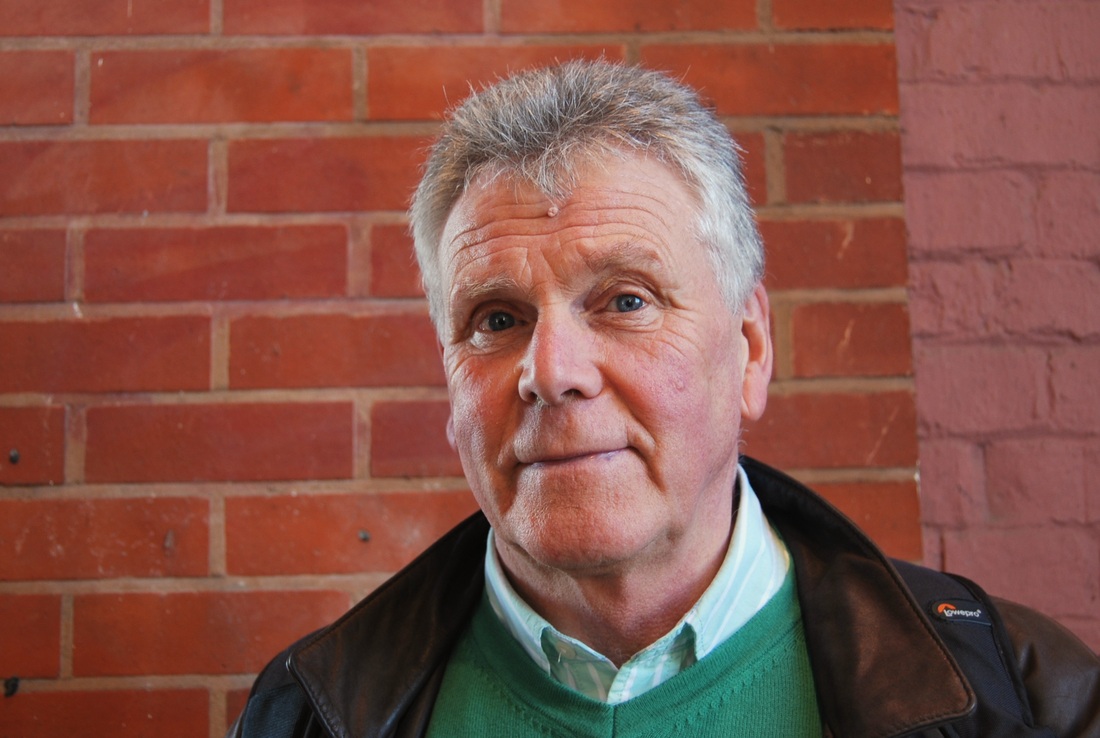
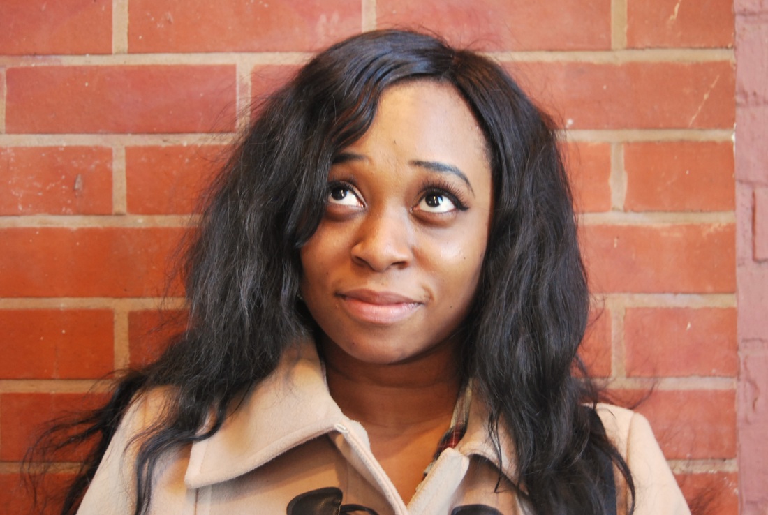
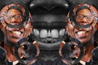
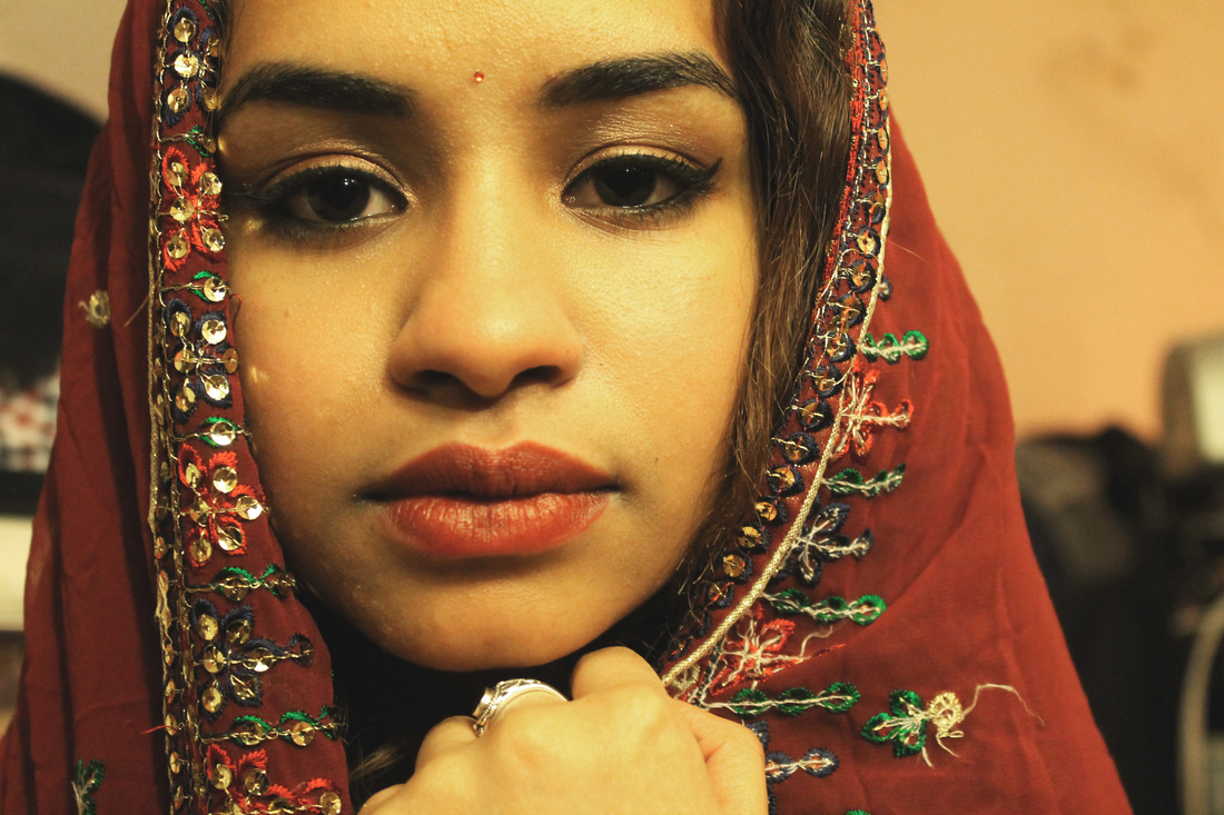
PORTRAIT DISORDER
ROMAIN LAURENT
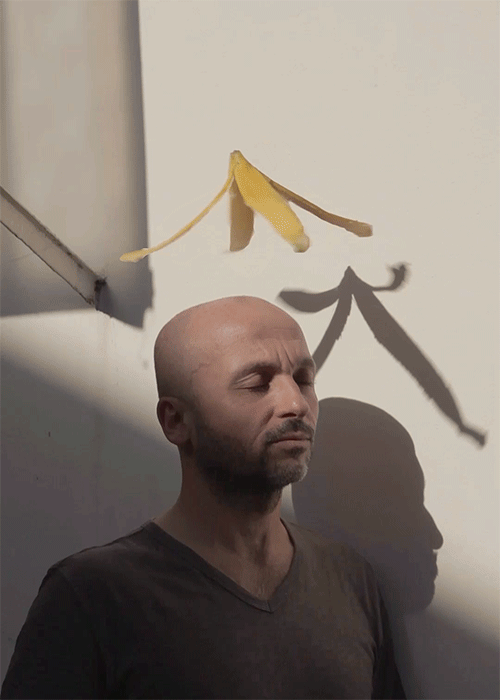
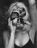
Romain Laurent is a french photographer and director with a unique talent. His carrier has led him to work with/ on magazines, agencies and brands like WAD Magazine, Reebok, Hermes, Lacoste, Nissan, VW, Google, Hilton, GQ and more. With his personal photography, which includes the loop portrait series (gifs) I have decided to feature some examples because its creativity and this is something i would definitely like to incorporate in my work.
|
|
|
Left- I thought this gif was particularly effective due the comical element created by the "halo" like banana framing this man's head. I also liked the expression on his face, which added to the image as his mesmerised structure appears oblivious to the banana. I was particularly drawn to the shadows and lighting in the background of the image, as this created some really interesting shapes and made the image more complex. I chose to feature this gif as part of my inspiration due its use of a unique object; fruit. When responding I will try to incorporate some interesting objects to add a deeper meaning and complexity to the image.
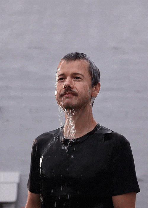
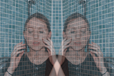
Middle- I really like this image, firstly due to its simplicity of the basic bland colours and his mantained concerned expression. Secondly, I like the fact that the water is slowly embracing his face while his face remains in the same content expression. The use of water, is very clever as the lighting plays an effective result due to the opaqueness of the water. I featured this image due the colours and the strong focus being on the man with trickling water pouring down his face, his maintained position and what the water has transformed his features into, such as flattening hair, which is something I am going to attempt to incorporate into my gifs.
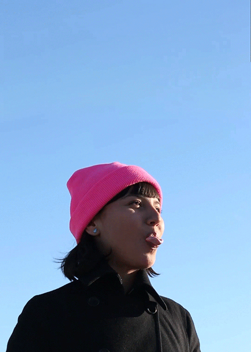
Right- I found this image very interesting, due to many aspects, one being its bright pastel colours which immediately drew my attention to the photograph, the colours also have a purposeful effective spin on the gif in which they are complimenting each other; her earrings and the sky, and the colour of her bubble gum and her hat. What generally attracted me to this image is its simplicity throughout, her bland clothing choices and the constant blue coloured background supply a simple yet attention grabbing response. I like the whole composition of the image and thought it was very clever to use bubblegum, something thats globally recognised.
Middle- I really like this image, firstly due to its simplicity of the basic bland colours and his mantained concerned expression. Secondly, I like the fact that the water is slowly embracing his face while his face remains in the same content expression. The use of water, is very clever as the lighting plays an effective result due to the opaqueness of the water. I featured this image due the colours and the strong focus being on the man with trickling water pouring down his face, his maintained position and what the water has transformed his features into, such as flattening hair, which is something I am going to attempt to incorporate into my gifs.
Right- I found this image very interesting, due to many aspects, one being its bright pastel colours which immediately drew my attention to the photograph, the colours also have a purposeful effective spin on the gif in which they are complimenting each other; her earrings and the sky, and the colour of her bubble gum and her hat. What generally attracted me to this image is its simplicity throughout, her bland clothing choices and the constant blue coloured background supply a simple yet attention grabbing response. I like the whole composition of the image and thought it was very clever to use bubblegum, something thats globally recognised.
FIRST RESPONSE:
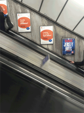
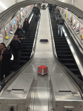
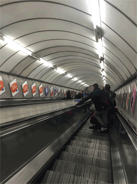
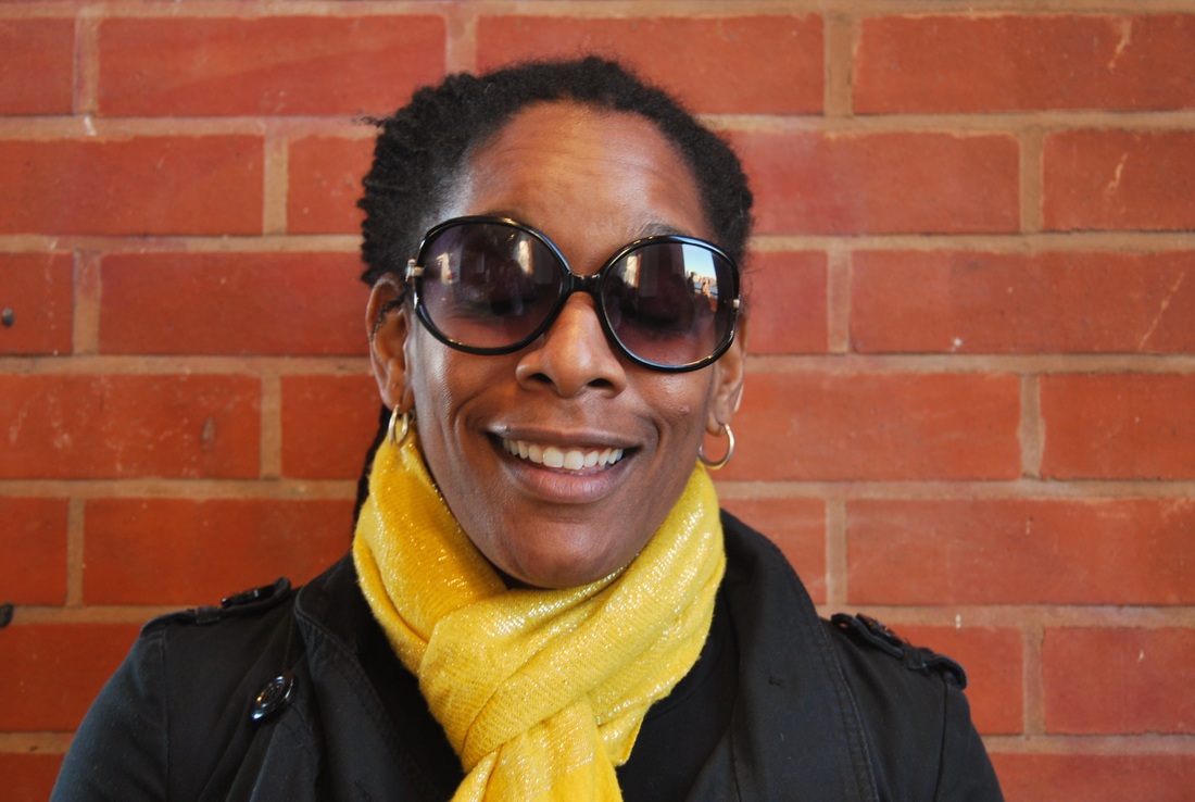
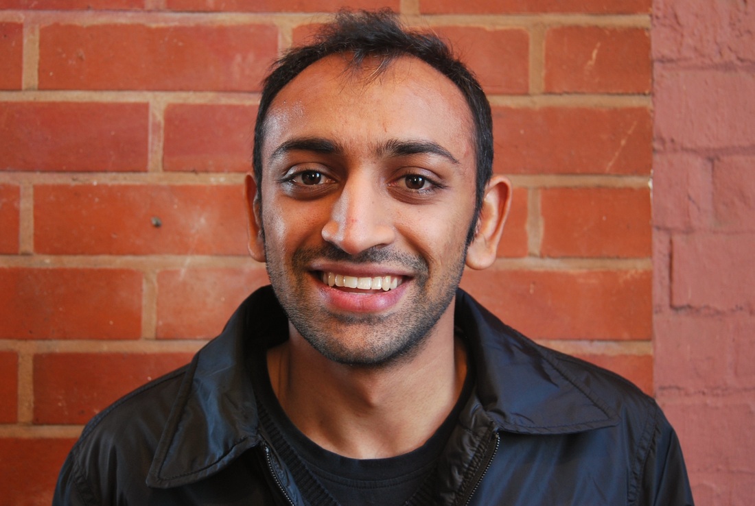
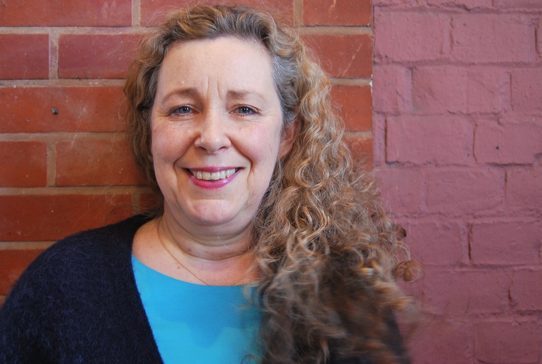
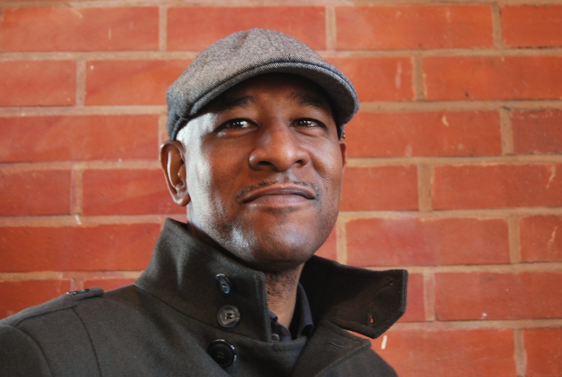
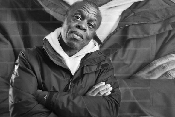
For my first response, I could pictures in a tube station. I thought this was a simple place to begin as the focus object of the image is moving so creating an effective gif would be less complex. In an attempt to imitate Romain Laurent and his talented work, I have began by doing simple compositions in order to get used to forming these gifs. I chose these images to turn into gifs because of their simple construction and form, I have also made them the same speed of 0.1 seconds
|
|
|
Improvements- To improve my images I will further respond by making sure the images I combine to create my gif are all in the same place, so by using a tripod to maintain accuracy. I will also make sure that that the model/object is/in the image stays still, so the gif will run smoothly.
SECOND RESPONSE:
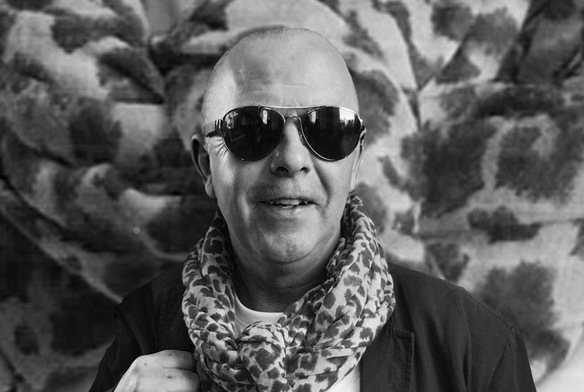
Whilst having a further look at Romain Laurent, i discovered more interesting, advanced styles of capturing and making gifs, in which i have tried to attempt here. I have also tried using different materials within the gif to make it more interesting.
Above I have made the model try to remain as still as possible by focusing on one particular spot in the distance and attempting to not move whilst doing so. I also focused on my flaws and composed this image using a tripod to maintain accuracy.
|
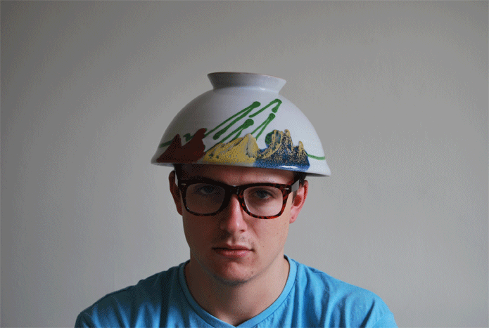
In this response, I decided to use a patterned bowl and place it on the models head. I chose to do this because I thought it was a unique form of showing off the pattern whilst adding an interesting touch to the gif.
|
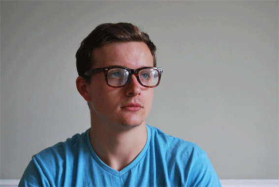
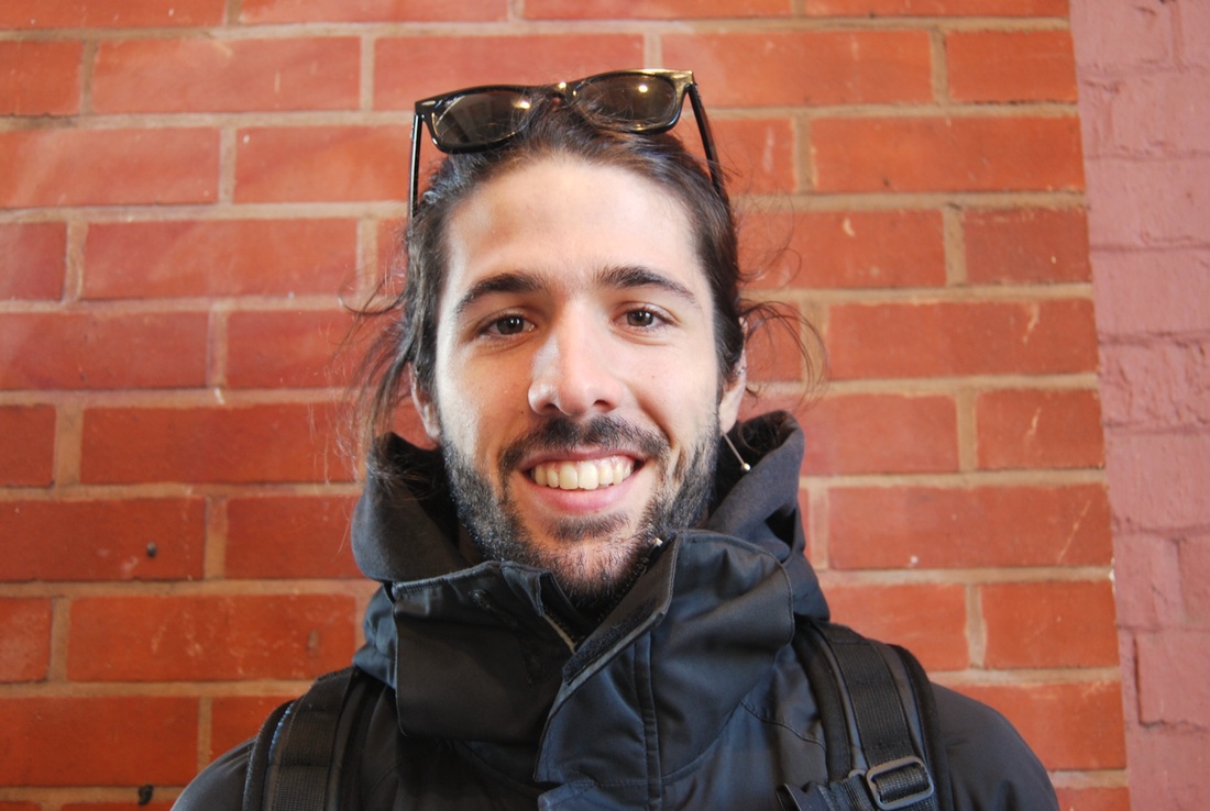
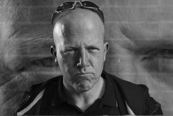
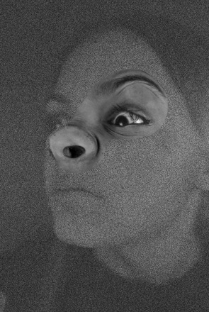
For this gif, I decided to firstly use a different model, for variation within my responses and to use sunglasses. Sunglasses provides a greater contrast than normal see throw glasses as it completely blocks of any sight of the eye. I also chose this to make into a gif due to his enhanced concerned look on his face which I thought was particularly effective. On photoshop, i also cropped this gif so that the focus was more on him rather than the surroundings.
ARTIST AND ME:
These have a similar resemblance. Primarily for the fact the gif is the movement of the glasses. However, it is evident, my work isn't as still as his, which is something i will work on when I respond further.
|
Romain Laurent's work:
|
My work:

|
EXPANDING:
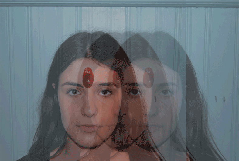
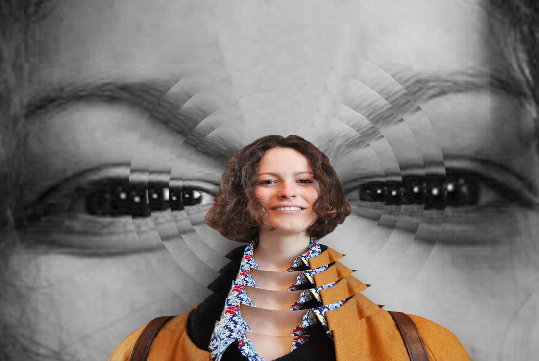
For this response, I firstly captured all my images with a tripod to maintain accuracy, I also told the model to attempt to stay as still as possible so I could end up with the best result. For the actual composition of the photographs. I decided to look at the disorderly element and took both abstract images including ketchup to images of daily acts, for example washing your hair. For this process, I used photoshop. For the two images on the left and right, I changed the opacity and mirrored each image. I then had to save each edited image and recreate the gif. For the centre image, I edited each image by making the model have three of her faces but with different opacities again. I then saved each image and created the gif.

|
|
|
THIRD RESPONSE:
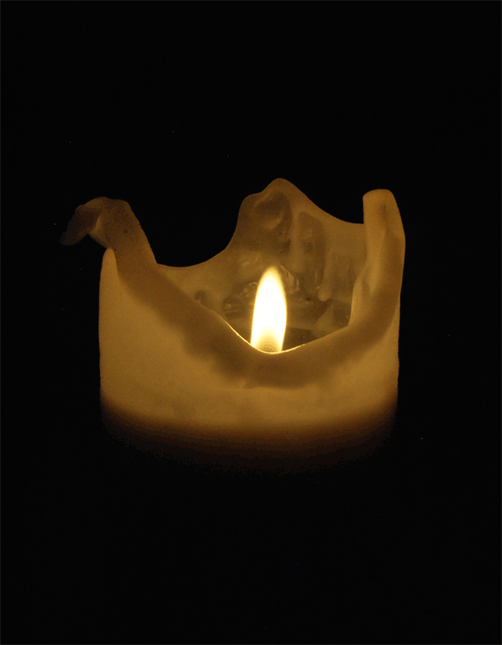
For my final response, I decided to create gifs using objects rather than humans. My focus on this response was on fire and light.

|
|

SYMMETRICAL ORDER
SASHA LEVIN
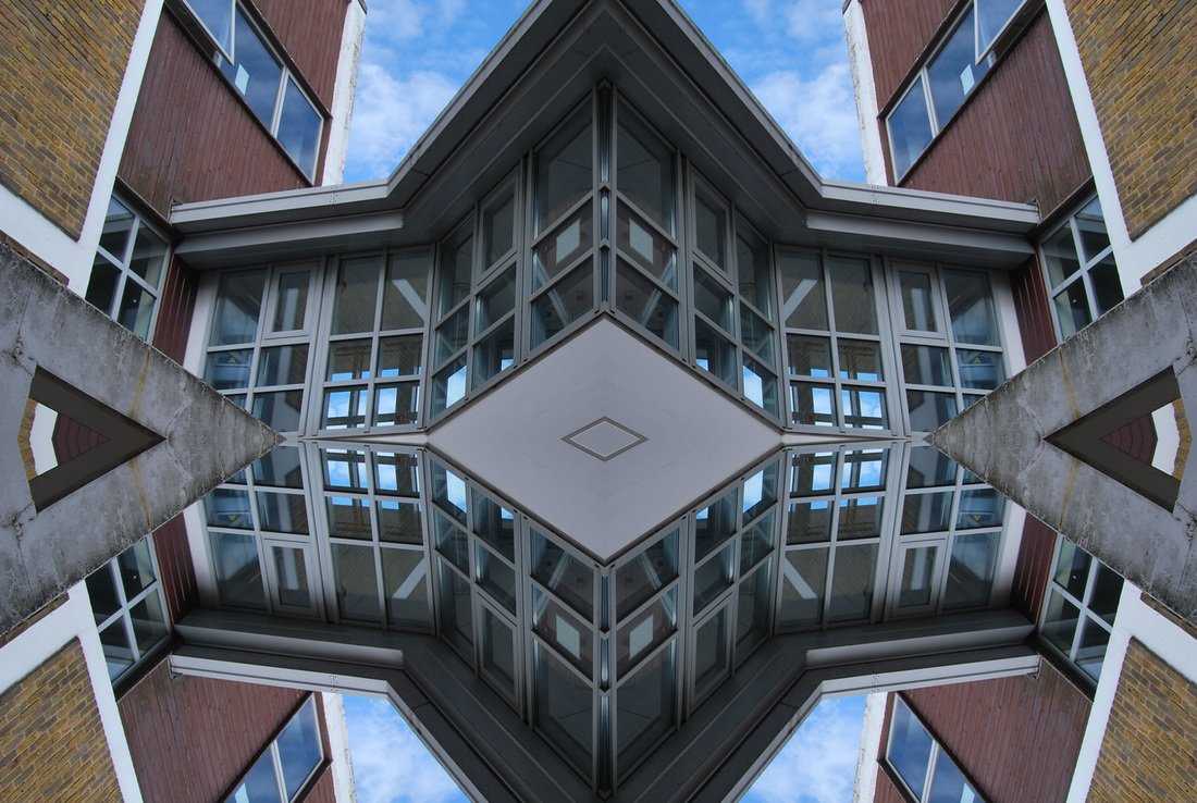
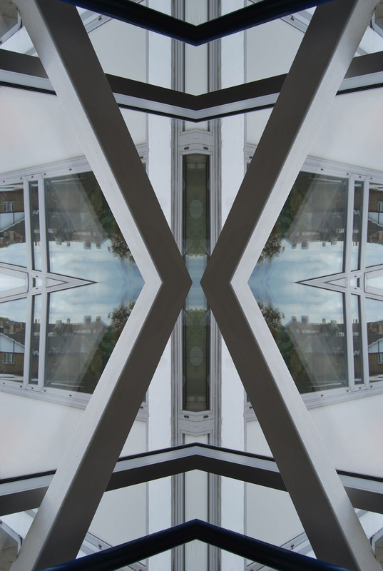
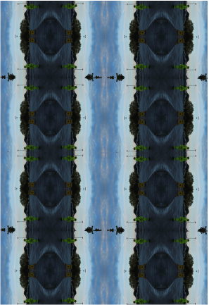
Sasha Levin is Moscow based famous photographer, specialising in commercial photography. His talent often involves a symmetrical element to it. I decided to use images from his Instagram, as i think it features some of its most effective responses of symmetry. There is sparse information online about Sasha Levin as I found when researching most of it was in Russian.
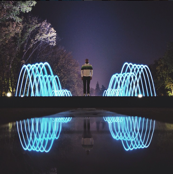
Left- I chose to feature this image firstly, for its blatant display of symmetry. However, I was also drawn to the use of lights reflected onto the, what seems to be a lake, as the shapes and light contrast with the rest of the image, which I thought was particularly effective. This shows how symmetry is part of the natural world and not just something that can be created with photoshop. I really liked the effected created by the lake, as the reflected image presented an almost misty, unclear response. I think something that Sasha Levin pays much attention to is colours, which can be shown throughout his work. This is apparent in this photo with the strong deep blue night being lit up by the glistening light blue fountain. The colours and composition is something that really stood out and is something that I would like to look for when taking my own images.
Middle- This image i included is once again, symmetry created by architecture rather than physically creating in on a computer program. I thought the man standing centre stage in stark red really stood out in contrast to the rest of the image, this almost creates a sense that he is important, as he is the focus with the lights acting as a spotlight, highlighting his authority. This is orderly photography as everything is neatly symmetrical, in my responses i will try to imitate this.
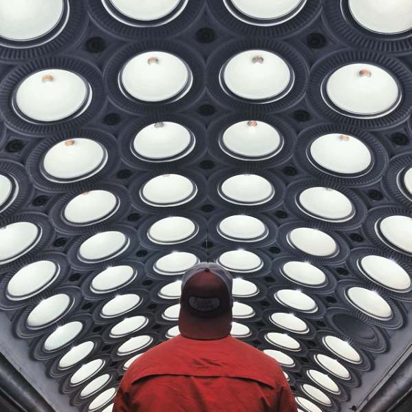
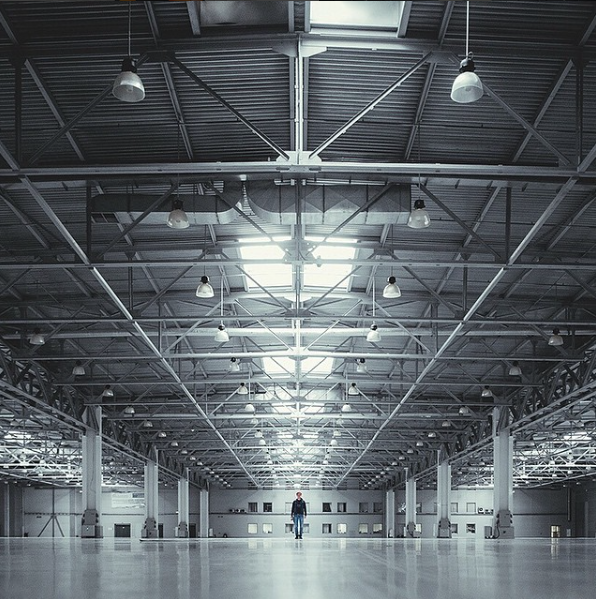
Right- I was particularly inspired by this photograph. The large expanse created an extremely dramatic, powerful response. I also liked the fact that the man was once again standing centre stage, but this time he is tiny in comparison, showing the sheer size of the warehouse Levin was situated when taking this image. For my response, I will try to capture something like this, rather than focusing on small aspects as I believe this response was one of the most effective.
Middle- This image i included is once again, symmetry created by architecture rather than physically creating in on a computer program. I thought the man standing centre stage in stark red really stood out in contrast to the rest of the image, this almost creates a sense that he is important, as he is the focus with the lights acting as a spotlight, highlighting his authority. This is orderly photography as everything is neatly symmetrical, in my responses i will try to imitate this.
Right- I was particularly inspired by this photograph. The large expanse created an extremely dramatic, powerful response. I also liked the fact that the man was once again standing centre stage, but this time he is tiny in comparison, showing the sheer size of the warehouse Levin was situated when taking this image. For my response, I will try to capture something like this, rather than focusing on small aspects as I believe this response was one of the most effective.
FIRST RESPONSE:
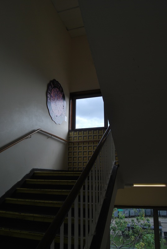
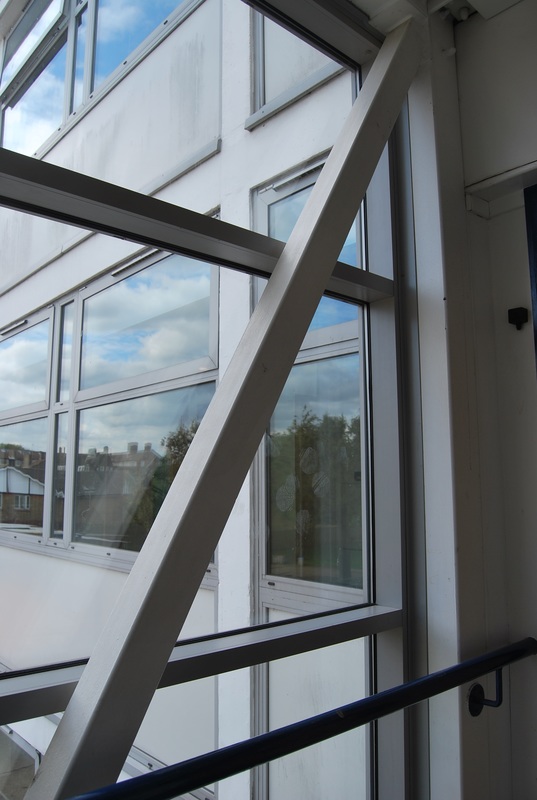
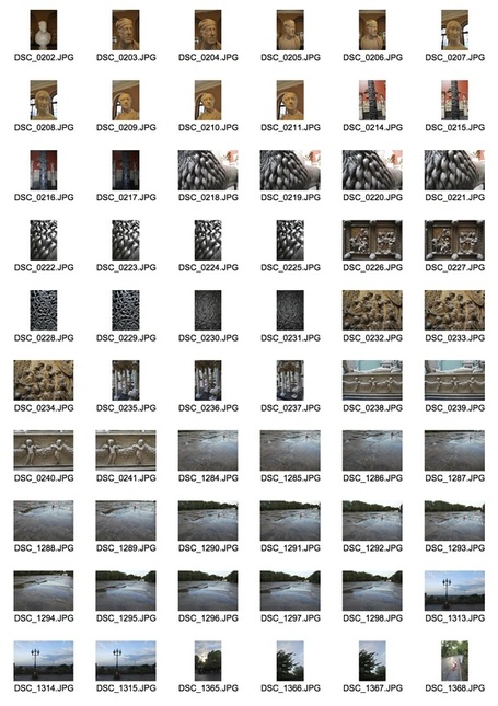
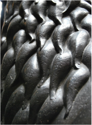
For my first response to symmetrical order, it involved me going round south wing in search of elements in which I thought would look particularly effective once edited on photoshop. This meant looking for objects with interesting architectural aspects or shapes. This response was done during class time, below are my contact sheets of all the images I took.
|
|
|
SELECTED IMAGES:
I chose these images to edit on photoshop as i though they were the best imitation of Sasha Levin and expanding my work even further I decided to reflect the image horizontally as well as vertically to add the element of symmetry. I tried to take a variety of images with different lighting, colours and angles so that I could create a variety of responses.
BEFORE
|
|
|
|
|
|
AFTER
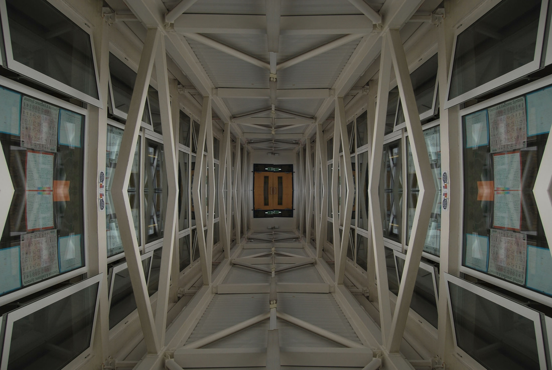
|
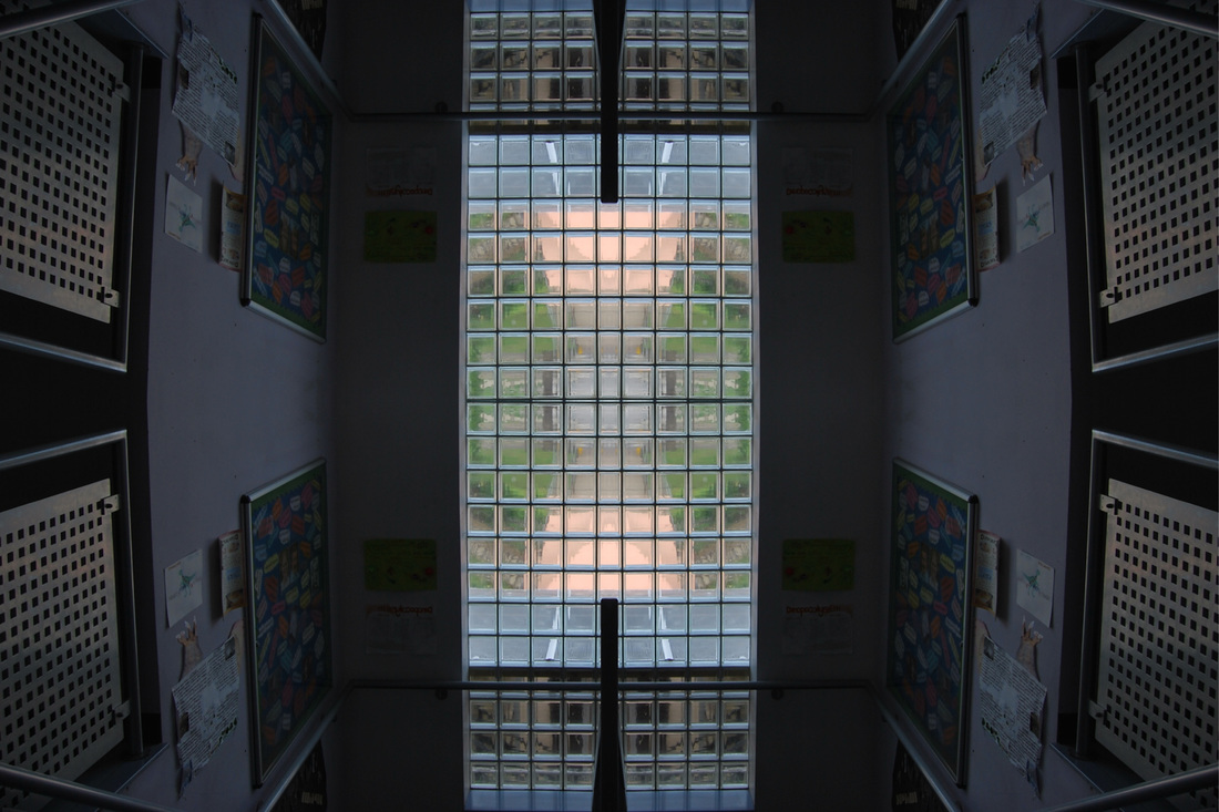
|
|
|
|
|
Improvements- For my second response, when editing on photoshop I will focus on improving my edits. I will do this by not only reflecting the image on itselfs vertically and horizontally but reflecting the whole image various times to create a whole new image.
SECOND RESPONSE:
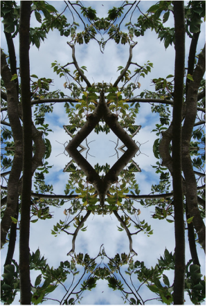
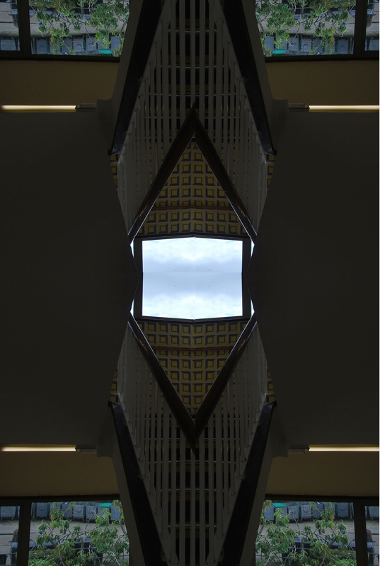
This response was done out of class time so I decided to not just go to one area but many as possible, to result in a varied response. I went to two places to capture these images: a park around my local area (Alexandra Palace) and the V&A museum. Alexandra Palace supplied me with images mostly of skyline and weathered conditions. Whereas at the V&A i captured images mostly consisting of abstract patterns and textures which I believe would create an obsure outcome.
|
|
SELECTED IMAGES:
For this response, I decided to capture images from I took these images in Alexandra Palace, in the evening when the lighting was good enough to create an interesting effect on the water and in the sky. Once edited, the sky created a very interesting effect. I also focused on the environmental aspects of this area and took various images of the wildlife. Also, for my images taken at the V&A i focused on cropping it so that the image was unique. Finally, I took in account my improvements I needed to make from my first response focused on this whilst editing these images on photoshop.
BEFORE
|
|
|
|
|
AFTER
|
|
|
|
|
EXPANDING:
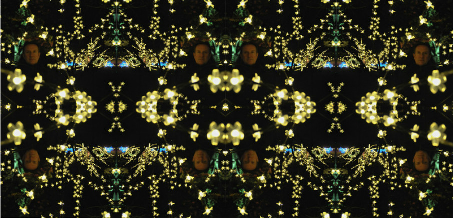
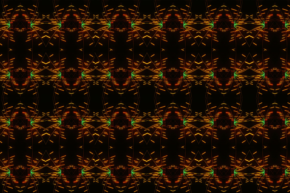
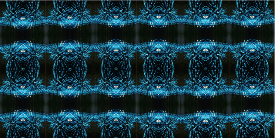
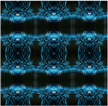
After my second response, I discovered the best form of editing the photographs. However, I wanted to compose images that would look better even before edited and I thought lights from The Kew Gardens Christmas display would be appropriate.
SELECTED IMAGES:
BEFORE
AFTER
ARTIST AND ME
These have a hint of resemblance in the fact that they are both symmetrical pictures involving the use of luminance blue light. However, there is a constant between the two, Sasha Levin's work focuses on capturing symmetry naturally whereas my response is manipulated using photoshop.
|
Sasha Levin's work:

|
My work:
|
CUT UPS
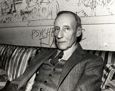
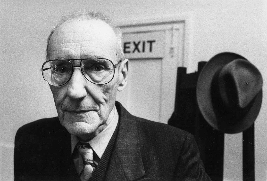
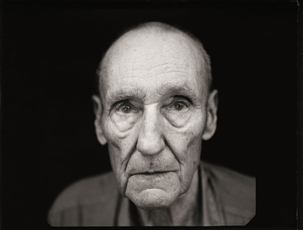
WILLIAM S. BURROUGHS
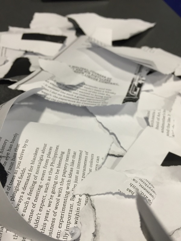
William S. Burroughs was born on February 5, 1914, in St. Louis, Missouri, and became one of the founding figures of the Beat Movement. He is most famous for his literary career, varying from spoken word perfomer all the way to a poet writer, known for creating "cut ups." William S. Burroughs is considered to be "one of the most politically trenchant, culturally influential, and innovative artists of the 20th century." In knowledge of this, we used his unique form of expressing a particular topic and interwined this into my photography. This response is majorly considered to be disorderly, as the person who is constructing the work, is physically dismantling the words and reforming them in a more orderly way.
"Take a newspaper.
Take some scissors.
Choose from this paper an article of the length you want to make your poem.
Cut out the article.
Next carefully cut out each of the words that makes up this article and put them all in a bag.
Shake gently.
Next take out each cutting one after the other.
Copy conscientiously in the order in which they left the bag.
The poem will resemble you.
And there you are – an infinitely original author of charming sensibility, even though unappreciated by the vulgar herd." - William S.Burroughs
FIRST RESPONSE:
|
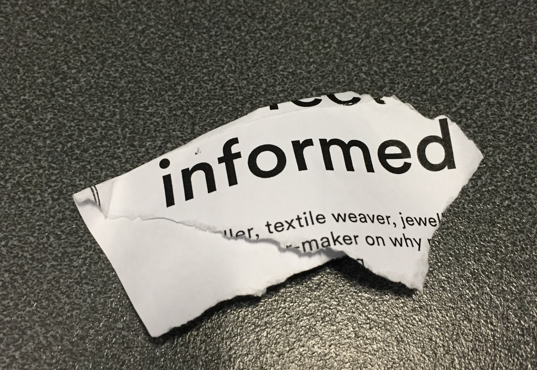
For this task, we were given an article and told to rip it up to create disorder within a place of writing that had order, thus sticking to the theme of order and disorder. Once i had finished destroying the article, I chose a piece of ripped up paper at random, which was "Informed." So, in knowledge of this I began to think of ideas to capture the idea of informed around my school for my first response. Below is an image of my word and the torn up article and to the left is my contact sheet of all of images I took.
|
SELECTED IMAGES:
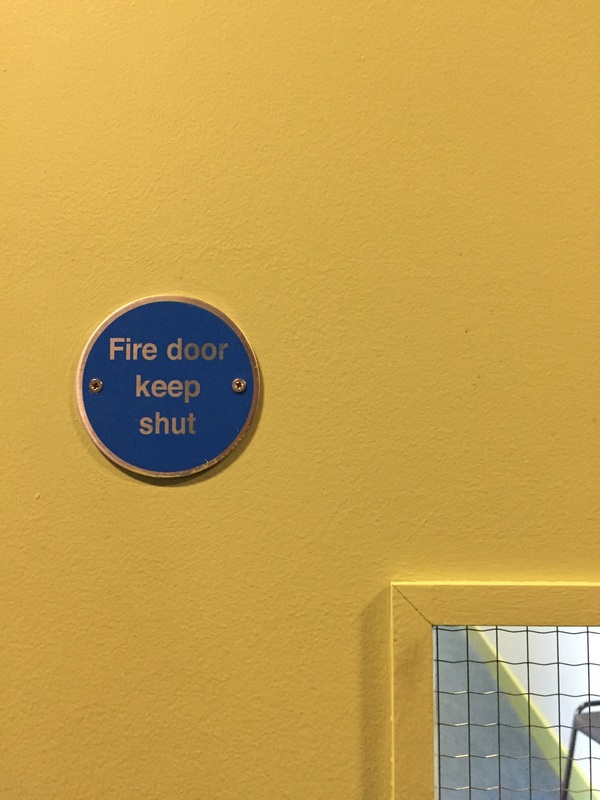
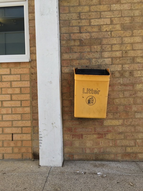
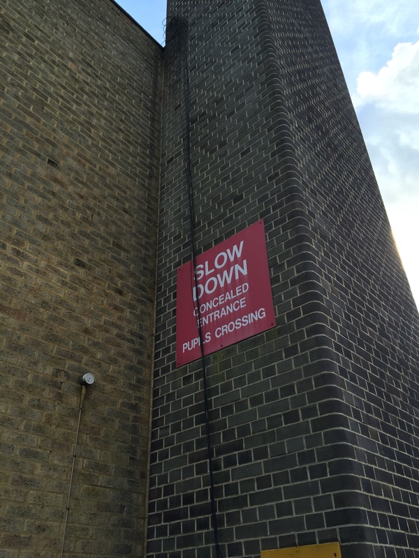
For these images, I went round North Wing and captured images of my chosen word, "Informed." This meant focusing on common signs and information provided around the school.
Improvements- When expanding my work, I will look for places of more variety, maybe presenting the word in different unique forms. I will also try to maintain a focused colour scheme to add a flow to my work.
SECOND RESPONSE:
For my second response, I selected the word "alphabet". I thought this was particularly fitting as this is included in all aspects of society. Below is where i have attempted to capture all the letters of the alphabet in everyday items and objects.
THIRD RESPONSE:
For my third response, I chose another article and teared it up until I reached the random word, which for me was "Busy." So, in knowledge of this I began to think of ideas which I could compose. I also looked back at my spider diagram to get more concepts, I then chose to expand of this word in two different forms; "Protest" and "Packed."
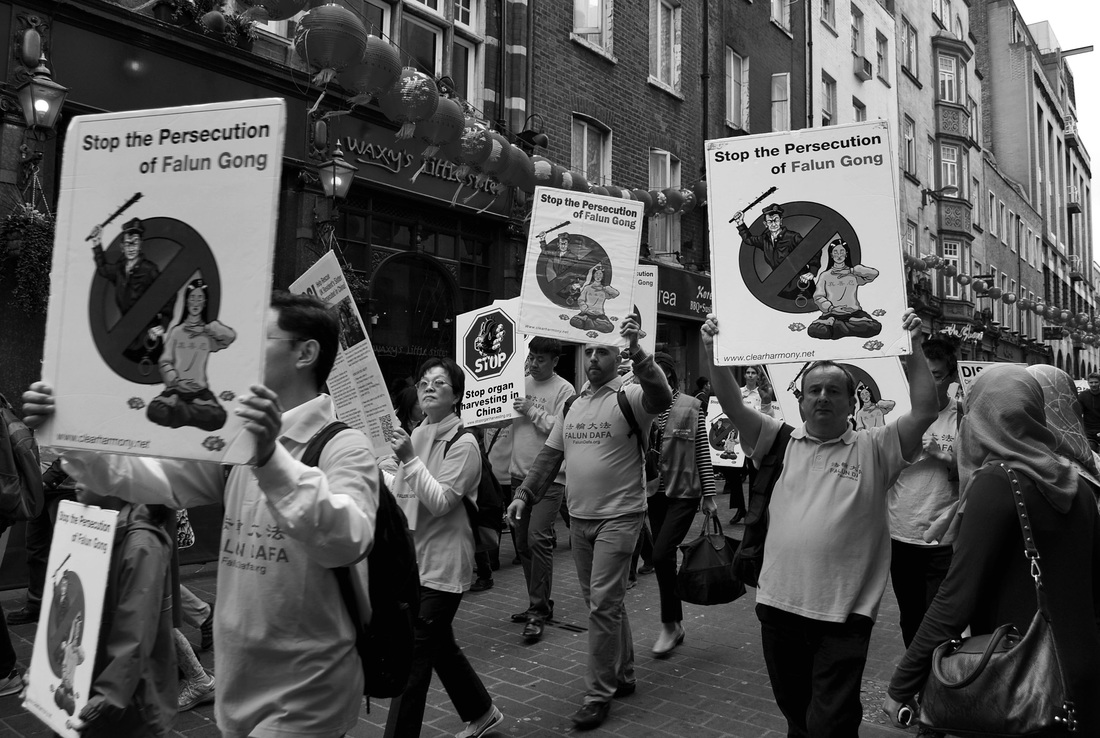
PROTEST
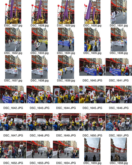
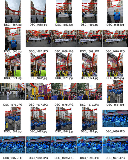
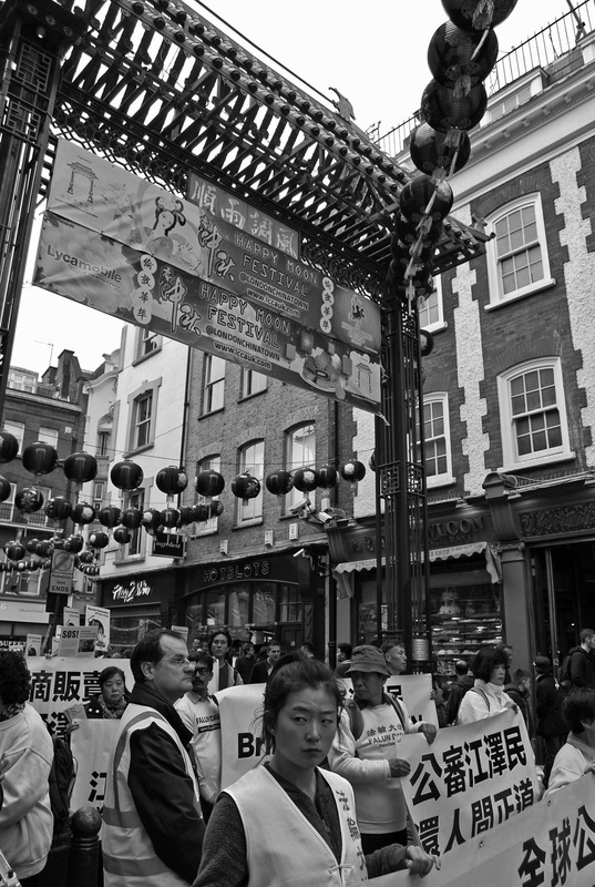
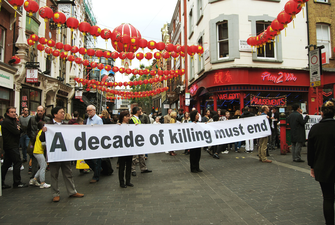
For this extract, I also went to central London, in search of a protest. I came across one in China Town and this brought major attraction and business. I thought this was an effective word to extract from "busy" as protest brings attention and awareness and thus bringing business.
|
|
SELECTED IMAGES:
I included these image as one of my responses primarily due to the strong compositions. In the first image the interesting expression presented by the women in the foreground of the image, i thought this showed her raw passion for the protest and added a focus amongst the business. The photos below i believe represent protest very blatantly, by capturing signs presented by those expressing the truth of a corrupt system, fighting to change their wrong ways.
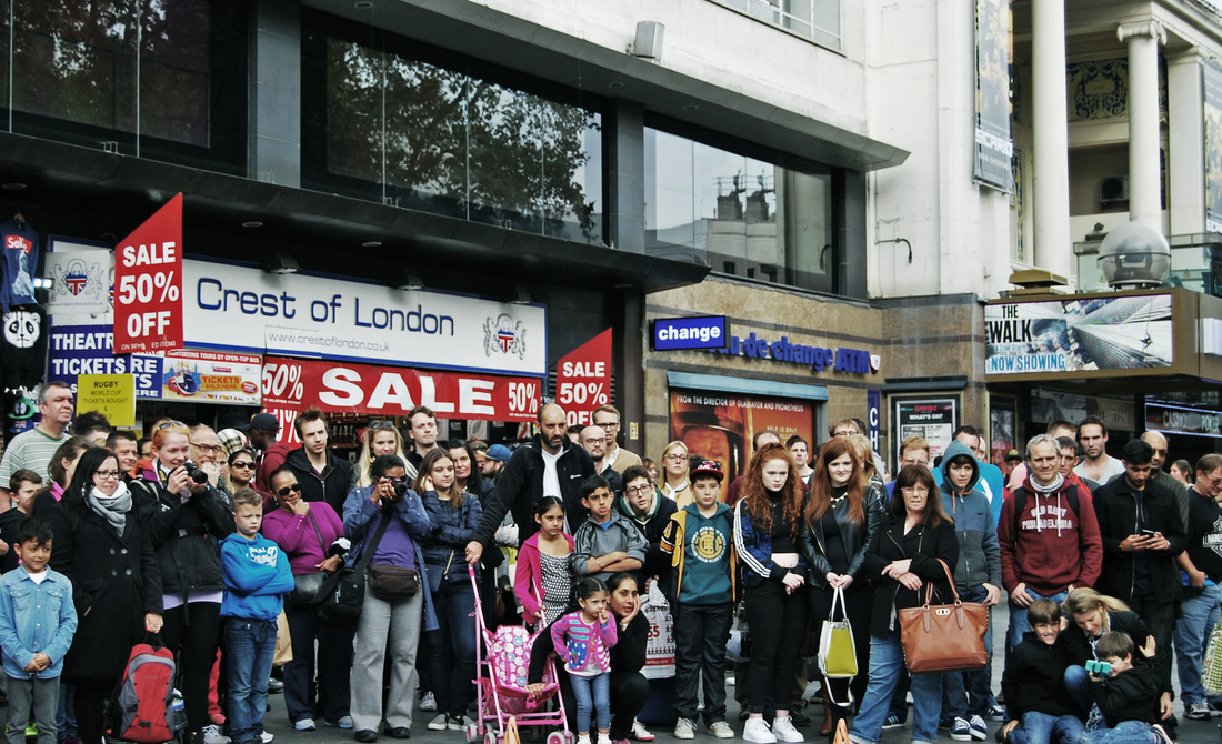
PACKED
For this response, I went to Leister Square, a very central location in which typically many street entertainers bring interest. Below are my images from this.
|
|
SELECTED IMAGES:
I chose this image as one of my main responses as I thought this was an effective representation of the word "packed." This was packed from the audience watching a street performer, which is another reason why i decided to feature this, as all their attention was focused on the same aspect, therefore presenting the various different reactions/expressions.
SPEED PRIORITY - WATER BALLOONS
HAROLD EDGERTON
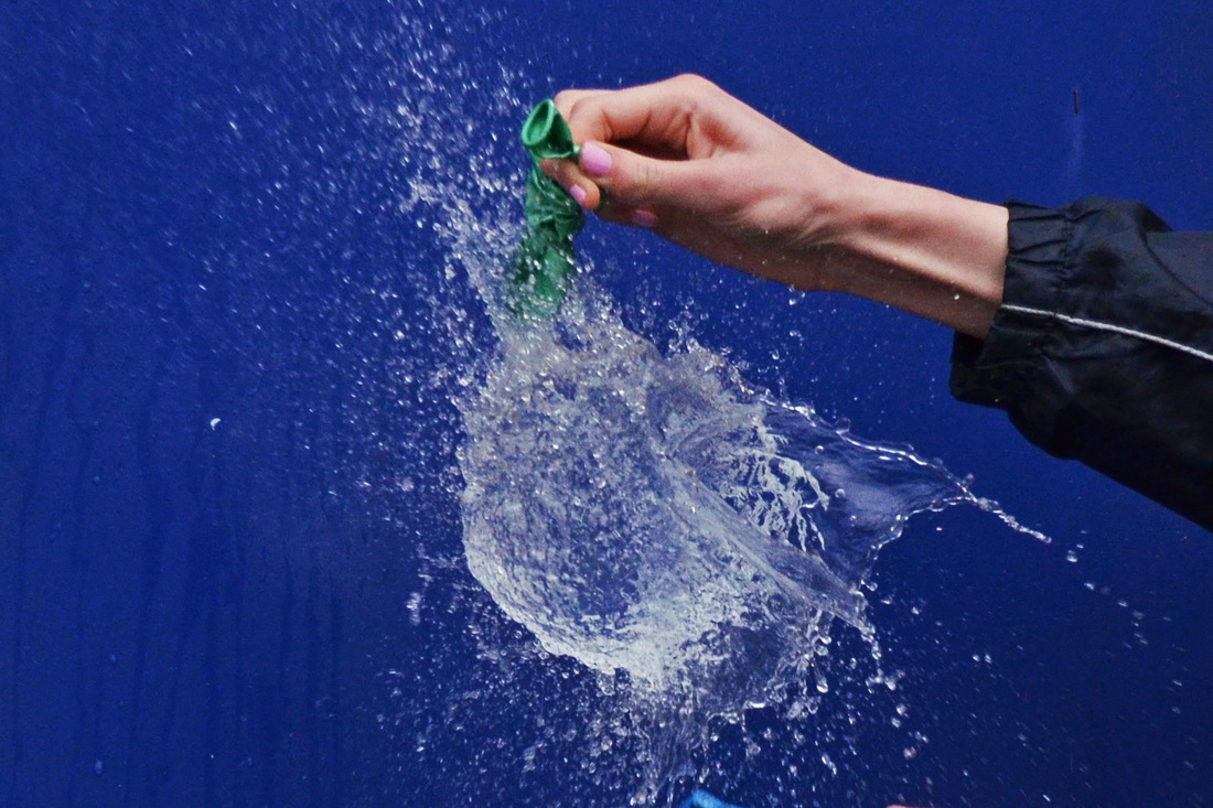
Harold Edgerton born in April 1903. His work was largely associated with stroboscope, in which he was credited from turning it into a common device. He was also strongly involved deep sea and sonar photography. Below is three images from his line of work. These pieces express his exact attention to detail in capturing the photograph in the exact, perfect moment to create an effective result.
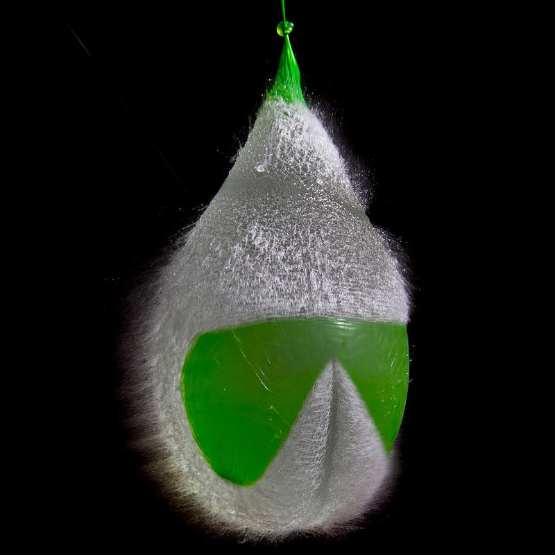
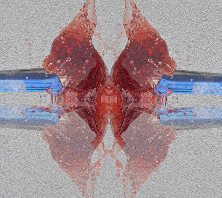
I chose all three of these images for there strong representation of popping water balloons. The huge rush of water once the balloon is popped creates an effective response revealing new shapes and interesting textures. I like the use of the dyed water against the background making it majorly stand out. I also thought the textures created in the balloon skin was really interesting and is something I will try to capture in my response. I have a strong interesting in this style of photography and I believe it beholds a disorderly approach, particularly as it results in a physical explosion of water. For my responses, I will use the knowlege and style of Harold Edgerton to attempt to result in a similar effective result.
FIRST RESPONSE:
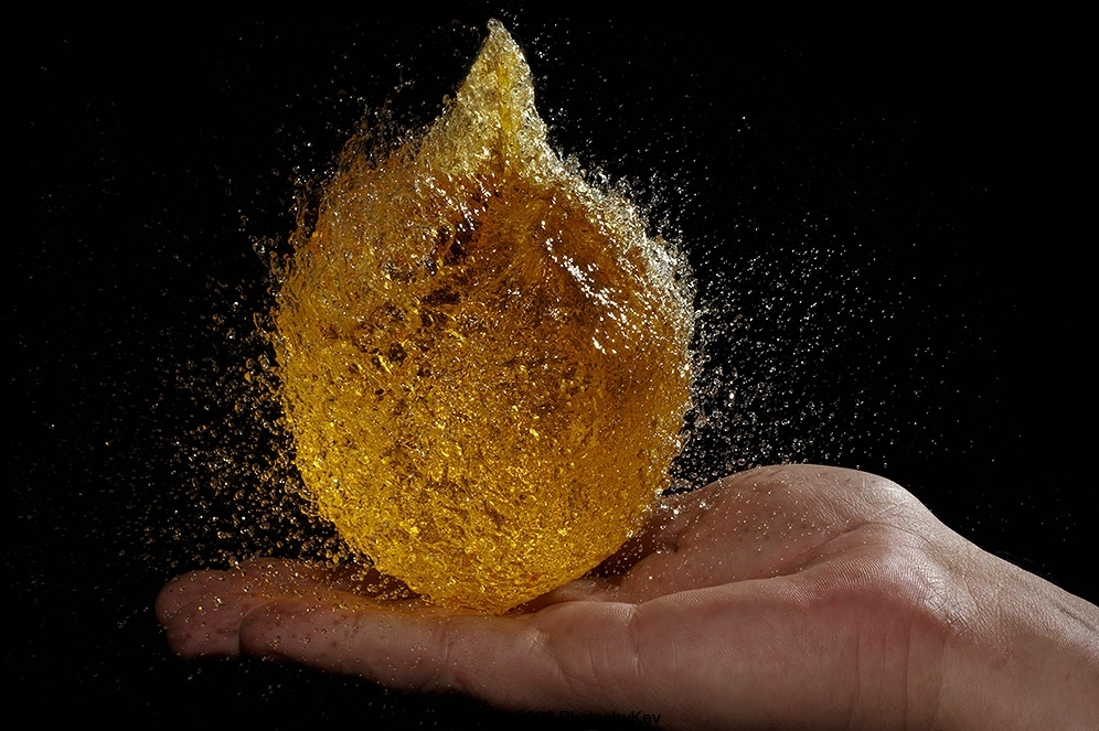
For this section I will be using balloons filled with water and attempt to capture the water as it explodes and releases the water contained in the balloon. The image will present an exploding effect. I will be using a high shutter speed and a tripod in order to capture an accurate, clear response. Below and above are good examples of what I am trying to achieve in this tangent of work.
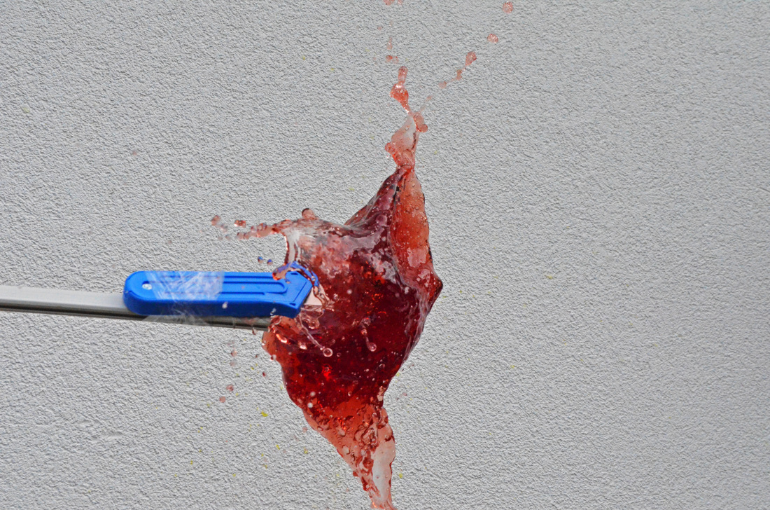
For my first response, I decided to go for a basic brick background so the coloured balloon would stand out. I used a high shutter speed of 1/500 in order to capture the bursting action of the balloon.
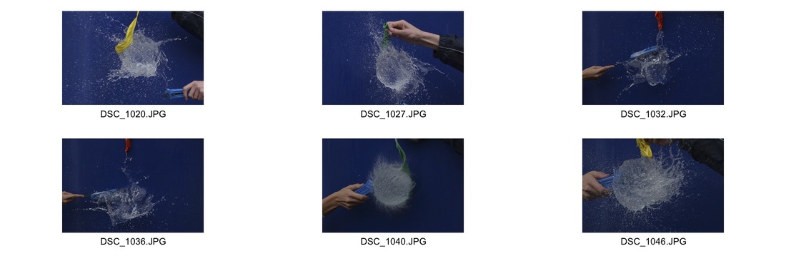
From these slow motion videos, I took various screenshots to have a more effective representation of the water balloons bursting. Below are the best screenshots from all three videos.
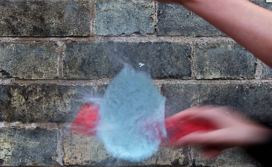
Improvements- If i was to do a further response, I would attempt to get a better final selection of images. I would do this by trying to capture the point at which the connection between the sharp object and the balloon collide. This could be shown from a screenshot from a slow motion video or using an even faster shutter speed. Also, when doing my next response I will chose a background that creates a more effective response and focus on the balloon.
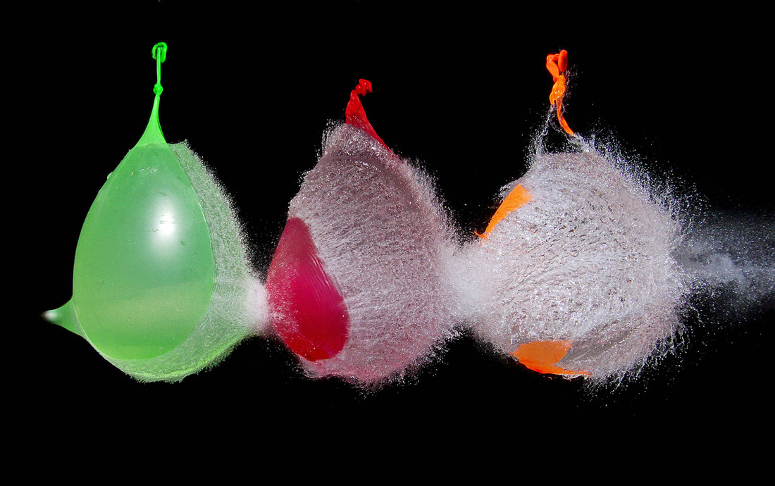
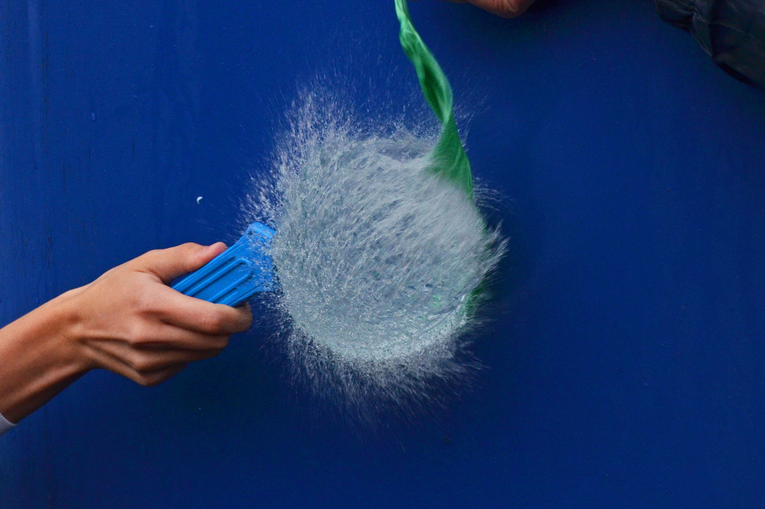
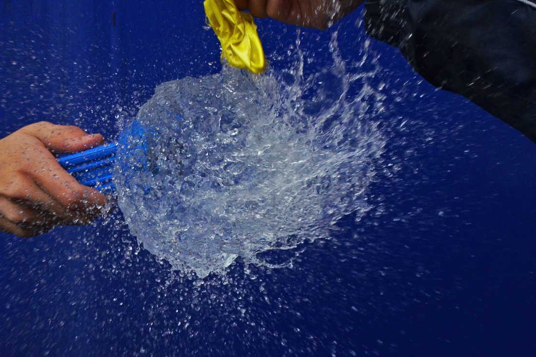
SECOND RESPONSE:
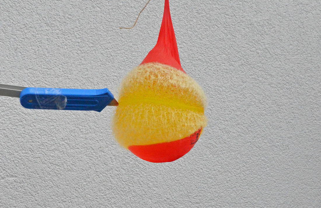
For this further response, I began looking at my first response and the imperfections. So when recapturing my images, I searched for a better background, and decided on this bright blue one as i thought you could view the explosion of the water in a a clearer and more dramatic form.
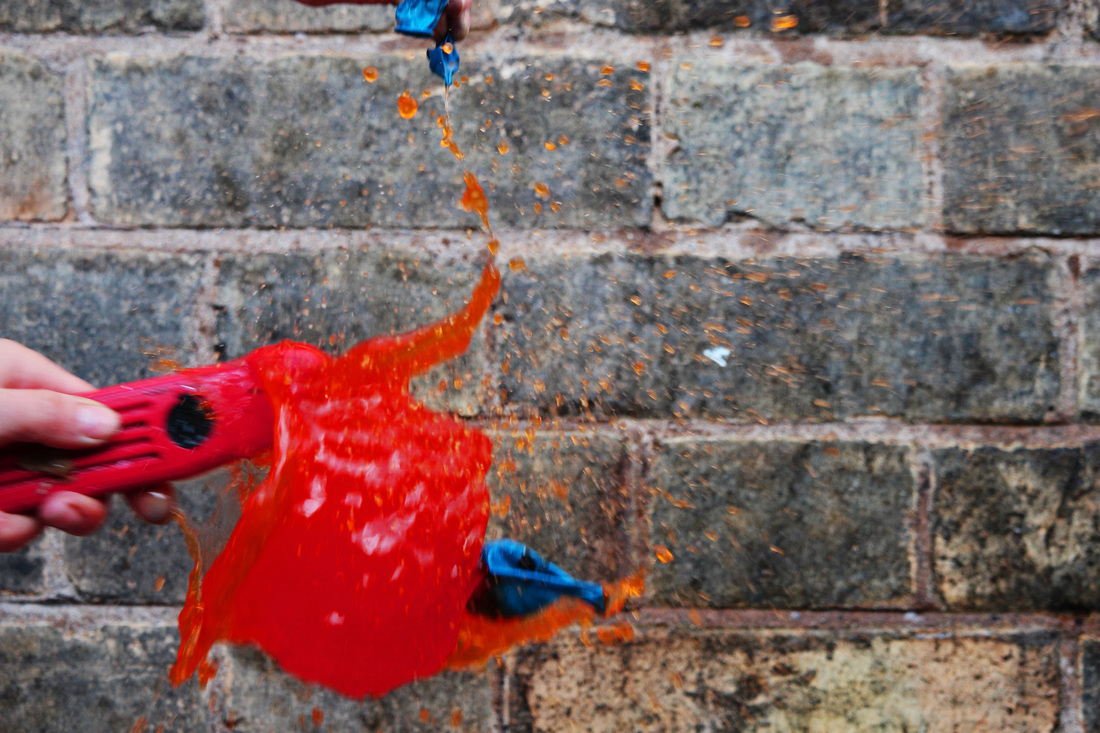
THIRD RESPONSE:
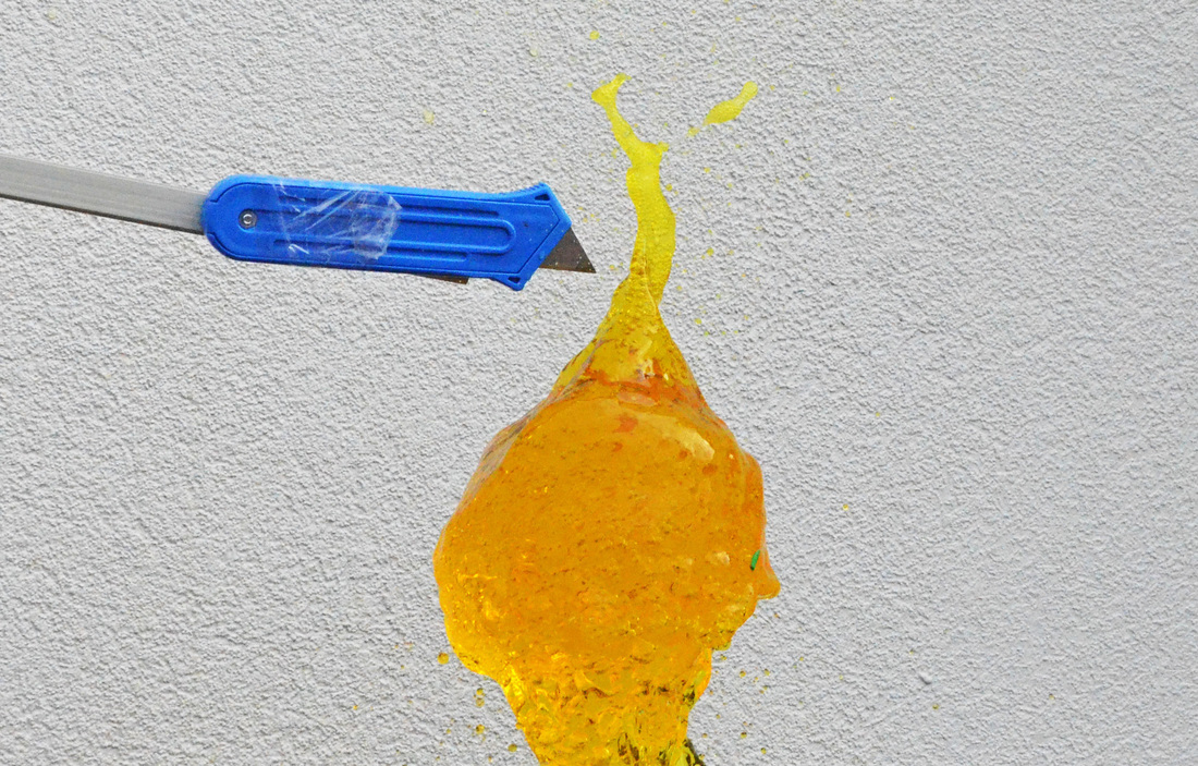
For my third response, I purchased coloured balloons and filled them with various coloured dyes. I then positioned my tripod in a suitable position to enable an accurate close up photograph. Below is my response and my outcome from photoshop with inspiration form the symmetry section.
BEFORE:
AFTER:
STRAND DEVELOPMENT:
PEOPLE
STRAND ONE:
PORTRAIT TRANSFORMATION:
For this strand, i will use photoshop to manipulate portraits of people in different styles and situations.
STRAND TWO:
THE CITY:
For this strand , I will look at the order and disorder within cities. I will also manipulate the photos to create order and disorder.
STRAND THREE:
FLAWS:
This strand is all about bodies. I will look at different shapes and sizes and different flaws/imperfections that people believe they have.
STRAND ONE:
PORTRAIT TRANSFORMATION
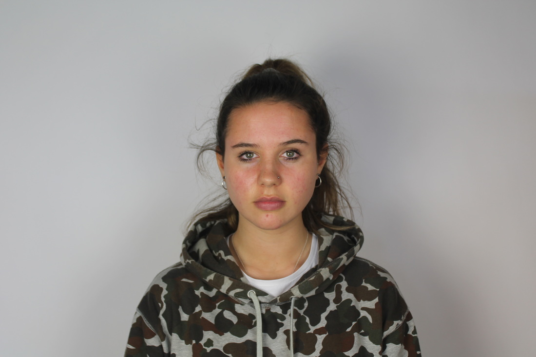
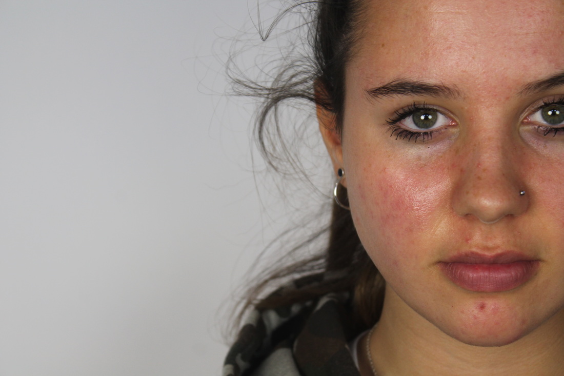
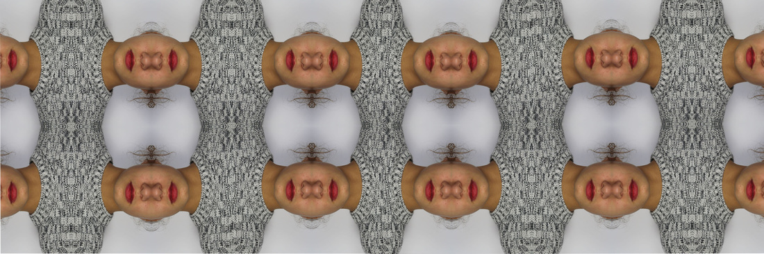
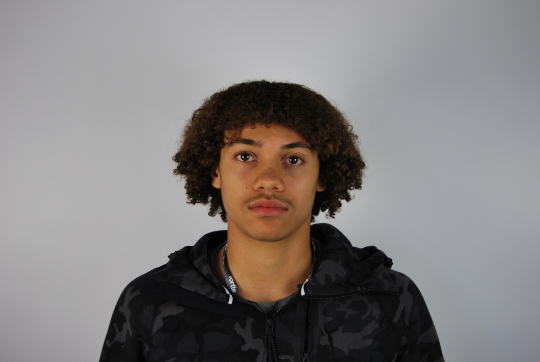
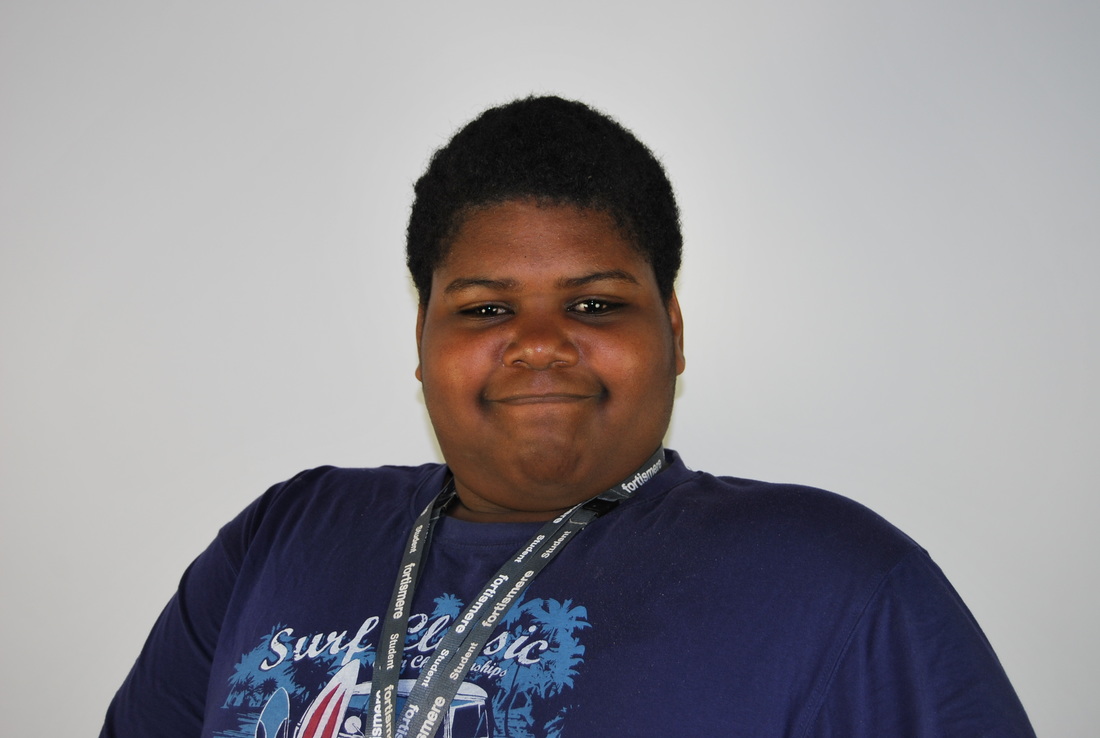
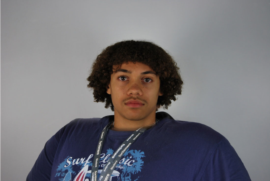
For this strand, I will use the skills and understanding that i have developed from the symmetrical order and intertwine it into my response, using people. I decided to use the same background throughout to maintain a flow throughout this response and so you can compare all the responses using the different people. Also, using the same plain background enables your focus to be maintained on the person therefore nothing distracting them.
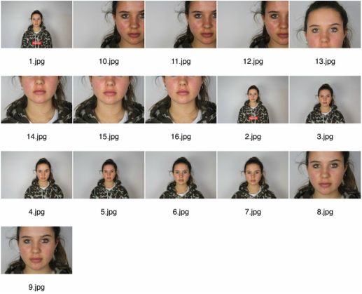
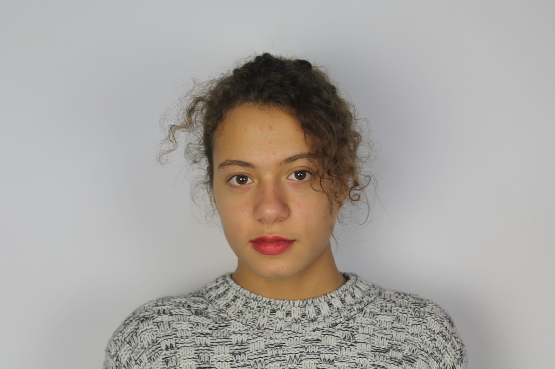
FIRST RESPONSE:
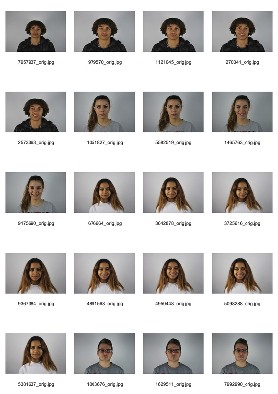
Below are my two contact sheets of the two girls i chose to use for this response and then my photoshop work done on the photographs.
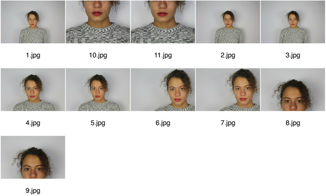
|
|
BEFORE:
AFTER:
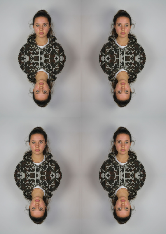
SECOND RESPONSE:
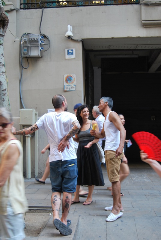
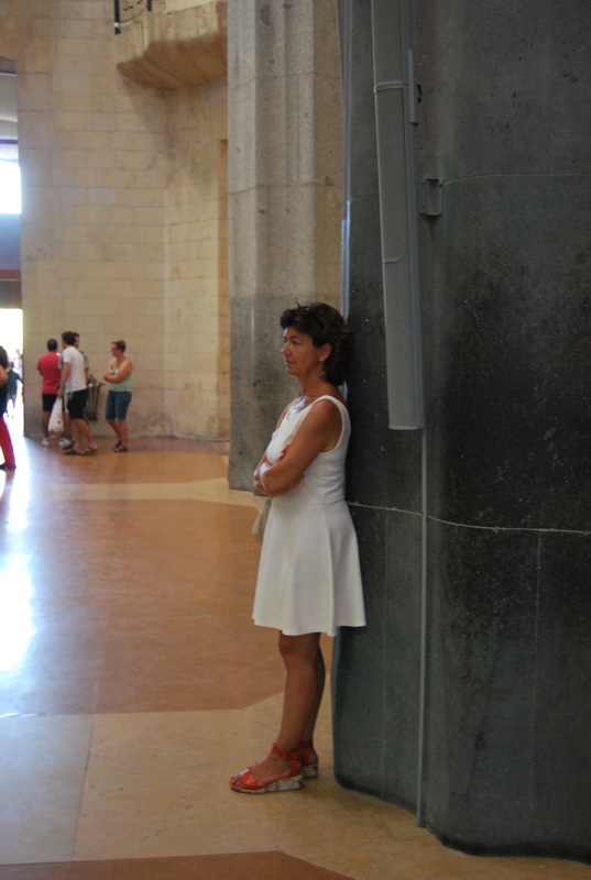
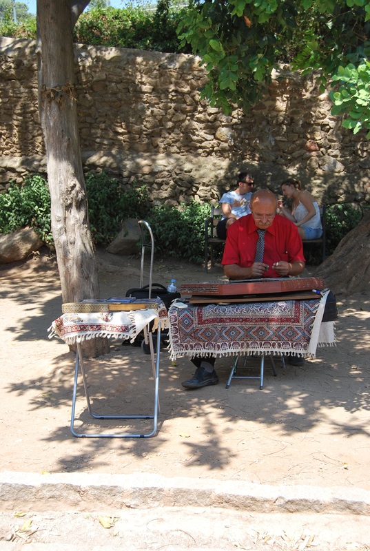
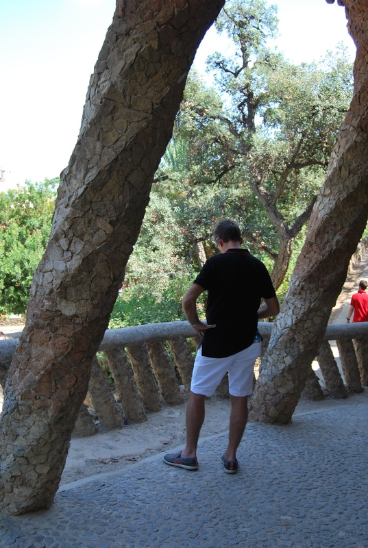
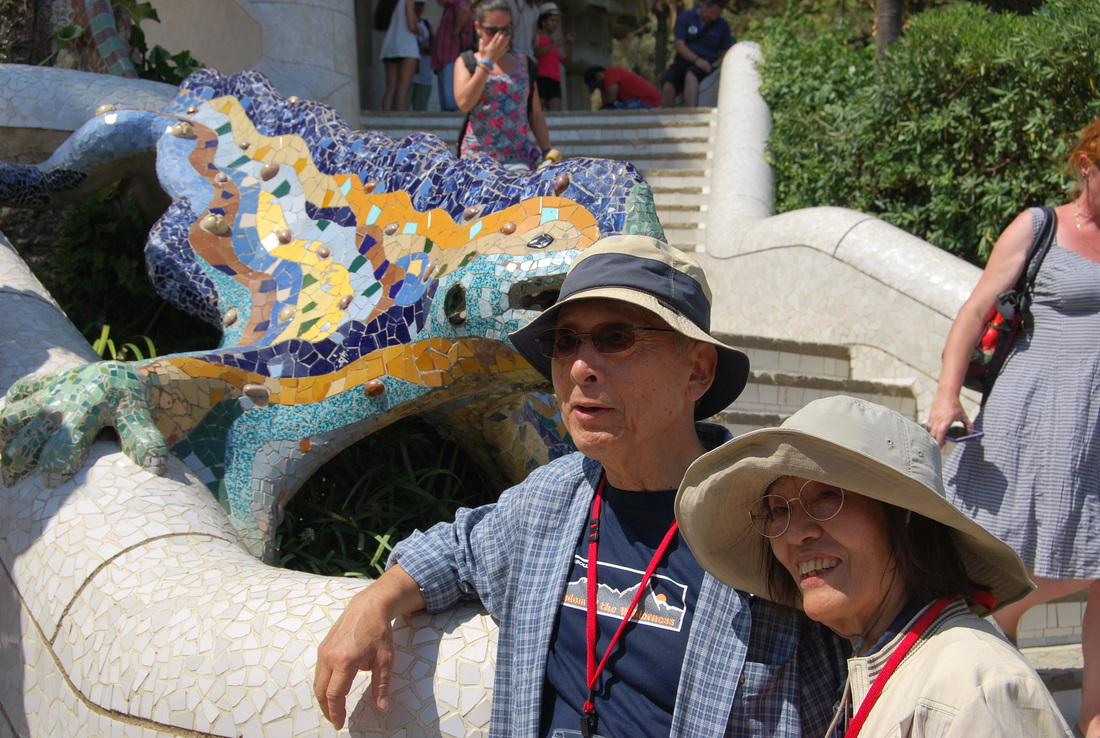
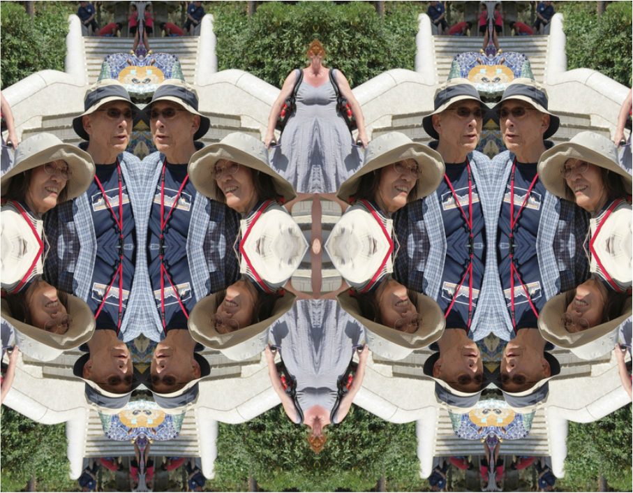
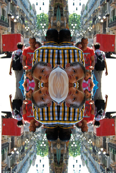
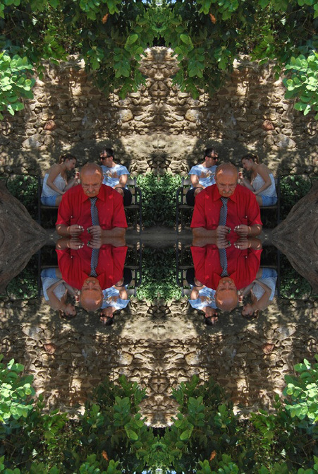
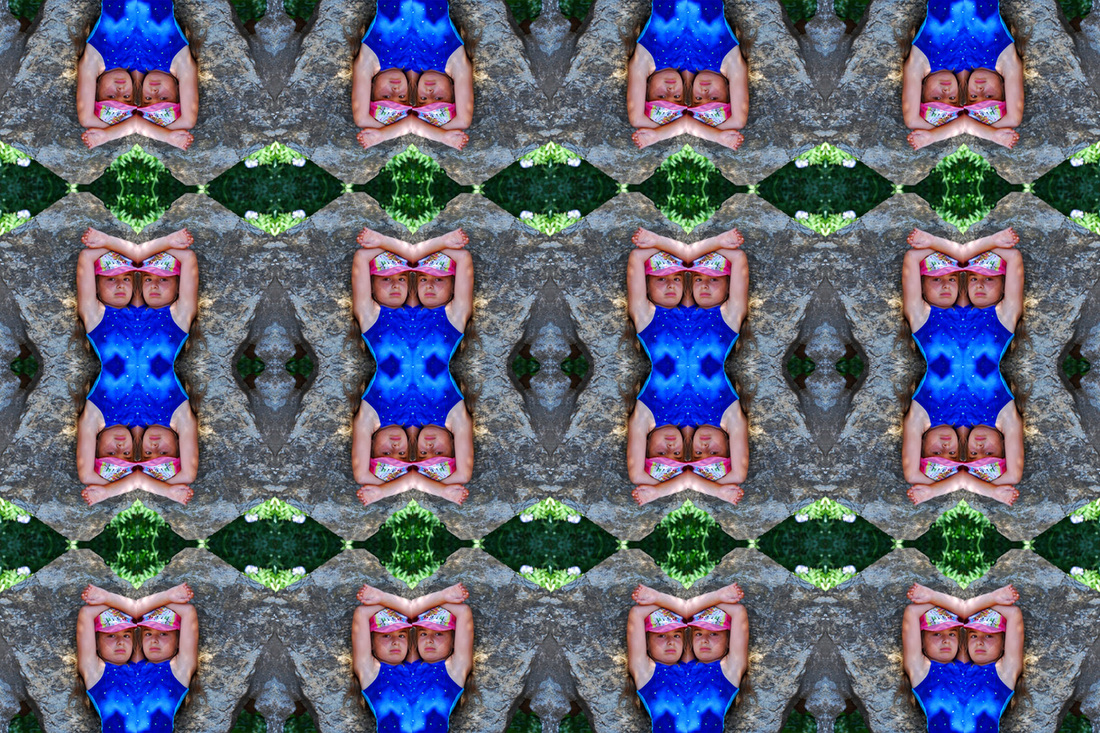
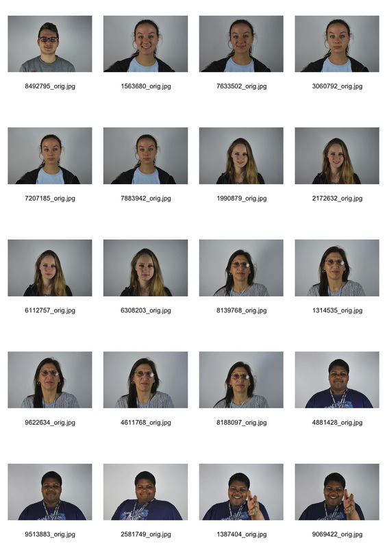
I decided to include street photography as a response as you can see how different people react in their comfortable environment. I took my images in Barcelona for variety in environment thus creating an altogether different response. It is also an interesting concept to use a different country as you can view if the behaviour is different and why due to possible cultural, language and climate differences.
BEFORE
AFTER
|
|
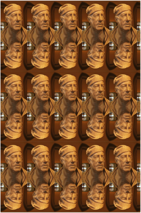
GORDAN MAGNIN
Gordan Magnin is a Los Angeles based artist who's line of work is a product which combines the ideas of portraits and shape. He often works with found images to turn high fashion magazine layouts into bizarre portraits.
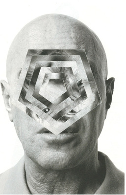

Left- I chose to include this image as it caught my eye. Magnin has decided to leave most of the image, the silohette of his face, ears and half of his lips, and focused on adapting his main features; eyes, nose, some of his lips. I really like this as the distortion of his features completely transform the picture, making him seem almost alien-like. Although the image has been partly manipulated, you can still recognise familiar subjects such as his eye in the corner of one outline of the pentagon shape which I think is very clever as when using this style of photography and editing it is hard to create an interesting, effective image without completely changing the features and most things recognisable about the human face.
Centre- This is my favorite of the three image. Partly due to her pose and her style, which is shown especially in her now, distorted face. Her hand clasped around her face suggests that before the manipulation she was holding her large sunglasses which acts as a unique focus/statement for the whole image which now, with the edit adds an interesting effect because they are round which works well with the shape used to create this bizarre portrait. I also like this image as Magnin manipulate a fashion model with gives the impress of false beauty and how currently in society peoples appearance is commonly deceived by new modern technology; makeup and plastic sugary ect, and I think this is particularly suggested here.
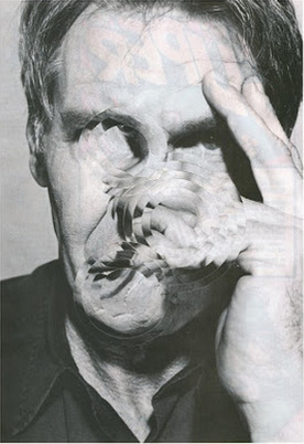
Right- I chose this image as something to respond as it was a much simpler manipulation than the others, due to the fact it is a easier shape, since its a circle, which made the whole image still recognizable but the man look a little distorted. By having his hand resting against his face with his fingers spread across his face show that he has uncertainty about something and that possibly he could be hidding something. However, the fact that his
Centre- This is my favorite of the three image. Partly due to her pose and her style, which is shown especially in her now, distorted face. Her hand clasped around her face suggests that before the manipulation she was holding her large sunglasses which acts as a unique focus/statement for the whole image which now, with the edit adds an interesting effect because they are round which works well with the shape used to create this bizarre portrait. I also like this image as Magnin manipulate a fashion model with gives the impress of false beauty and how currently in society peoples appearance is commonly deceived by new modern technology; makeup and plastic sugary ect, and I think this is particularly suggested here.
Right- I chose this image as something to respond as it was a much simpler manipulation than the others, due to the fact it is a easier shape, since its a circle, which made the whole image still recognizable but the man look a little distorted. By having his hand resting against his face with his fingers spread across his face show that he has uncertainty about something and that possibly he could be hidding something. However, the fact that his
MY RESPONSE:

SELECTED EDITS:
For the selected images, I took the image and selected the most prominent part of the person and made it the background to create a unique, unusual outcome.


VISUAL MINDMAP:
I created this visual mind map here as I believe my first strand was beginning to get rather complicated. So below I have described the different developments and expansions I did and how it will lead me on to a further and final response to this strand.
|
I began by creating transforming portraits I took of other students in my class on photoshop to create a strange and unique outcome.
|

|
I then expanded this by using images I had captured in Barcelona to recreate the portrait transformation to get a more vivid effective outcome.
|

|
|

|

|
I then chose a select few images and on photoshop made the background the most prominent aspect of the person. Then I responded to Gordan Magnin in the same style.
|

|
|
Development 2: For this development I looked at Gordan Magnin and then responded by first taking images of people around London to create variety in my response.
|
|
From the developments above, I will look at another artist who involves manipulation and portraits and then respond to that.

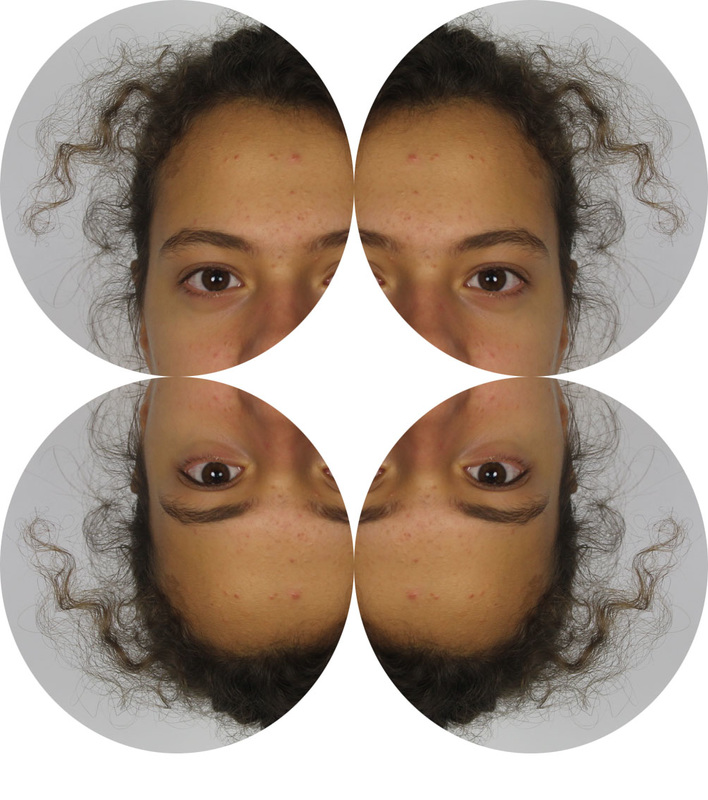
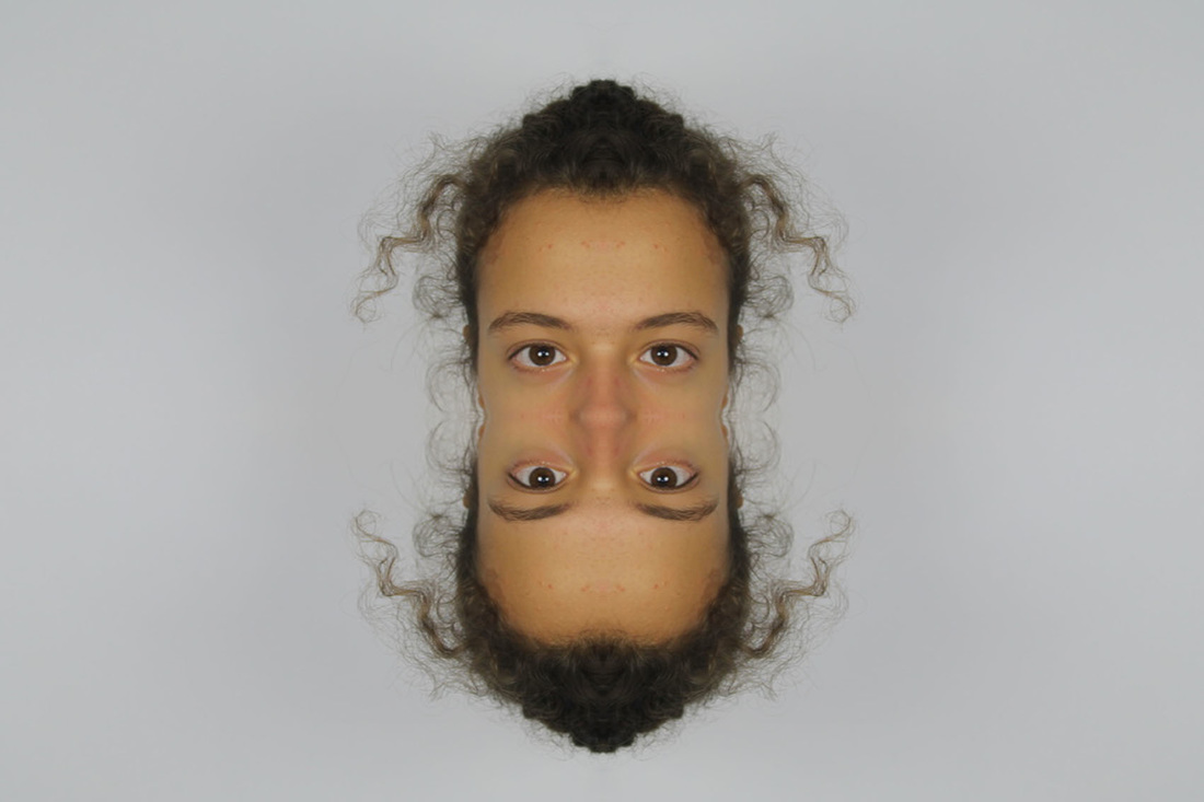
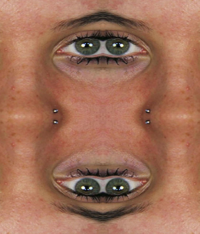
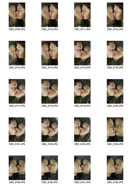
ULRIC COLLETTE GENETIC PORTRAIT
Uric Collette is a Canadian photographer but based in Quebec as a graphic designer and photographer. I am focusing on his Genetic Portrait series, in which he is exploring the genetic similarities between different members of the same family (fathers and sons, mothers and daugthers, brothers, sisters, etc). I will try to imitate his style with different people, some similar and some completely opposite to add the element of order and disorder.
|
|
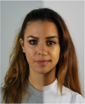
Left For this image, I decided to include it as I immediately thought it related to the order element of this topic. These two females, although have different features, when put together appear to be very similar, which is something i particularly liked. You can clearly see, despite the same differences that these two women are related. I really liked that you can view the affects of ageing on this person, and almost acts as a projection into the future. This is something i will attempt to include in my response.
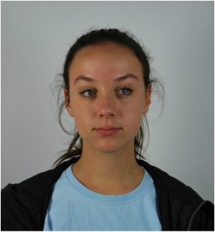
Right- However, in contrast to the photography on the right, this image is more disorderly as the two males are extremely different and you can strongly view their comparisons when put next to each other. They are firstly different due to their ages, and eye colour,hair colour,hair style, facial hair and skin condition. This then strongly hints at human conditions and whether their living conditions and upbringings have affected their aesthetics today, which is something i found very interesting. I will try to incorporate this into my work.
Right- However, in contrast to the photography on the right, this image is more disorderly as the two males are extremely different and you can strongly view their comparisons when put next to each other. They are firstly different due to their ages, and eye colour,hair colour,hair style, facial hair and skin condition. This then strongly hints at human conditions and whether their living conditions and upbringings have affected their aesthetics today, which is something i found very interesting. I will try to incorporate this into my work.
MY RESPONSE:
|
|
ORDER
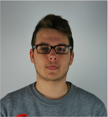
For this response, I took pictures of two people with generic similarities; skin tones, eye colours and hair colour and then merging them together so you can then view the comparison and similarity between each face. I liked the result, as you can clearly see although separately these two females look different, when put together they seem to be rather similar. I could improve this image but making sure the background is the same colour so that the final outcome is more effective.
|
BEFORE
|
AFTER
|
|
|
|
DISORDER
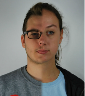
In this response, I took two people, who i thought were polar opposites and combined them together like Uric Collette's generic portrait photography. For the first person, i chose a male, with glasses, a beard and piercing and for the second, a female with a contrasting look.
|
BEFORE
|
AFTER
|
|
|
|
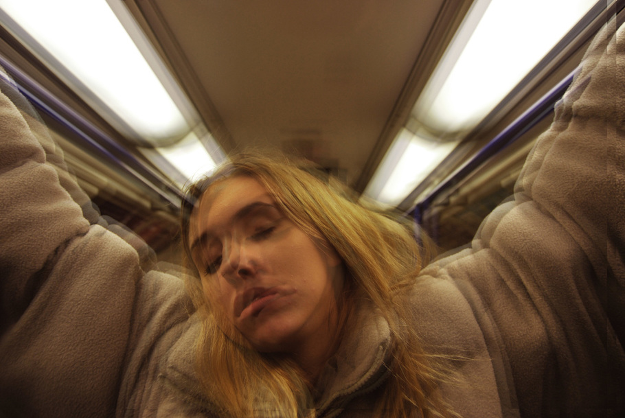
SECOND RESPONSE : DISORDERLY FEATURES
I have decided to response in a unique form by taking the pictures i used from the previous response and rather than neatly showing the difference in people, with their features and such being compared to one anothers. But by completely merging different features of people.
BEFORE |
AFTER |
STRAND TWO:
THE CITY
STEPHANIE JUNG
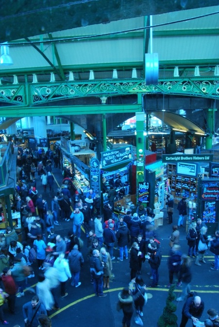
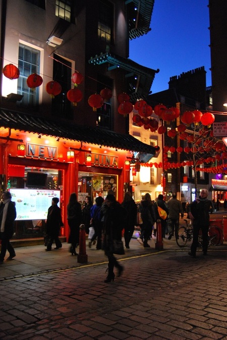
Stephanie Jung is a photographer who is based in Germany who's work focuses on fine art and portrait photography. She discovered her passion for experimental photography when she finished her studies in Visual Communications in 2010. Since then, she travels the world, especially to large populated cities, to capture vibrant and busy scenes of cities. She then edits her photographs in a particular way to enhance the hectic mood she aims to capture.
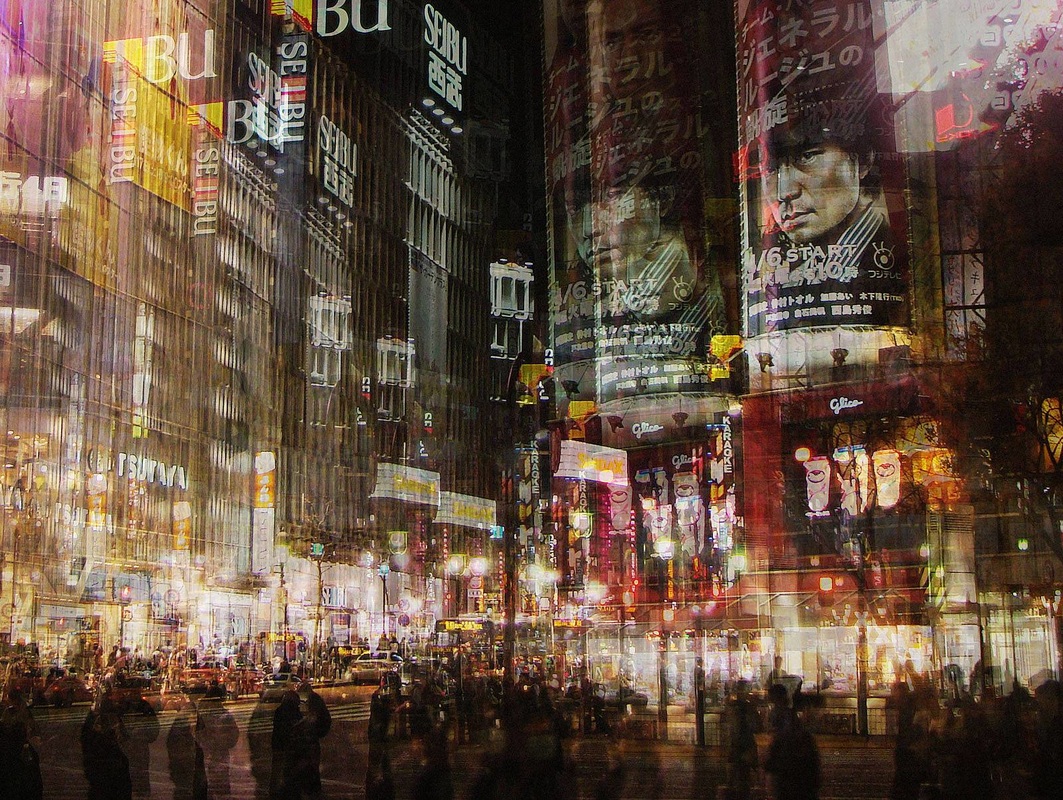

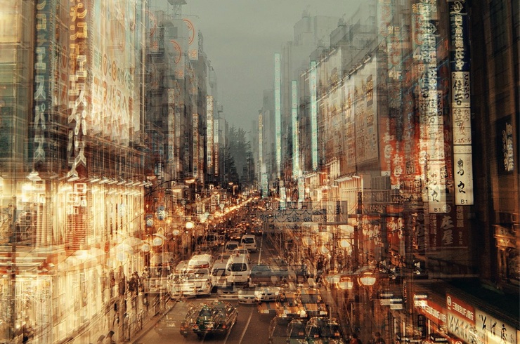
I believe all three of the images above are particularly effective. Stephanie's style of photographing a typical urban scenery combined with the added double exposure edit, portrays city disorder in a whole new unique form. From research I discovered that Stephanie Jung's inspiration for her pieces was not from the classic beauty of the landscape or the abstraction some buildings present but instead it was the repeating events of everyday normal life that presented as an interesting and compelling concept. "My biggest inspiration comes from life itself." This shows that her focus for capturing these images was portraying a scene of normality. I believe she is particularly effective in doing so, her photos show a mass disruption of cars, people and bright lights. Which is something all heavily populated cities include. But by adding this unique edit creates a whole new perspective and emphasis the hectic scene. This is something I will attempt to recreate in my work.
FIRST RESPONSE:
For my first response, I wanted to respond in black and white so that the focus was on the elements of the picture not the colours. I think by doing this created a unique outcome, something Stephanie Jung created when she first released her concept.
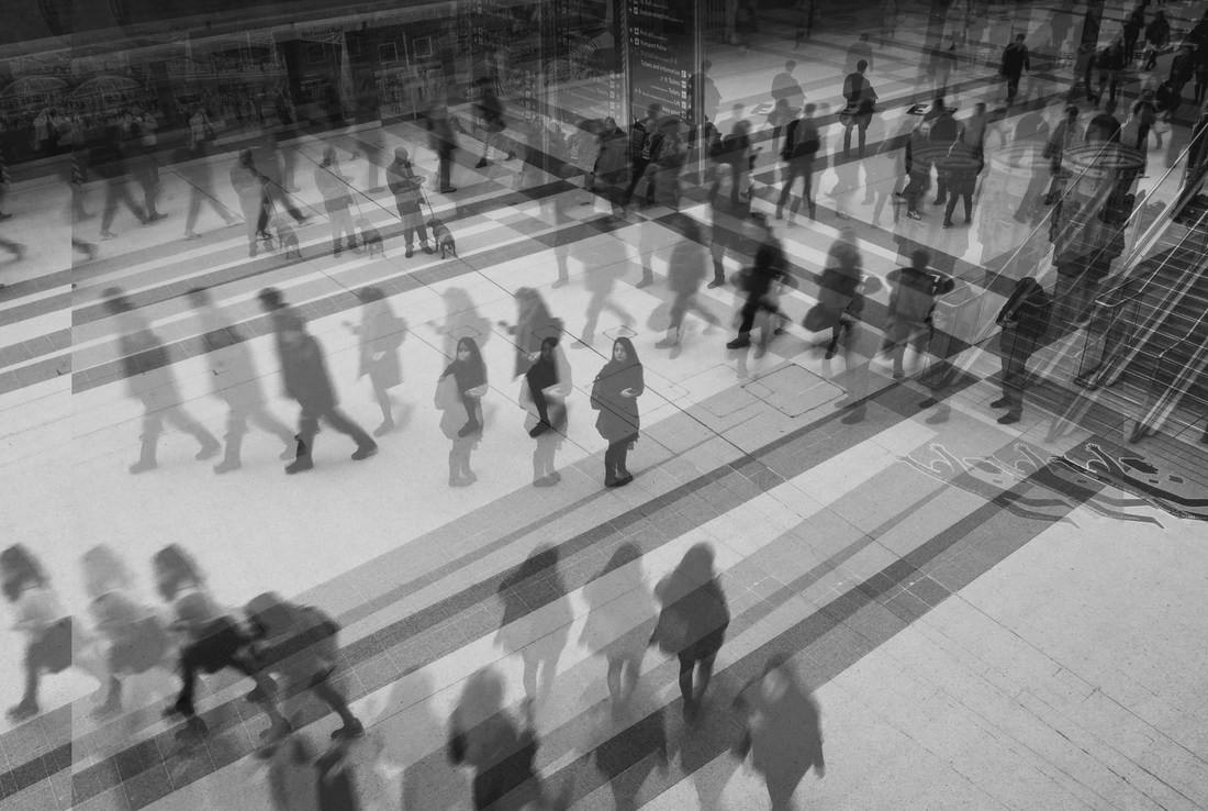
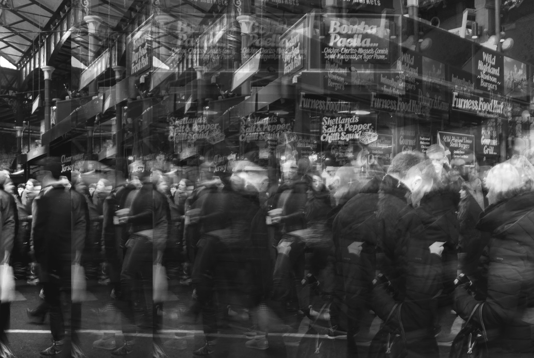
SECOND RESPONSE:
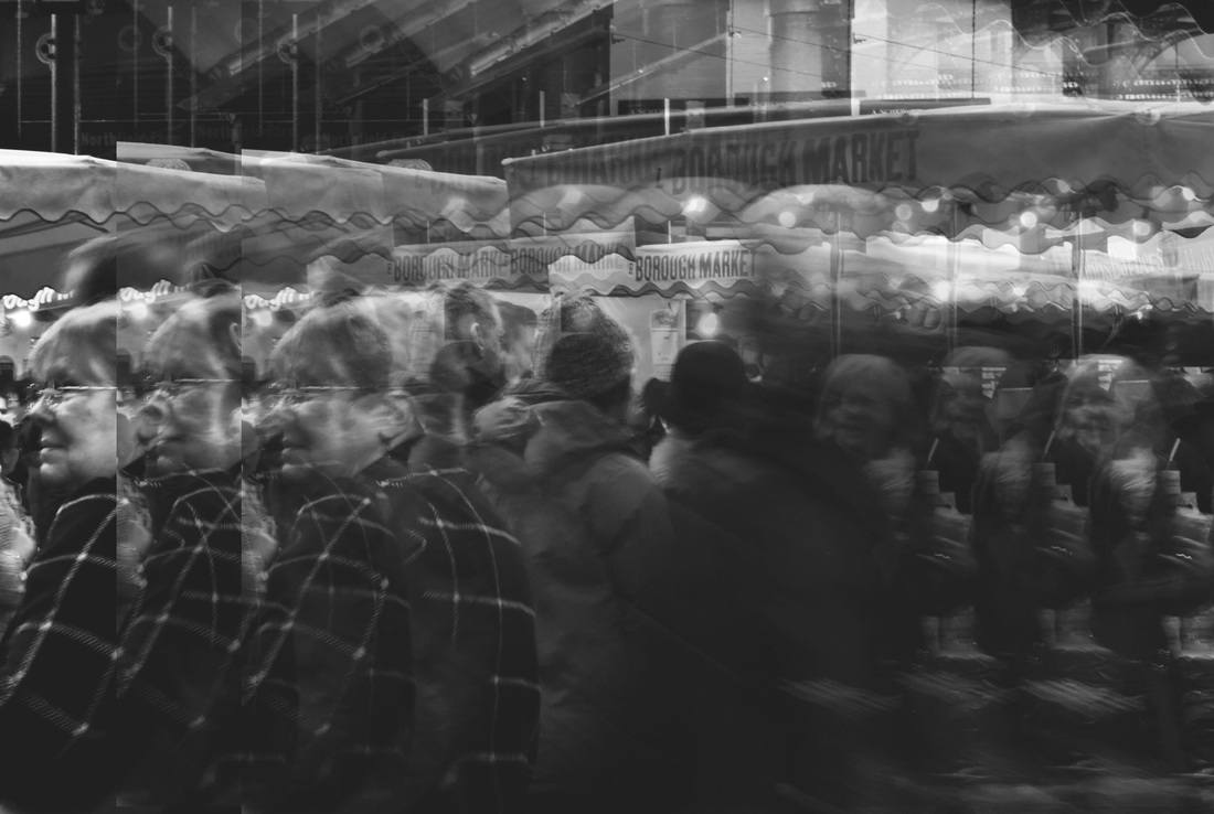
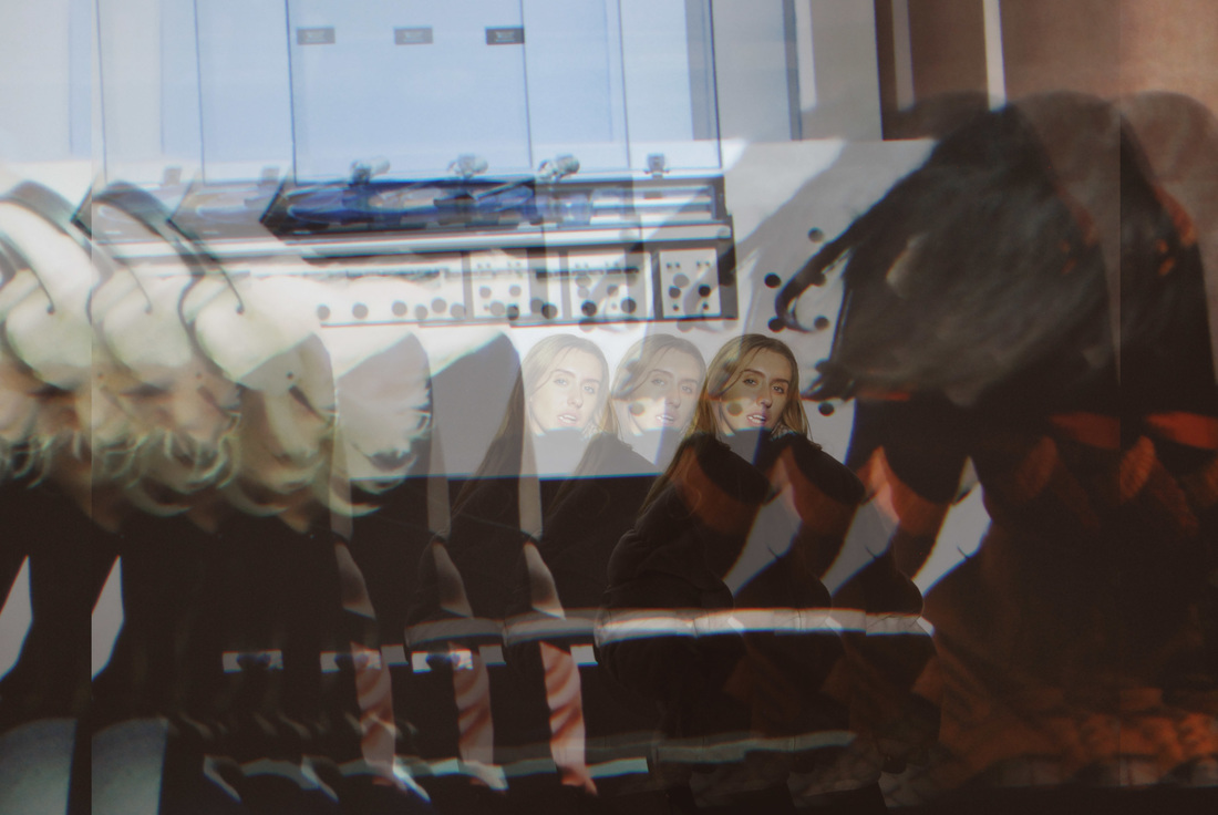
For this response, I tried to capture the images from a low perspective so that I could include the whole scenary of the image in attempt to imitate Stephanie Jung. I also enhanced the colours and created her double exposure edit on photoshop.
SELECTED IMAGES':
BEFORE:
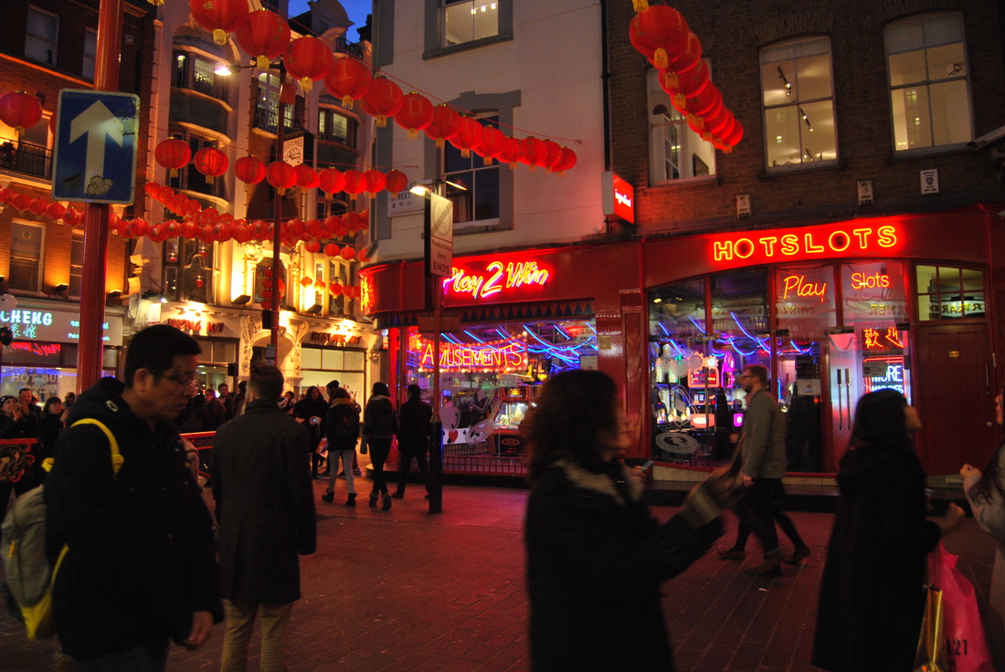
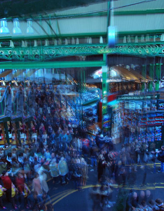
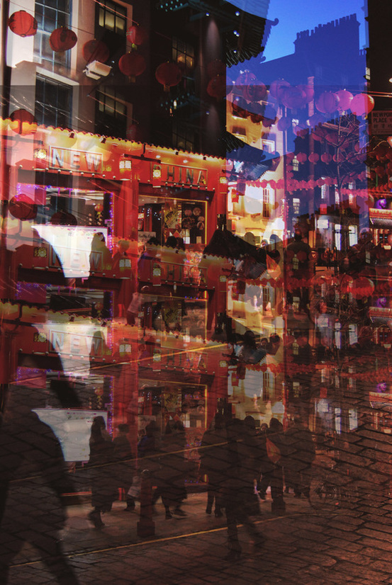
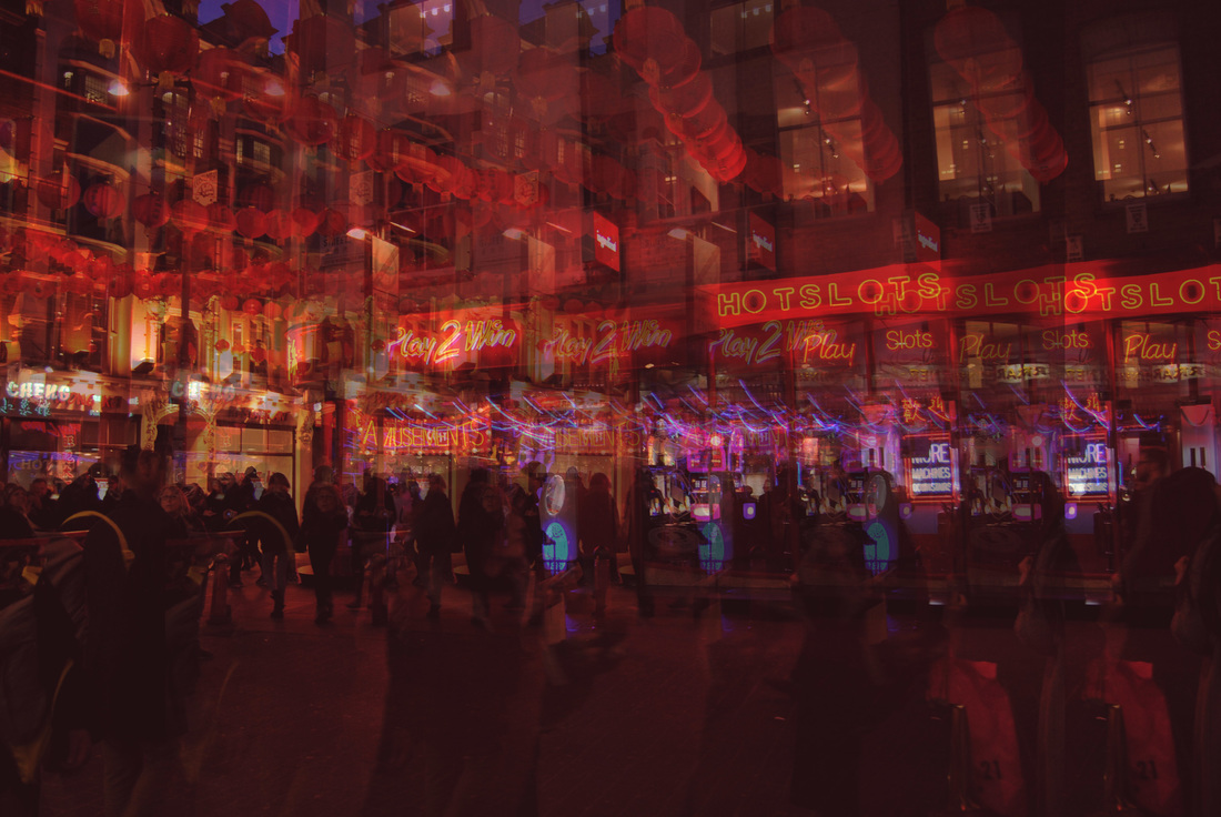
Before I responded properly to Stephanie Jung I had to get the right location in order to create an effective response. I chose popular places in London as I think the involvement of people would create an interesting outcome. So i visited china town at night and I also included a picture from Borough Market during a Saturday.
|
|
AFTER:
To imitate Stephanie Jung's style of editing I used photoshop. I then first adjusted the colours to create a bold, striking scenery, enhancing the normal aspect of everyday life, which is something she typically focuses on. Then, I created replicers of the layers and changed their opacity and then moved them so that the result was a image of mass confusion mirroring it's hectic environment.
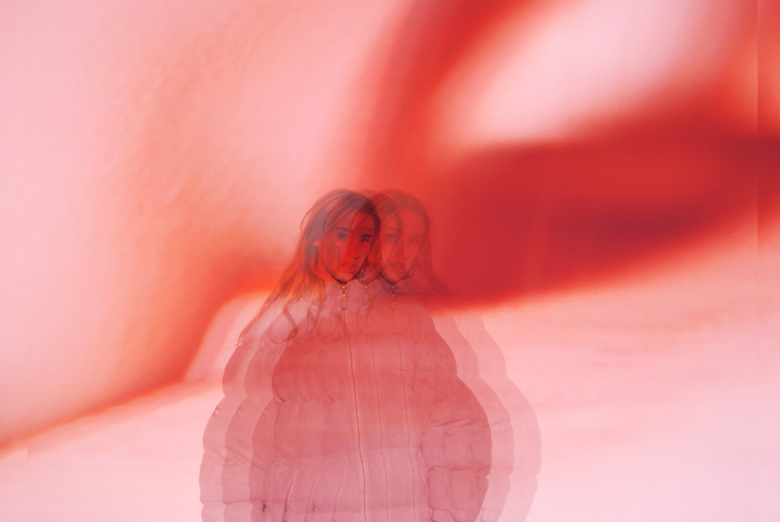
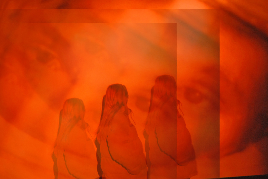
THIRD RESPONSE:
For this response, I wanted to maintain the style of Stephanie Jung's but present it in a different form. So i decided to capture this edit with humans and abstract backgrounds to keep the burst of colour. For this response, I went to a location at a remote time and captured these images of the model in front of a exhibition's video to create an interesting background.
SELECTED IMAGES:
STRAND THREE:
FLAWS
BODY POSITIVTY
Body positivity is all about tackling what society deems normal and perfect weight. It is an educational site highlighting that you are healthy at any size. The movement emphasises acceptability at any size, rather than focusing on weight loss. The website covers
fitness for fat people, size acceptance, recovery from eating and body image problems, information for health professionals, activism to end the cultural obsession with thinness and discrimination based on body size, and the arts celebrating the beauty of diverse body sizes. It is all focused on how people should stop wasting time on diets and trying to achieve what they view acceptable and concentrate on living the best life you can, now.
fitness for fat people, size acceptance, recovery from eating and body image problems, information for health professionals, activism to end the cultural obsession with thinness and discrimination based on body size, and the arts celebrating the beauty of diverse body sizes. It is all focused on how people should stop wasting time on diets and trying to achieve what they view acceptable and concentrate on living the best life you can, now.
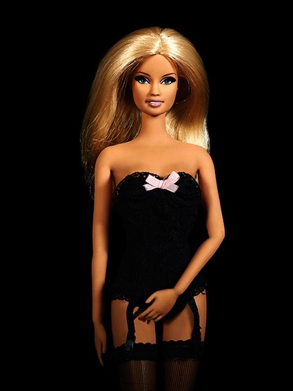
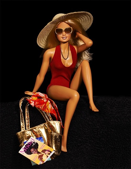
CECILE PLAISANCE
"The beginning started with a doll, an icone of fashion and beauty…The biggest names in fashion, Karl Lagerfeld, Yves Saint Laurent, Christian Louboutin, Christian Lacroix, Chantal Thomas and many others, paid tribute to her."
Cecile Plaisance is a photographer, who has focused capturing things she finds beautiful. Her work below is a project she worked on based around modern perceptions of idol of femininity and what society ultimately deems all women should look like.
Cecile Plaisance is a photographer, who has focused capturing things she finds beautiful. Her work below is a project she worked on based around modern perceptions of idol of femininity and what society ultimately deems all women should look like.
|
|
These two images above are very striking. The black background makes the two barbies immediately stand out. I think the clothing she has decided to put these barbies I'm is particularly interesting. The image on the left, shows a barbie in provocative underwear showing a clear example of how women are perceived by men and often objectified. By photographing this scene Cecile Plaisance is fighting for women to defend their rights, their desires and maintain their gained freedom. Again, the barbie on the right is barely dressed. She's seen wearing a bay watch like swimsuit. I think this artist stands for something very important. Not just for women's rights but she is also tackling common societal 'normality' of beauty, something that is unachievable for most women, an impossible goal.
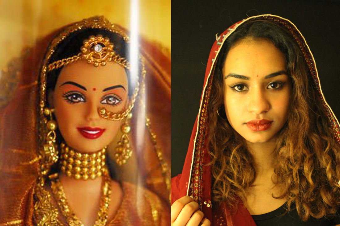
MY RESPONSE:
For my first response, I wanted to began this strand with how people perceive themselves. To do this I wanted to begin with the work of Cecile Plaisance as I think the message behind her photography is very important. Her feministic views have been applied to her work and almost promoted to the public, sending out an vital message. One which tells women to stop aiming to be like barbie, a figure that is unnatural and impossible to achieve, one that tells women they aren't beautiful because their body type or beauty doesn't fit into what society and the media deems beautiful. This is something that i believe is very problematic issue and is heavily associated with The Body Positivity campaign, telling everyone that their body is perfect in their own way. So to present this and imitate the work of Cecile Plaisance, I used a model and a barbie image I found online and attempted to recreate the barbie picture with the model. This then shows how society, particularly youth culture obsess over aiming to be something they are not.

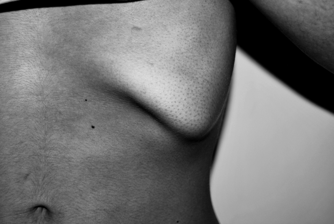
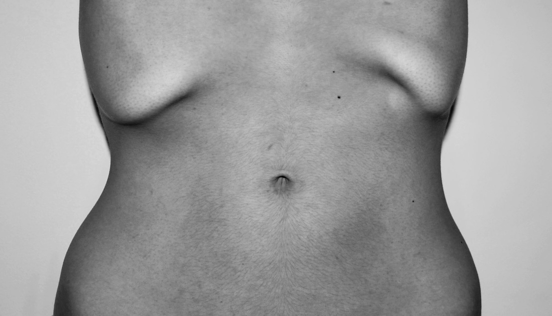
JENNY SAVILLE
Jenny Saville was born in Cambridge, England in 1970. Saville uses her art to fight ‘society’s idea of the perfect body’. She does this by enlarging and distorting her body. Saville work explores the reality of the female body, rather than what we see glamorized on TV and in magazines.
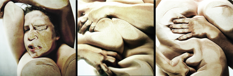
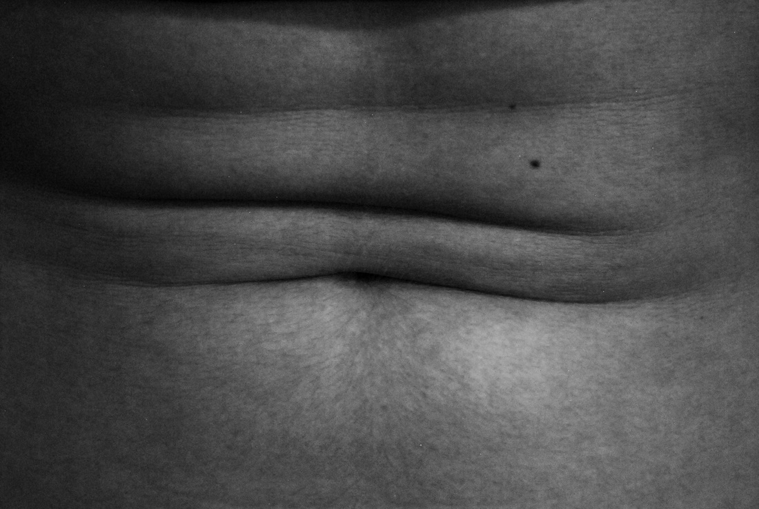
I chose this image as I thought this was a perfect representation of what Jenny Saville was trying to tackle. Above you can see how Jenny Saville is distorting her body by pushing her flesh in unique, unrecognisable angles and postions which enables the audience to question our own body image and beauty in comparison to what we know a body to be. Although, i particularly liked this line of work as i think it is so different and eye catching, it does create a sense of unease by the way she is tugging on her flesh. This almost reflects the pain people endure when they have plastic surgery done mentally and physically in order to achieve their ideal body.
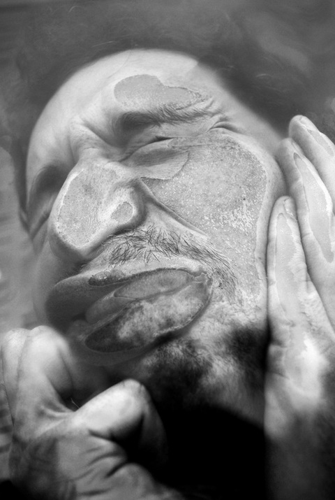
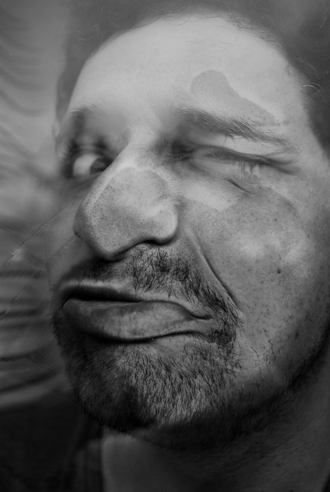
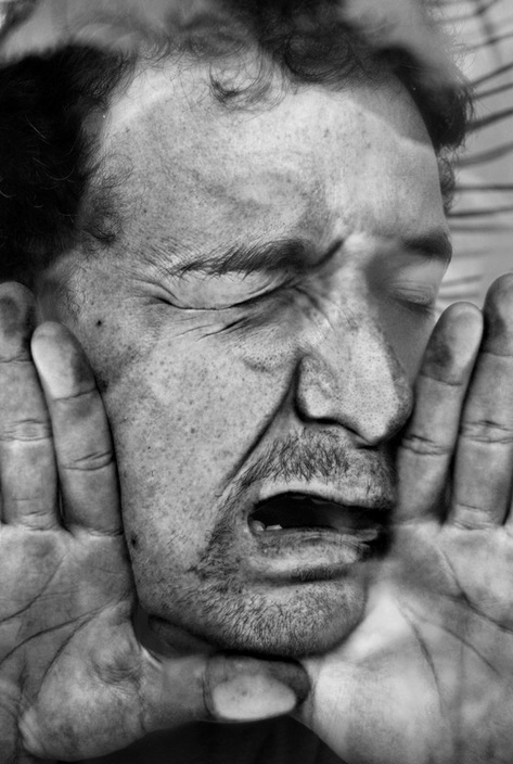
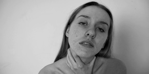
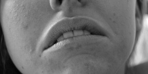
FIRST RESPONSE:
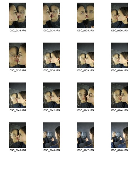
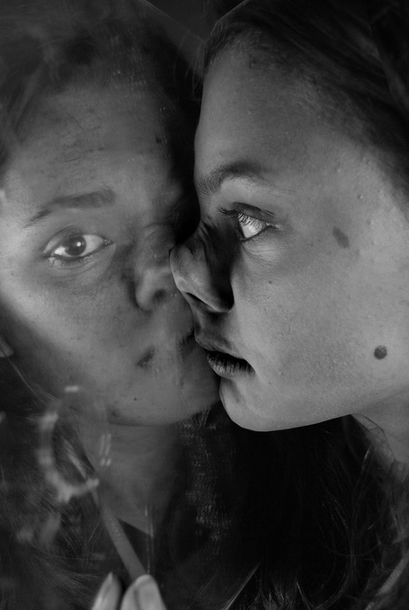
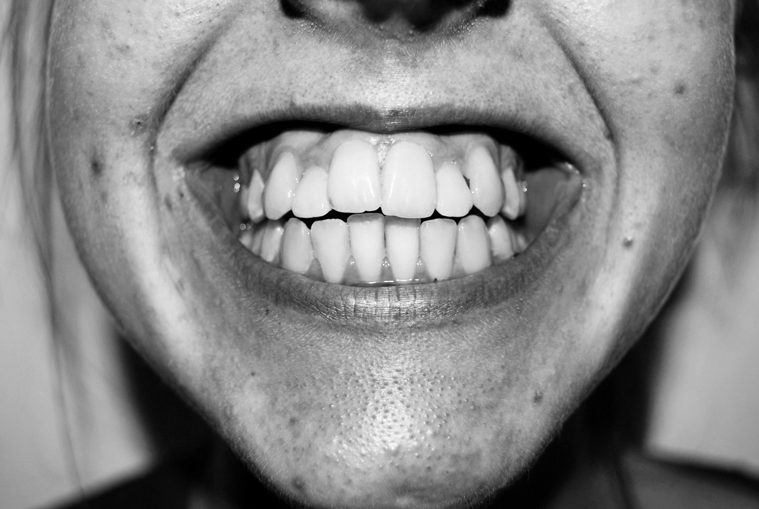
In response to his work I have created my own set of distorted faces. I did this by getting a model to press his faces against a window and photographed from the other side. When it came to editing, I edited my photos using photoshop in black and white. I think the contrast from the black and white highlights the imperfections. Below is my contact sheet and selected images.
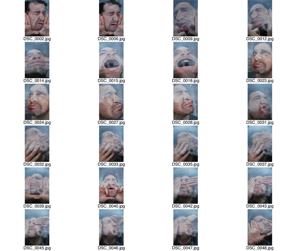
SELECTED IMAGES:
SECOND RESPONSE:
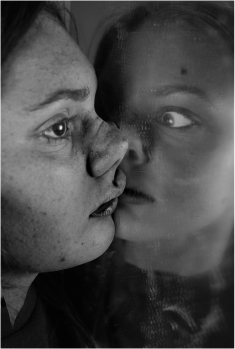
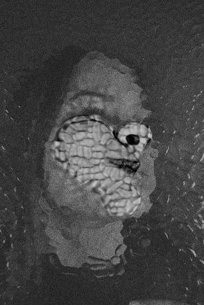
For this response, I further the response to Jenny Saville by used different glass textures and mirrors. I then on photoshop edited them in a specific way. For the mirror images I edited so their friend was in the reflection to them. I particularly liked the one on the left as I though it almost looked like her conscience telling her to pay attention but her real self wasn't listening. This almost reflects body image as it is often your mind telling that your not what society deems 'perfect.' The three images afterwards are taken with different textured glass. i got the models to again, press their faces against it. Then on photoshop I edited the pictures and blurred the background and had a particular area where I left it focused.
|
|
|
|
|

|
|
EXPANSION:
Here I decided to expand upon the squishing and manipulation of human bodies and apply the same principles but with everyday objects. Below is my outcome.
|
ORDER
|
DISORDER
|
ARTIST INFLUENCE:
JOHN COPLAN
John Coplan is an English photographer, painter, writer and curator. In 1984 Coplan began taking self portrait photographs of his body with which is when he established his universal respected reputation as an artist. He would take the images originally as 4x5 inch Polaroid photographs and then present them enlarged in back and white and grouped. These were depersonalised images of his body, created by cutting off the head, and acted as a suprising, intriguing object with great detail and malleability. His work also stands as a riposte to the cult of youth and beauty represented by commercial photography and what he saw as the vanities of the 1980s art world.
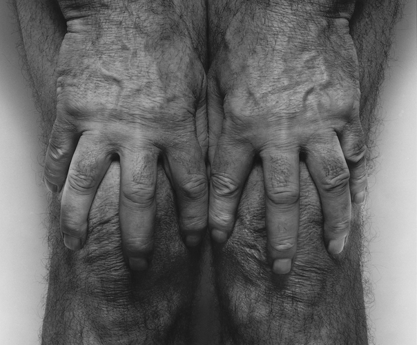
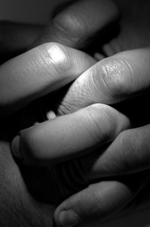
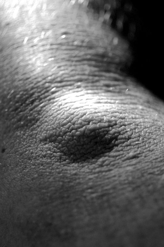
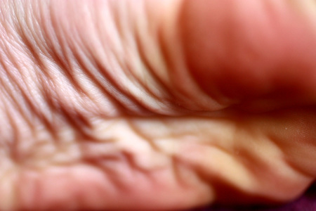
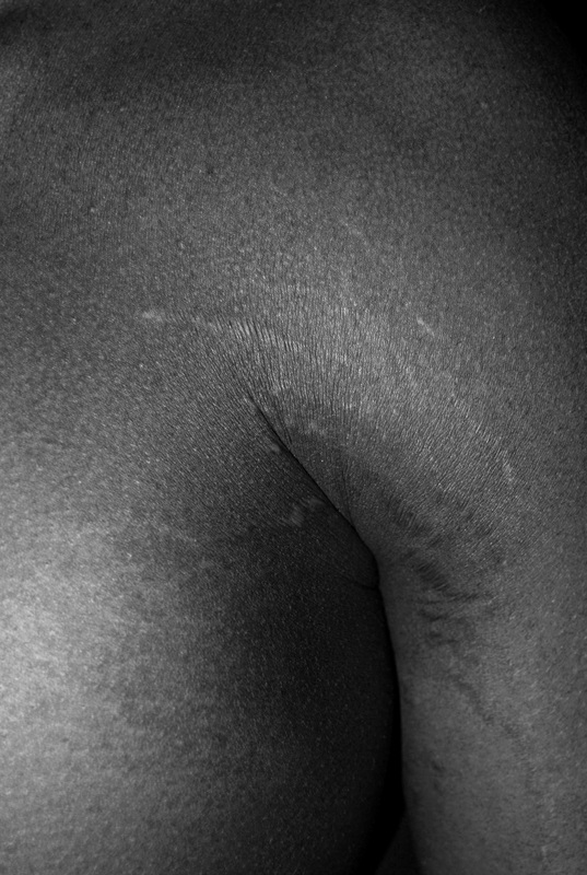
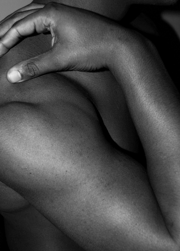
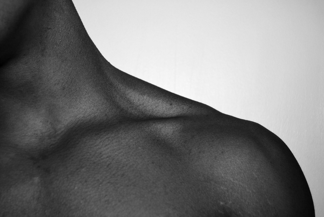
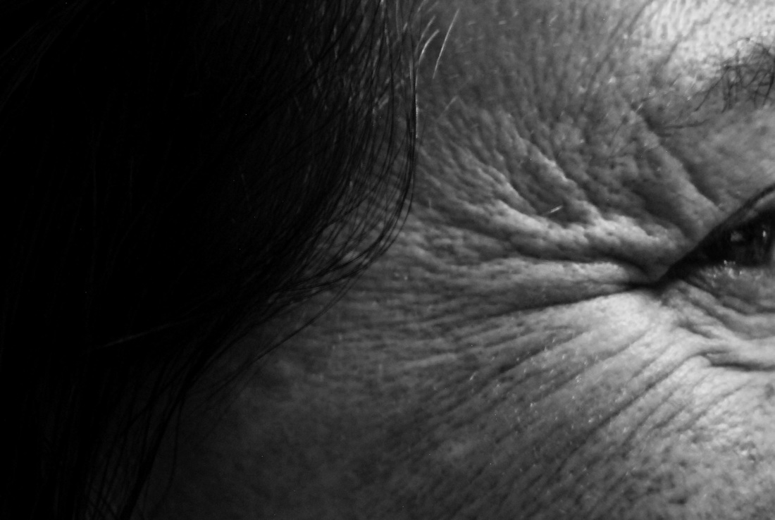
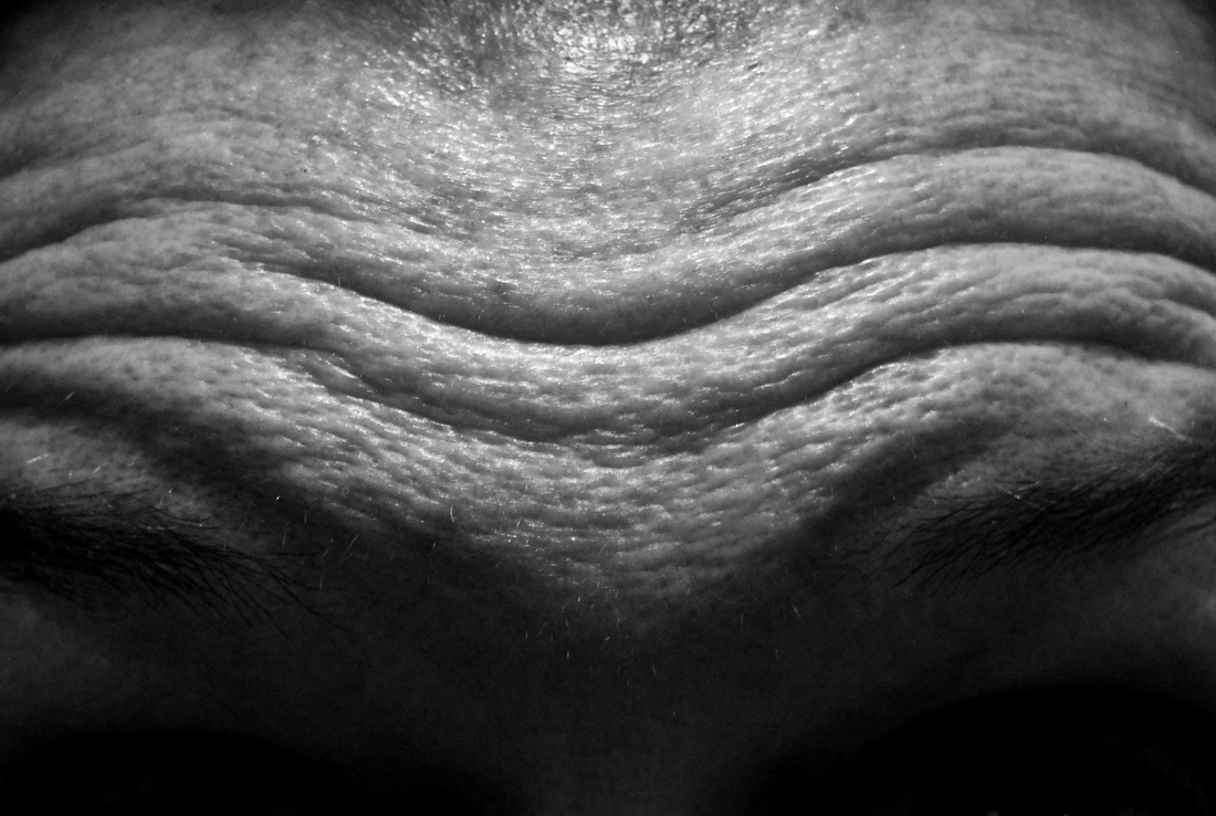
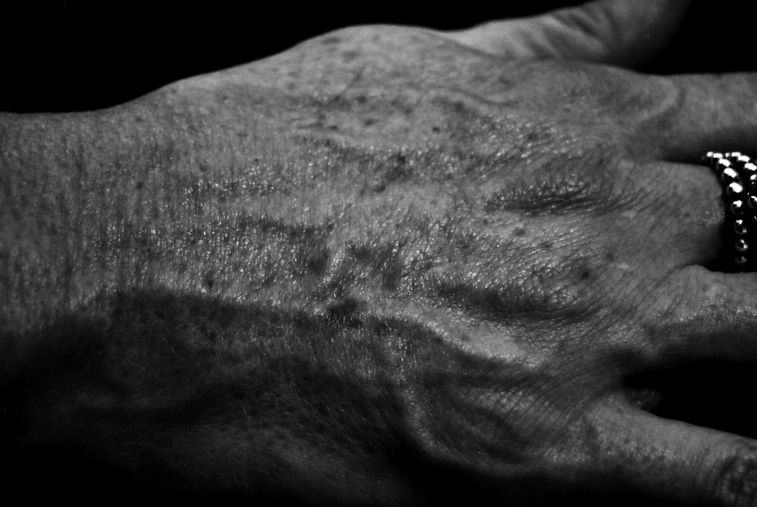
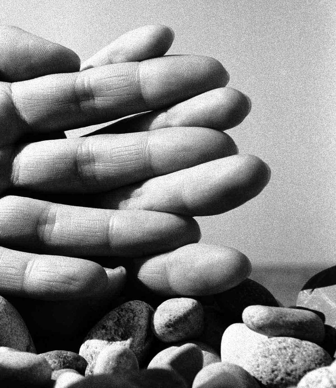
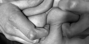
Left- I like this image primarily for the composition and shapes created. The use of himself presents some particularly effective aspects such as the the wrinkles, veins and hair which adds texture to the photograph and contrasts against the stark white background. The fact Coplan has spread his finger over his kneecaps makes his skin on knuckles appear stretched. The depicted body parts become like a landscape of skin texture and body contours which is very effective. The use of studio lighting has created a deep, contrasted effect behind his wrists and again between his fingers conferring a dramatic atmosphere. This is something I will attempt to imitate in my response.
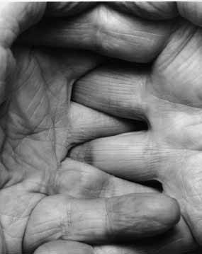
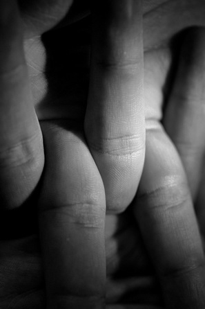
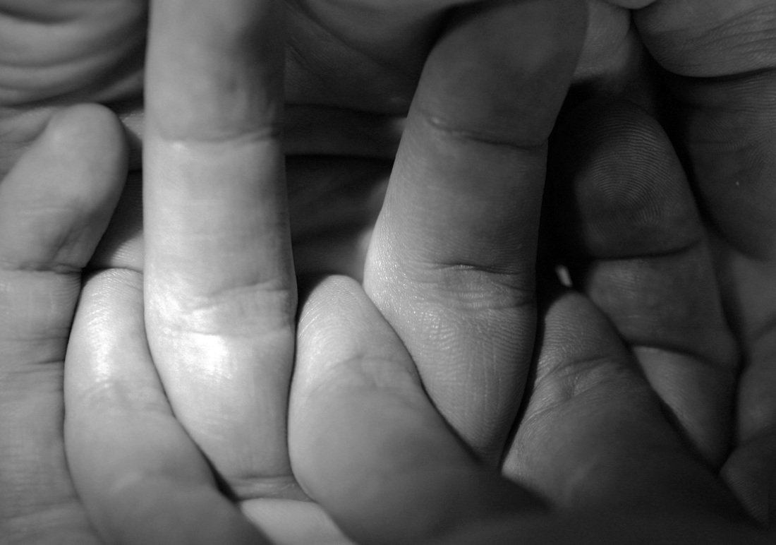
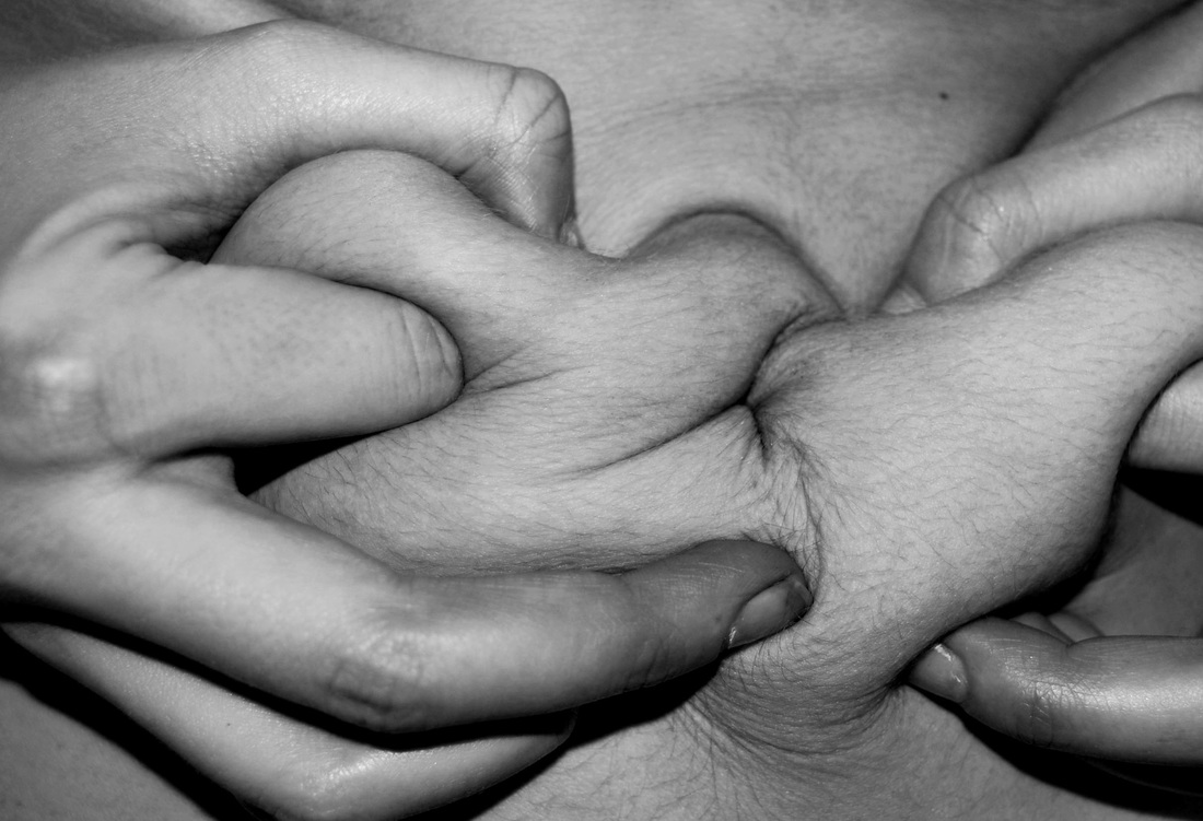
Middle- I immediately liked this photograph by the fact it was taken so close. This then made me pay attention to the detailed fine lines which created a response filled with texture. Again, it is clear John Coplan has taken these using bright studio lights to enhance the contrast and ultimately create a more dramatic effective result. By interlocking the hands and taking it from a perspective like such acts as though it is protecting something, guarding it away from danger, which almost adds a personal touch to the image. I think this photo is order and disorder. The orderly aspects is presented by the fact the hands are equally spaced apart and mirroring the same projection either side. However, it is disorderly by the fact it is swarmed with wrinkles and fine lines which are naturally not perfect nor neat nor equal hence why I believe there is a disorderly aspect to the image.
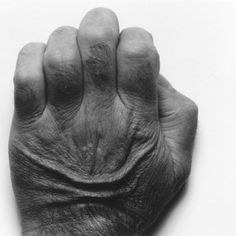
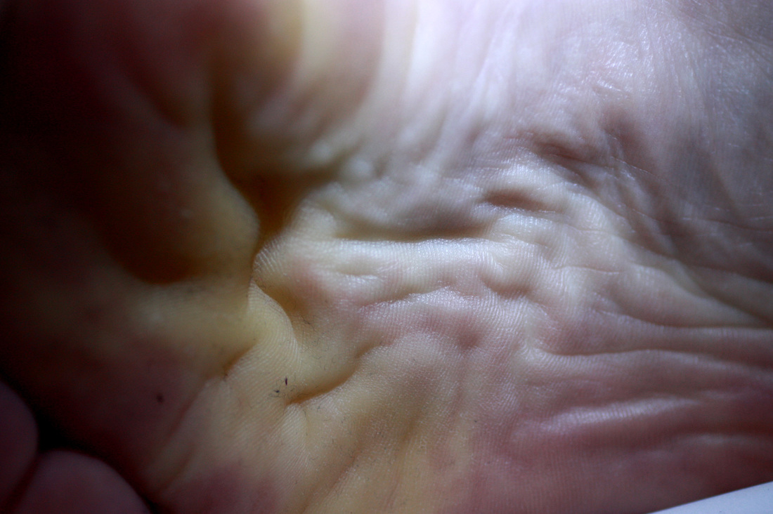
Right- Here Coplan is once again, using contrast and lighting to create an effective outcome. The white canvas makes the hand a focus of the image. The most interesting aspect to this image is the sagging skin on his hand. It is clear John Coplan is trying to present to the media and society something that is not necessarily stereotypically aesthetically pleasing or perfect and in doing so allows for him to project a unique response and confirm to modern society that nothing is perfect and all bodies should be accepted, no matter how wrinkly or veiny they are.
Middle- I immediately liked this photograph by the fact it was taken so close. This then made me pay attention to the detailed fine lines which created a response filled with texture. Again, it is clear John Coplan has taken these using bright studio lights to enhance the contrast and ultimately create a more dramatic effective result. By interlocking the hands and taking it from a perspective like such acts as though it is protecting something, guarding it away from danger, which almost adds a personal touch to the image. I think this photo is order and disorder. The orderly aspects is presented by the fact the hands are equally spaced apart and mirroring the same projection either side. However, it is disorderly by the fact it is swarmed with wrinkles and fine lines which are naturally not perfect nor neat nor equal hence why I believe there is a disorderly aspect to the image.
Right- Here Coplan is once again, using contrast and lighting to create an effective outcome. The white canvas makes the hand a focus of the image. The most interesting aspect to this image is the sagging skin on his hand. It is clear John Coplan is trying to present to the media and society something that is not necessarily stereotypically aesthetically pleasing or perfect and in doing so allows for him to project a unique response and confirm to modern society that nothing is perfect and all bodies should be accepted, no matter how wrinkly or veiny they are.
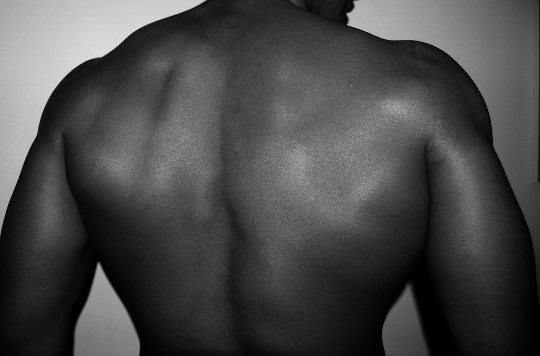
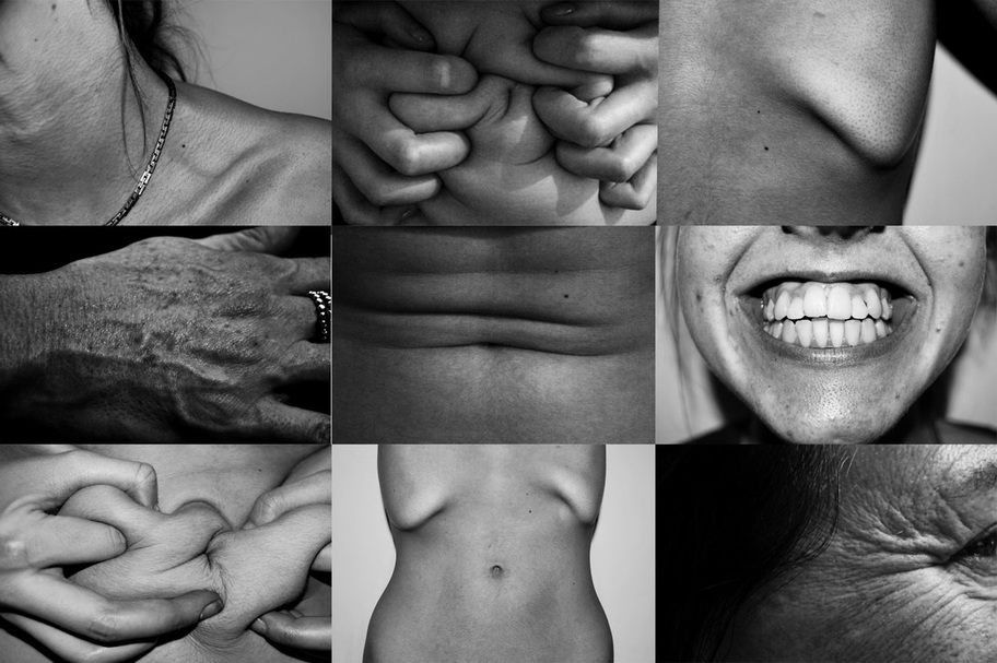
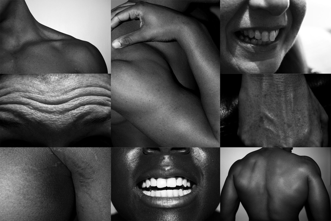
MY RESPONSE:
For my response, I wanted to imitate Coplans style and composition. So, in order to do this I used a torch to create stark contrasts , photographed the models body parts against a white background and used a macro-lens to get extremely close up focused images. This then resulted in a varied result. I wanted to add more depth to my photographs so I edited them on photoshop by making them black and white and adjusting the contrast and levels of the image to create a dramatic atmosphere of a unusually presented body part.
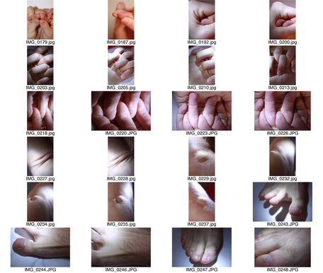
|
|
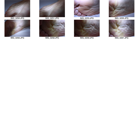
SELECTED IMAGES:
|
|
|
|
|
ARTIST AND ME
I thought these images were particularly similar. They both involve photographing very close up images of hands in an abstract form. The only difference between the photographs are the ages of the hands, so in John Coplan's piece the hand seems to have more depth.
|
John Coplan's work:

|
My work:
|
BILL BRANDT
Bill brant was born in Hamburgon May 1904. Research claims he began photographing amateur enthusiast when he was a patient undergoing treatment for tuberculosis. In 1930, Brant visited Paris in which he dsicvered new concepts of Surrealist film and grasped the new poetic possibilities of photography, in which has influenced his latter photographic career.

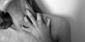
Left- I chose to feature this image as i liked the strong focus on hands intertwined together. The close compostion of this image enables you to to view all the winkles and fine lines which I thought was particularly effective and gives a different perspective, unlike something that someone would really focuses on before. i think presenting the image in black and white, creates this strong contrast and allows you to really focus on the deepth and intricate details to this body feature. I think using hands is particularly effective as hands are not only a necessity to our daily lives but also by interlocking two hands creates an almost imitate portrayal. i think this represents a disorderly response as the way the hands are intertwined presents a messy outcome but for the best.
Middle- The middle image presents an interesting concept, showing a womens hairy legs. Something that typically in twenty first century society isnt accepted, which I think Bill Brant is attempting to tackle with his strong focus on them. I like the fact that this image is so natural. It isn't, nor by what I can tell from the image, is the person concerned for having hair on their legs and thus i believe this is something he is trying to stress. The lighting on the legs almost creates this whole new shape and abstract response, transforming the legs into something different. For this sense, the image is very effective and is something i will try and attempt in my work.I think this piece of work is disorderly for the sense that Brandt is transforming a normal body part into something a new and unique form whilst highly controversial societal standards of women.
Right- I really like this image. It is different to the other images I have analysed for its composition, which is immediately very striking. Here a women is crouched over in a ball but the image is captured from the back. I really like the strong contrast between her shadowed body and the bright light reflecting on her spin and presenting this unusual shape created by her spin. I think once again, Brandt is aiming to present the human body form in an abstract form to create this unique unusual response and has completely achieved this in this image. It is almost like he is comparing her to the geology she surrounds herself in. I think this is also disorderly, from the whole composition and the focus on her strangely shape and the way the light falls creating this unusual pattern in her body. I will also try to intertwine this into my work whilst focusing on presenting my theme of body positivity.
ARTIST AND ME
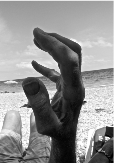
I took the image on the right on holiday with my family, it is a picture of my granddad's hand. I think this resembles the work of Bill Brandt for the fact that the focus is a starking, interesting shape, something inhumane about it. Also for the fact that both images are located in an isolated place, except for a few other families.
|
Bill Brandt's work:
|
My work:
|
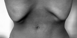
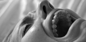
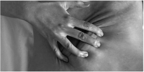
MY RESPONSE:
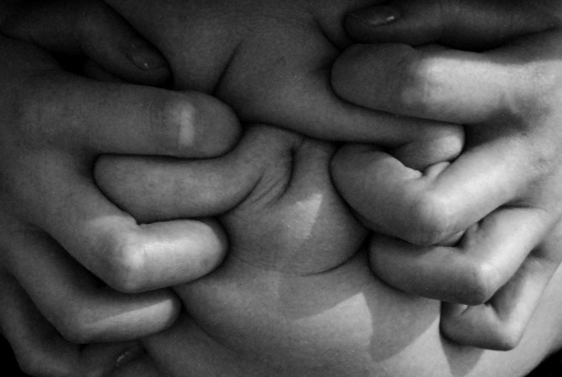
For this response, I used four different people to create a varied response. I then captured different parts of the body. For this i sometimes emphasises them by making the model squeeze the skin or tense the muscle. I then edited each image on photoshop to enhance the contrast and making them more striking. For this I used the black and white effect and adjusted the contrast, brightness, shadows, highlighting and levels.
SELECTED IMAGES:
FINAL EDIT:


VISUAL MINDMAP:

|
|
Devlopment 1: I first looked at Cecile Plaisance and then responded using the same composition and style.
|

|


|
Development 2: I then looked at Jenny Saville and responded by photographing images of my brothers squished face.
|

|
|
Development 3: I then looked at John Coplan and responded using a macro lens and captured images of abstract body parts, which is shown below.
|

|

|

I then further responded by photographing manipulated objects.
|

|
|
I then expanded by response to Jenny Saville by photographing using different textures and edited the images on photoshopin a specific way.
|

|

|
|
Development 4: Lastly, i looked at Bill Brandt's work and responded by photographing body parts close up.
|

|

|
Lastly, I created a college out of the photos I took as a response for Bill Brandt.
|
These developments and looking and responding to different artists enabled to inspire me to create my final piece.

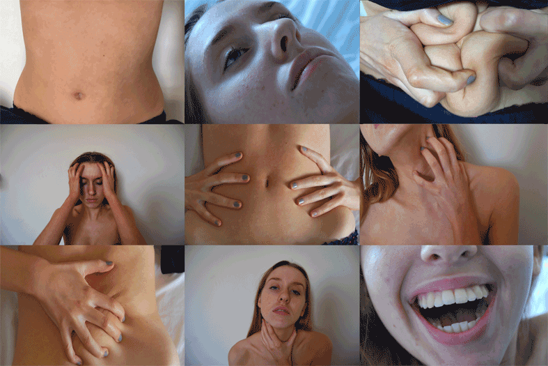
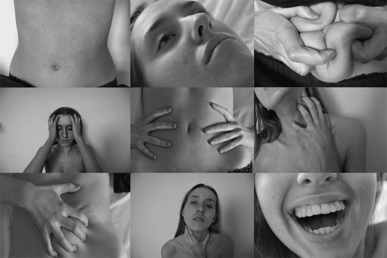
FINAL PIECE
|
|
|
|
|
|
|
|
|

For my final piece, i decided to focus on my final strand, body positivity. I wanted to expand upon my last college as I thought this was a particularly interesting way to present different body imperfections and perfections combined together, almost creating this representation of a normal human beings body, something filled with perfections and imperfections. However, whilst creating the colleges before there was a mixture of emotions within and I wanted to expand in a more effective way to really show how the media and society creates these impossible body images, that no one can achieve and the psychological and physical effects it has on someone. So below, I created a huge gif of one girl and her different emotions. On the top left corner, it is a gif of her sucking in her stomach to reveal her ribs, thus portraying the obsessive nature one can get to be skinny. The top right hand corner and very middle and bottom left hand corner gifs are all about body weight, they focus on being 'too fat', not having a perfect waist or toned tummy. Something that the media deems necessary for a women to be seen as beautiful. The top middle, left middle, right middle, and both bottom middle and right are all presenting the psychological effects of not achieving this impossible body figure and how it can utterly destroy someone. I decided to focus on hand movements such in the bottom middle and the middle right as i thought this almost represented stress and how it creeps up on people and is very physically and mentally straining. My inspiration for this came from this video.
To create this college of gifs I did it on photoshop. First, i collected all my images. I then created the first college of all the first shots of each section and then saved this as a single image. I did the same thing so i ended up with six stills. I then on photoshop went to file-> scripts-> load files into stack. Then i could select my six images and uploaded them into photoshop. I then went to Window -> Animation so i could create the gif. I then went to the settings on animation which is located in the top right hand corner and clicked "make frames into layers." Lastly, i changed the speed of the gif to 0.2 seconds between each frame and saved it by going to file and clicking on "save for web & devices". If the file size was too big to upload to weebly I changed the image size so it had less gbs and i could upload it. For the second gif, I did all of the above but change the opacity of the pictures when creating the first six shots. Lastly, for the final two images that are both black and white I changed that on photoshop by going to image-> adjustments -> black and white.
I wanted to presented different styles of the college as i think the colours present the gif in a stark and raw perception, whereas the black and white images allows the viewer to totally focus on the actual components of each image and also acts as a parallel, reflecting the depressing response body image portrayed by the media gives women and men in society.