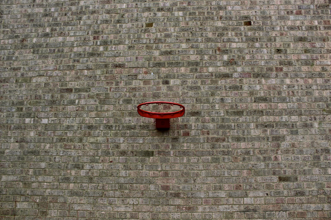
LANDSCAPE
Landscape photography refers to photographic scenes that are predominately about the physical landscape and, although this may involve people, the focus/subject is the environment.
ARTIST ANALYSIS:
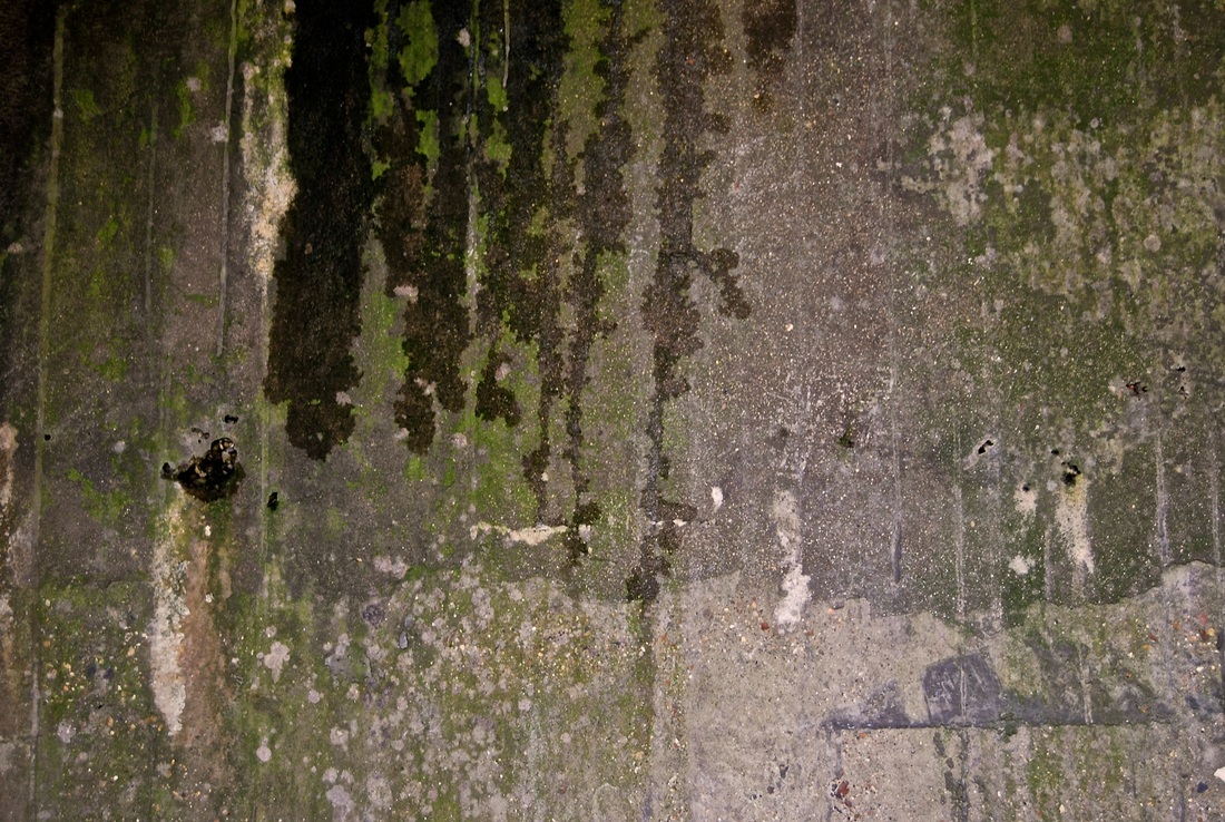
LEWIS BALTZ
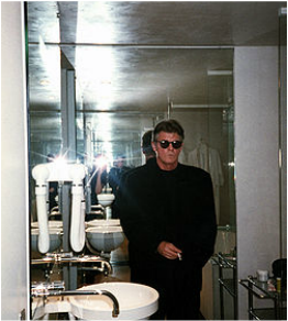
Picture of Lewis Baltz
|
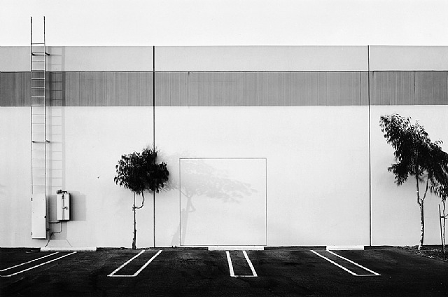
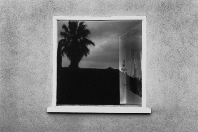
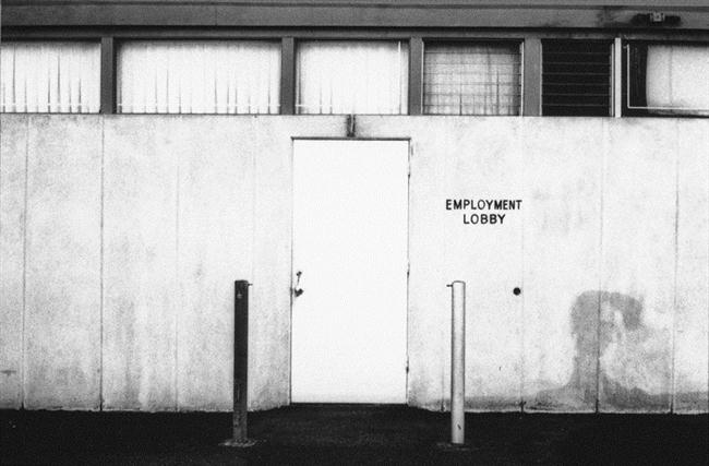
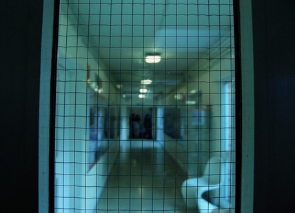
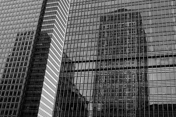
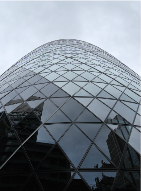
Lewis Baltz was one of the most prominent representatives of the New Topographics movement, which was seminal to the development of the conceptual photography. Born in Newport, California, in 1945, Lewis Baltz studied photography at the Art Institute in San Francisco from 1966–1969 and went on to hold various teaching positions and professorships in the 1970s. His work focused on searching for beauty in desolation and destruction, and highlighted the reality of human landscape such as offices, factories and parking lots. The three images below are all examples of Baltz's talent.His typical locations he photographed were previously unimproved land. His images all have a similarity in which they all include a plain blank background which creates mystery for the viewer, also the fact that many feature a window or a door makes each image have an element of curiosity. I especially like Baltz style of photography and I am inspired by it. His constant use of black and white show how simplistic these photos are but some how work very well and draw your attention to them. |
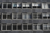
MICHEAL WOLF
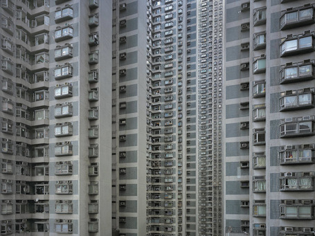
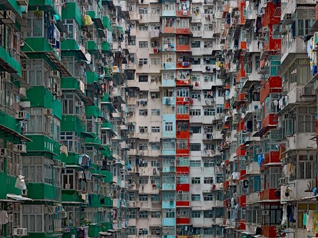
Micheal Wolf was born in Germany and raised in the United States, Europe and Canada. The focus of this photographers work is life in mega cities and many of his projects document the architecture and the honest bleak culture of these metropolises. His projects include, "Hong Kong", "Life in Cities", "Street view", "The real toy story" and "Portraits made in China 1997-1998". Some of his topics are very controversial such as during his project "Street view" , it features a section called "F*ck you" in which there are various pictures of people aiming their middle finger towards the camera however, some may say this gives you an honest opinion on what some peoples attitude is like and he is only capturing it and presenting it to the world. It is thought that due to his up bringing in various places with large cities lead him to this project. Below are some of his work from "Life in Cities - Architecture of density"
|
|
Left- This photograph was taken on one of the many Hong Kong housing quarters. Cleverly, Micheal Wolf framed the image in a particular way ensuring that the viewer could not see the whole building; from top to bottom. He photographed the middle of the building, so that the whole picture shows the structure, and he photographed the windows to emphasis the sheer amount of people living there. Which precisely brings out the feature/problem of this photo; the spread of where people live. In such a small place there lives 8 million people, on the other hand, land and housing apartments are always in deficit. I especially like this photograph as it shows great and interesting architecture but also has a greater meaning within it, which I believe was presented successfully by Micheal Wolf.
Right- This image immediately presents the viewer with a crowded and busy environment throughout. The audience can exactly identify, from the packed buildings, how small each apartment is and how crowded these people's living conditions are. You can tell by examining the photograph that the apartments seem very compressed. Micheal Wolf is someone that is considered to focus on the specific visual elements of this depicted high densely populated place and has managed to capture this cleverly and interesting, attracting much attention from his individual style and technique of his photographs.
Right- This image immediately presents the viewer with a crowded and busy environment throughout. The audience can exactly identify, from the packed buildings, how small each apartment is and how crowded these people's living conditions are. You can tell by examining the photograph that the apartments seem very compressed. Micheal Wolf is someone that is considered to focus on the specific visual elements of this depicted high densely populated place and has managed to capture this cleverly and interesting, attracting much attention from his individual style and technique of his photographs.
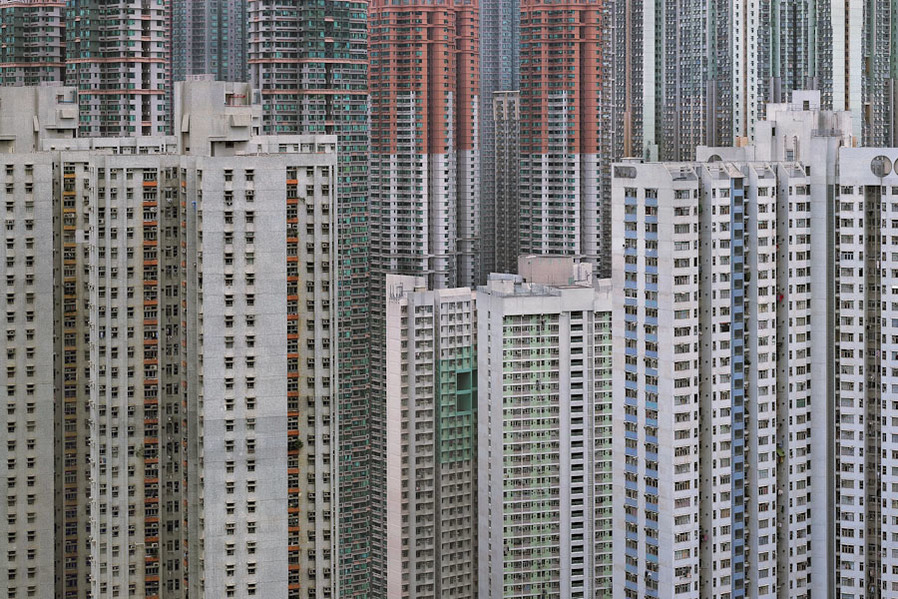
Above- Looking at Micheal Wolf's work, it is clear that he is interested in the structure and architecture of buildings in a large heavy populated city, choosing to document it with this particular colouring/ effect gives an abscure but faded appeal. This specific photograph cleverly manages to convey two different sides, the buildings in the foreground due to there difference in colour and the fact that they end, and in contrast, the background, which presents the viewer with incomplete buildings highlighted with greens and reds. It raises a question about how this city is perceived, as a whole or each individual building/ section.
ERNEST SEBASTIEN
Ernest Sebastien was born in 1981 and currently he lives in Belgium. He began his photography in 2011 with a self taught approach. On his website it includes most of his work put into different topics to make it simpler to view his photographs. These topics include,"Black & White", "Burn Baby Burn & Light Painting", "The Real Life", "Visit the World", "Night Life" and "The Natural World." He has just spend 2 years documenting his travels round hundreds of miles capturing abandoned buildings, including French mansions and grand palaces in Germany. I will be focusing my analysis on this part of his work as I feel this is the best representation of his work during his travels.

Left- I particularly like this image as it shows its complex story hidden within it. It's haunting atmosphere provides the viewer with a photograph that they drawn towards. It is evident that previously this room was frequently used and enjoyed by many people but now, it's left to wear away. I really like the use of colours, the green background shows a once vibrant bright room contrasting with the white design, which shows its history and style. The derelict foreground and furniture present themselves with a sad, destruct and unkept feel. The lighting has especially caught my attention; with the natural sunlight pouring into the landscape against the off-green paint, gives a nostalgic impression. This is an effective response to how neglect can impact a place, turning something that once was beautiful into a place of rot.
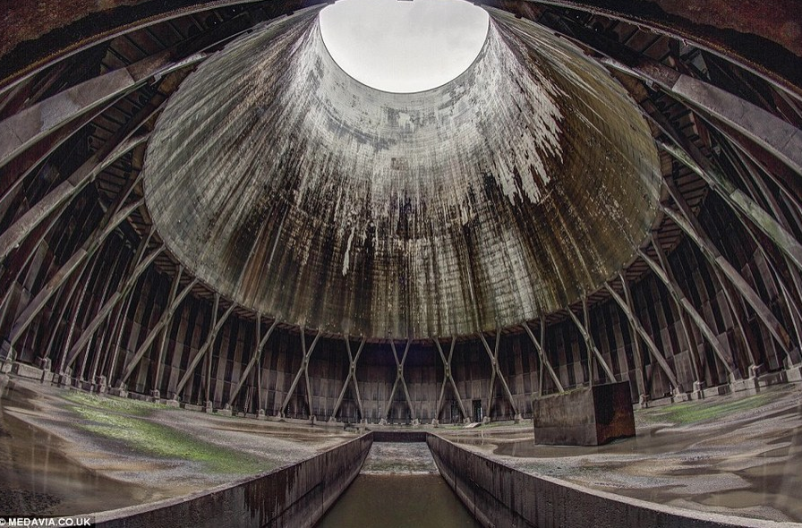
Middle- This amazing place was once previously used as a central energy cooling place/system in Belguim. Ernest Sebastian manages to capture this, creating a look of isolation. Every time Ernest Sebastain breaks into one of these amazing, abandonded places, he risks arrests, demonstrating how dedicated he is to his work and how successful his outcome is, capturing these powerful scenes every time, despite this. I was very drawn to this image as I feel it's sheer size creates an impact, this huge unused space with this pattern running around the whole image creates symmetry which adds more detail and depth to the picture. Also, by including the huge hole in the middle of the building, at the top of the image almost signifies hope, maybe for this neglected place.
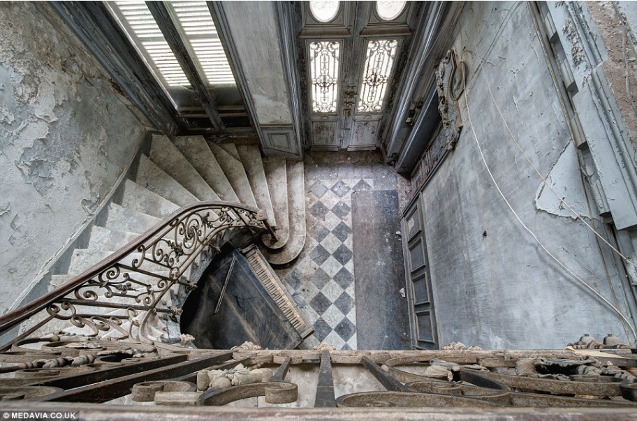
Right- A dilapidated piano is tucked under the grand staircase of this manor house in central France. Sebastian said, "sometimes these beautiful buildings quickly become looted and vandalised." This shows his sheer passion about the buildings and the environments he captures, presenting his connecting to them. I like the way he has taken this photograph, looking down shows the the curve and style of the staircase, adding an architectural element to the image, especially by featuring the tall french windows. Even though this place has clearly been left to wear its beauty still lies within.
Middle- This amazing place was once previously used as a central energy cooling place/system in Belguim. Ernest Sebastian manages to capture this, creating a look of isolation. Every time Ernest Sebastain breaks into one of these amazing, abandonded places, he risks arrests, demonstrating how dedicated he is to his work and how successful his outcome is, capturing these powerful scenes every time, despite this. I was very drawn to this image as I feel it's sheer size creates an impact, this huge unused space with this pattern running around the whole image creates symmetry which adds more detail and depth to the picture. Also, by including the huge hole in the middle of the building, at the top of the image almost signifies hope, maybe for this neglected place.
Right- A dilapidated piano is tucked under the grand staircase of this manor house in central France. Sebastian said, "sometimes these beautiful buildings quickly become looted and vandalised." This shows his sheer passion about the buildings and the environments he captures, presenting his connecting to them. I like the way he has taken this photograph, looking down shows the the curve and style of the staircase, adding an architectural element to the image, especially by featuring the tall french windows. Even though this place has clearly been left to wear its beauty still lies within.
|
|
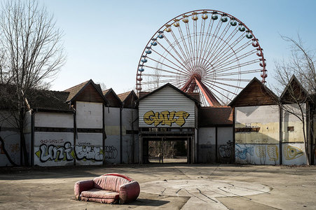
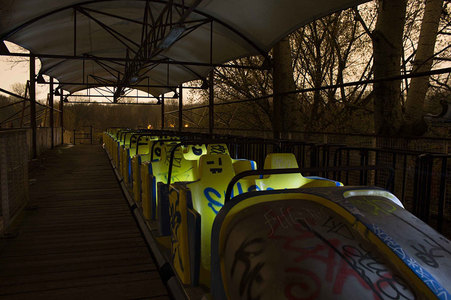
Above- Here are some images Ernest Sebastian took with Martin Harwardt, Peter When and Ralf Wendrich of an abandoned theme park in Germany. I chose to included this images as they caught my attention; both complete polar opposites of the same place. One (left) complete daylight featuring white and pastel colours throughout whereas the other picture (right) shows a moody dark feel with a brown and yellow theme contrasting with the blue graffiti. When capturing my images for this unit, i will take inspiration from this artist and try and imitate his composition, use of colours when editing and including specific aspects to the image to result in a more successful outcome.
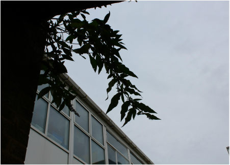
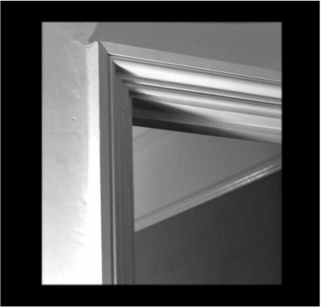
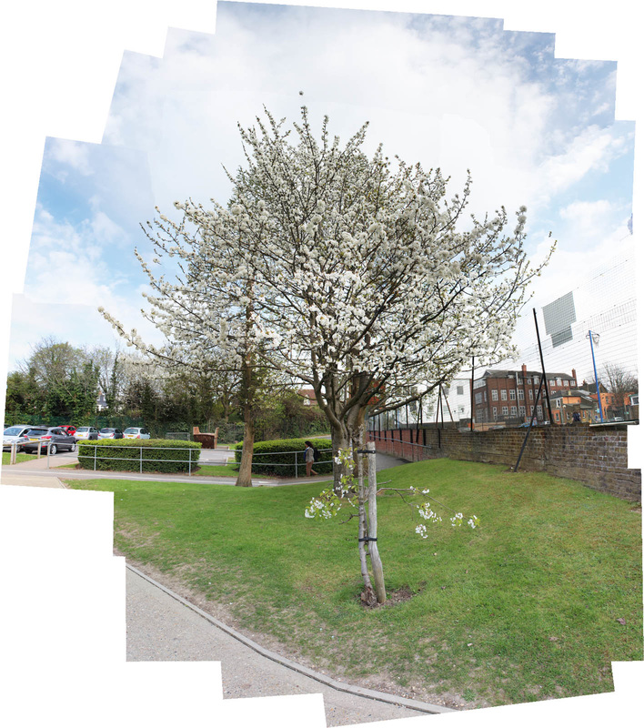
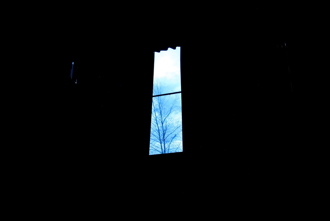
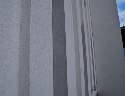
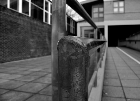
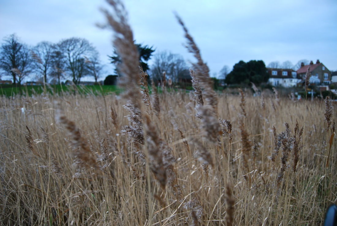
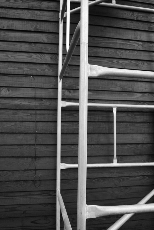
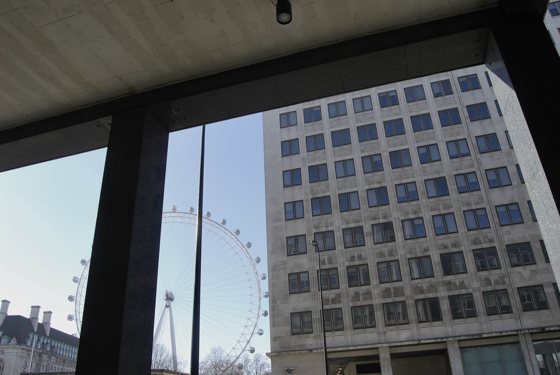
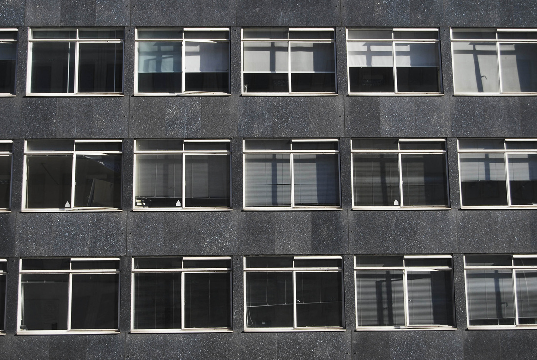
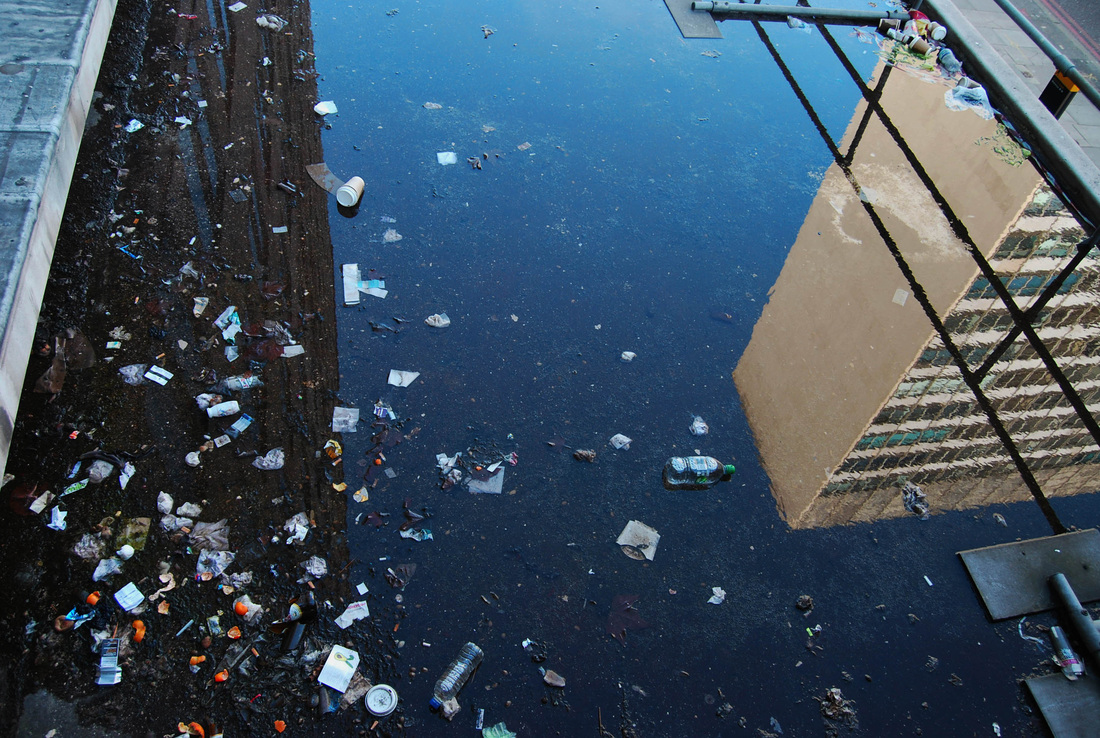
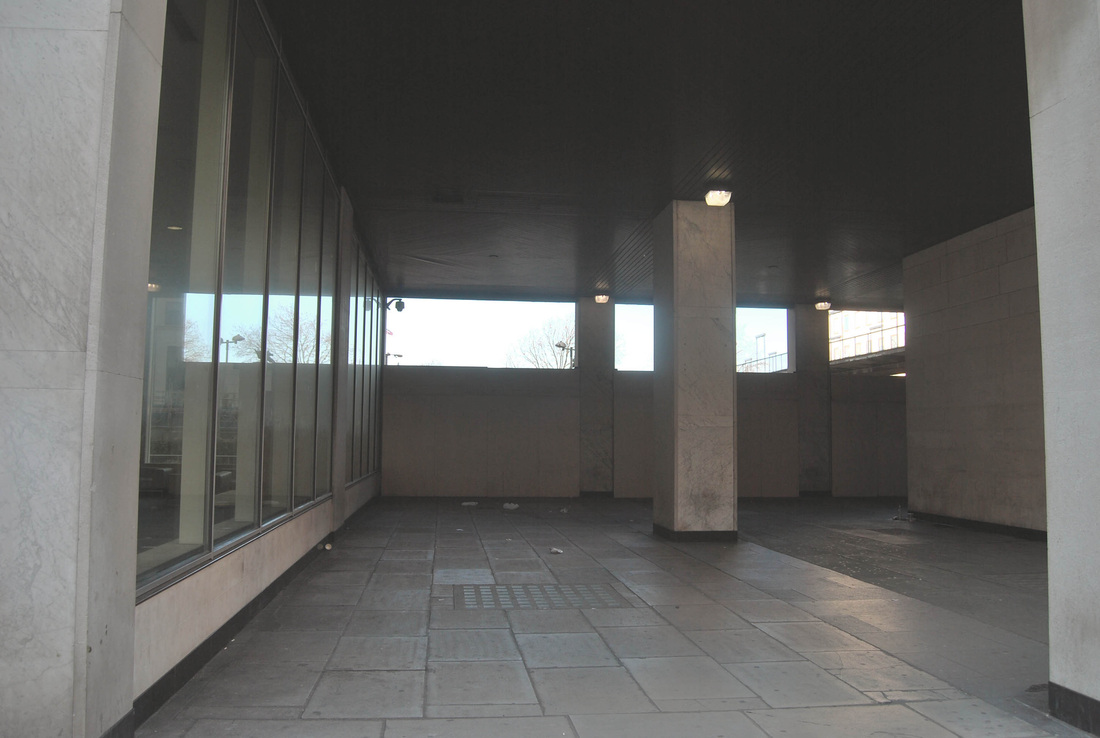
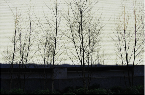
INTIAL SHOOTS ROUND THE SCHOOL
I choose to take these photos in North Wing as I believe they capture our school environment, reflect the time of year it is and show how I view my school. I attempted to photograph the school's interior and exterior in abstract angles and focusing on certain aspects which caught my attention, which I usually wouldn't take notice of before.
|
|
|
|
FRAMING TASK
JOHN DIVOLA
John Divola, a contemporary visual artist was born in Los Angles however, he currently lives in Riverside, CA. Divola is a photographer who describes his work as "an exploration of landscape by looking for the edge between the abstract and the specific". Below are three pictures by him which I feel best represent his work.
Left- In this image it shows a rural natural background contrasting with a man made destruct building. This shows the human affect on the world and how descruction can change a landscape completely. The colours present the viewer with a bland yet simple photograph which strangely grabs your attention, which is why I think it works. The colours of this photo reflect onto each other. The sky presents a misty, cloudy, dim white background and the floor near the foreground of the photo is also white, yet has been interupted by the occasional cracks of the concrete, which once again adds texture and diversity to the photograph. it also supplies more evidence to human's affect on nature and the constant battle between the two.
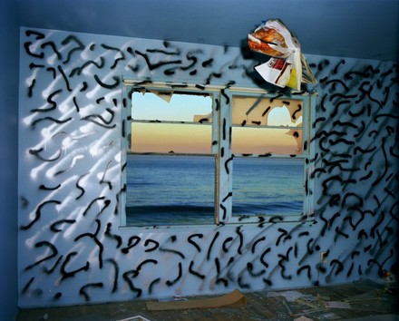
Middle- I particularly like this photograph as it captures the natural world against a derelict foreground showing the human affect on nature. Divola has cleverly taken this picture with the window being the focus, framing the sunset and the ocean which evokes a peaceful and harmonious emotion within the viewer. The artist not only captured this composition but he began to participate by manipulating the scenery and added a contemporary aspect by drawing the graffiti onto the wall to add depth and contrast against the sunset. The work forever emphasised the bond between man and nature, which until that time had been traditionally depicted as separate from man.
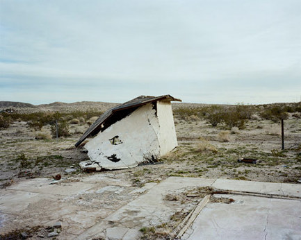
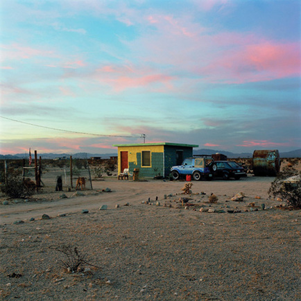
Right- In this composition the focal point is the small colourful building in complete isolation that attracted my attention. I particularly like the colours and textures the sky presents itself with; the accent of the blossom pink contrasting with the baby blue presents a innocent and harmonious surrounding. The image suggest this is a isolated place with the home-made barriers, the bleak background and the natural surrounding with no signs of infrastructure for miles. I choice to analyse this photograph as it's bleakness especially caught my attention.
Middle- I particularly like this photograph as it captures the natural world against a derelict foreground showing the human affect on nature. Divola has cleverly taken this picture with the window being the focus, framing the sunset and the ocean which evokes a peaceful and harmonious emotion within the viewer. The artist not only captured this composition but he began to participate by manipulating the scenery and added a contemporary aspect by drawing the graffiti onto the wall to add depth and contrast against the sunset. The work forever emphasised the bond between man and nature, which until that time had been traditionally depicted as separate from man.
Right- In this composition the focal point is the small colourful building in complete isolation that attracted my attention. I particularly like the colours and textures the sky presents itself with; the accent of the blossom pink contrasting with the baby blue presents a innocent and harmonious surrounding. The image suggest this is a isolated place with the home-made barriers, the bleak background and the natural surrounding with no signs of infrastructure for miles. I choice to analyse this photograph as it's bleakness especially caught my attention.
FIRST RESPONSE:
For this task I used my own made black borders to create an interesting picture within a small frame or shape depending on how you cut it out. However, it was often difficult to achieve a clear focused background with the shape looking perfectly rectangular which is why most of my photos are like this. Here are my attempts below:
|
|
|
|
|
|
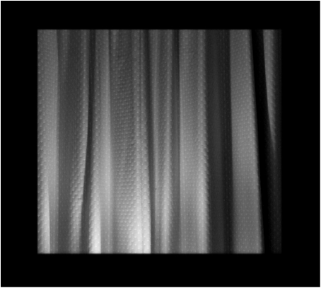
SECOND RESPONSE:
For this second response, I focused on different textures, shadows and shapes. I then added them on photoshop using black and white filter and adding contrast to enhance the image. I also decided to have them the same size as I thought this would create a more effective outcome, once placed together.
|
|
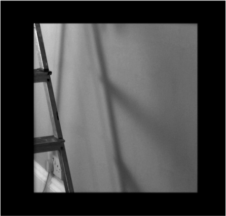
THIRD RESPONSE:
For my third response, I decided to improve the aspects I didnt particularly like in the second response. This was the style of the image. I wanted to capture something more interesting do that the images as a whole was more effective. I again focused on using the same border for each image so they would be the same size.
|
|
|
|
PANOGRAPHY
THE PROCESS
To do this process, you use photoshop to create the joiner/panography :
1) I went to File>Automate>Photomerge. When the window opened, I unticked blend as I wanted the final image to have a collage feel to it. Then I clicked browse to find and select all the images I wanted to use for my joiner.
2) When the photos had been overlapped and created a collage-style I wanted to try turning different layers on or off to see if they added or detracted from the image. I also made some adjustments to individual layers for example the brightness.
3) I wanted to make each image stand out so I added a shadow by double clicking on the fx button at the bottom of the layers pallet. You can also change the capacity, angle, distance, spread and size of the shadow but I felt the need that I didn't need to.
4) I then added a background colour to my collage by creating a new layer and filling the layer with the colour I chose which was white using the fill tool.
DAVID HOCKNEY
David Hockney is considered one of the most influential British artists of the 20th Century. He was particularly drawn to the light and heat of California in which he first visited Los Angles in 1963. From then on wards, the swimming pools became his favorite subject to photograph which is where his expressionist style began to progress. However, in the 1970's his style of photography slightly adapted and he was considered as more of a realist. Below are some examples of his work.
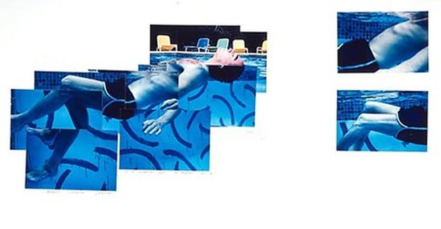
Above- This is an image of Robert Lippman floating in a pool in 1982. I find this image very interesting as it shows two different perspectives which you typically wouldn't see together; his body from inside a swimming pool and his head above the water. I like the focus on a blue tone as it shows the viewer what environment he is clearly taking this photograph in. The Joiner David Hockney has used show his body structure almost mixed up but somehow still represents Robert Lippman floating/ swimming in a pool. The fact that Hockney has included the deck-chairs in the background show its social atmosphere and also add more colour variation to the photo.
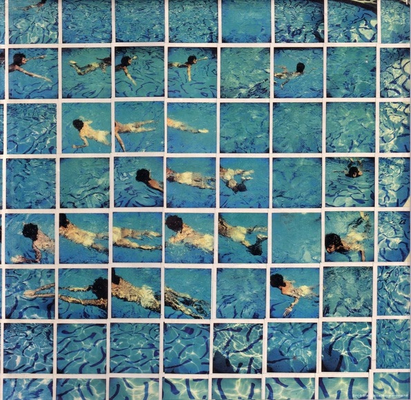
Above-This is one of Hockney's joiners he took by taking lots of Polaroid pictures on one particular subject; in this case, a boy swimming in a pool. His discovery of joiners occurred accidentally but resulted in an interesting unique picture. By creating this effect manually show his sheer talent for creating a cubist representation. I like his attention to detail, this is shown when he focuses on capturing on the design on the bottom on the pool.
FIRST RESPONSE:
|
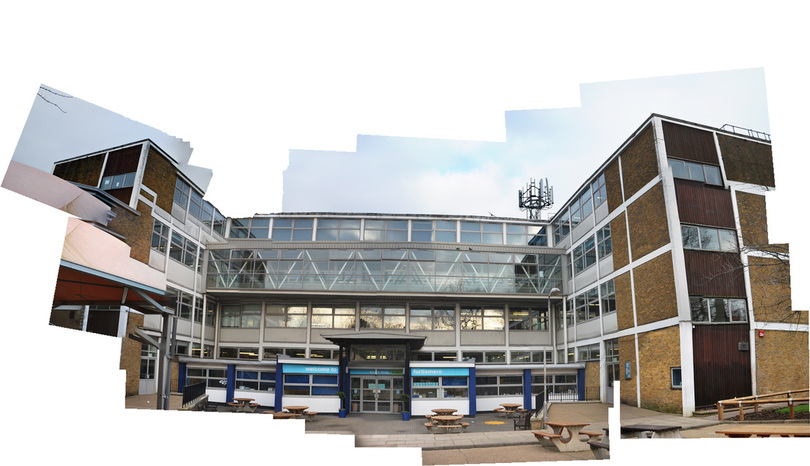
A photographic panography is a montage of images composited together to make a whole. The artist David Hockney is famous for his joiners that create a sense of movement and altered perspective, playing with time and space. In response to David Hockney's work, I experimented taking joiners around the school and then further responded outside of school. Below are my images:
|
CAMERA SETTINGS:
Mode: Manual ISO: 100-400 Speed: 1/80 - 1/125 Aperture: Automatic Focus: Manual Flash: Off Focal Length: 70-200mm (Zoom In) |
IMAGE ONE:
I begna my response with photographing the Tetherdown block from the corner. I did this as I believe this was an easy point to start at and allowed for an interesting response enabling two sides of the building which you would not typically be able to see when standing in that position.
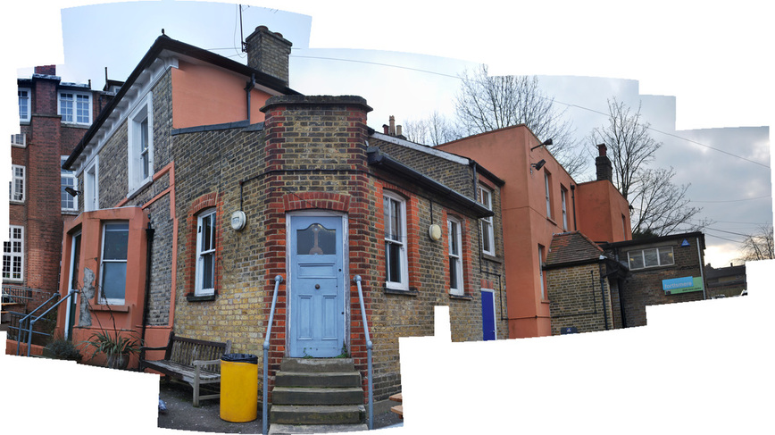
IMAGE TWO:
For this second response, I decided to take a picture of a panography that shows a wide perspective so I captured the front of the South Wing.
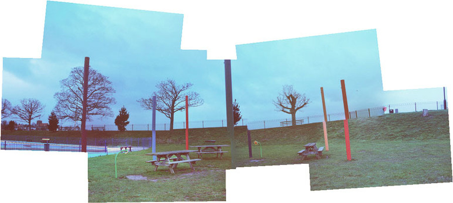
SECOND RESPONSE:
IMAGE ONE:
I took this image in Maldon, Essex. This image was taken on a particularly dark day so the image resulted in quite a gloomy, moody atmosphere. By capturing an empty playground also added to the eerie environment. I think the panography was successful, however, I dont think it very neat as some of the poles dont completely match up.

IMAGE TWO:
This image strongly contrasts to the last one. Firstly by the fact its very bright scenery and almost represents spring. I think this is more effective than image one as the panographies joined successfully.
ARTIST AND ME
I think my work particularly resembled the likes of David Hockeys. Below is my attempt at imitating a similar scene of his but there is obvious difference of location. The reason I believe this image share a similarity as they are both presenting landscape through the panographic style.
|
David Hockney's work
|
My work
|
THE FORMAL ELEMENTS
FIRST RESPONSE:
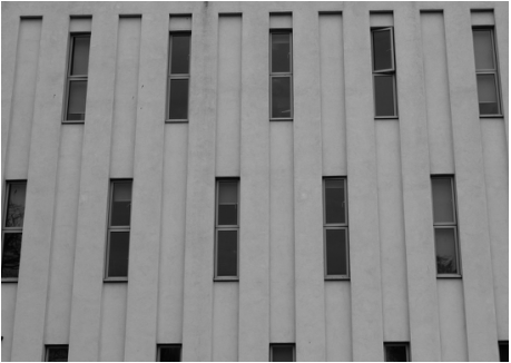
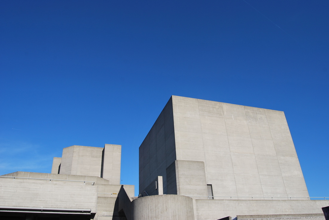
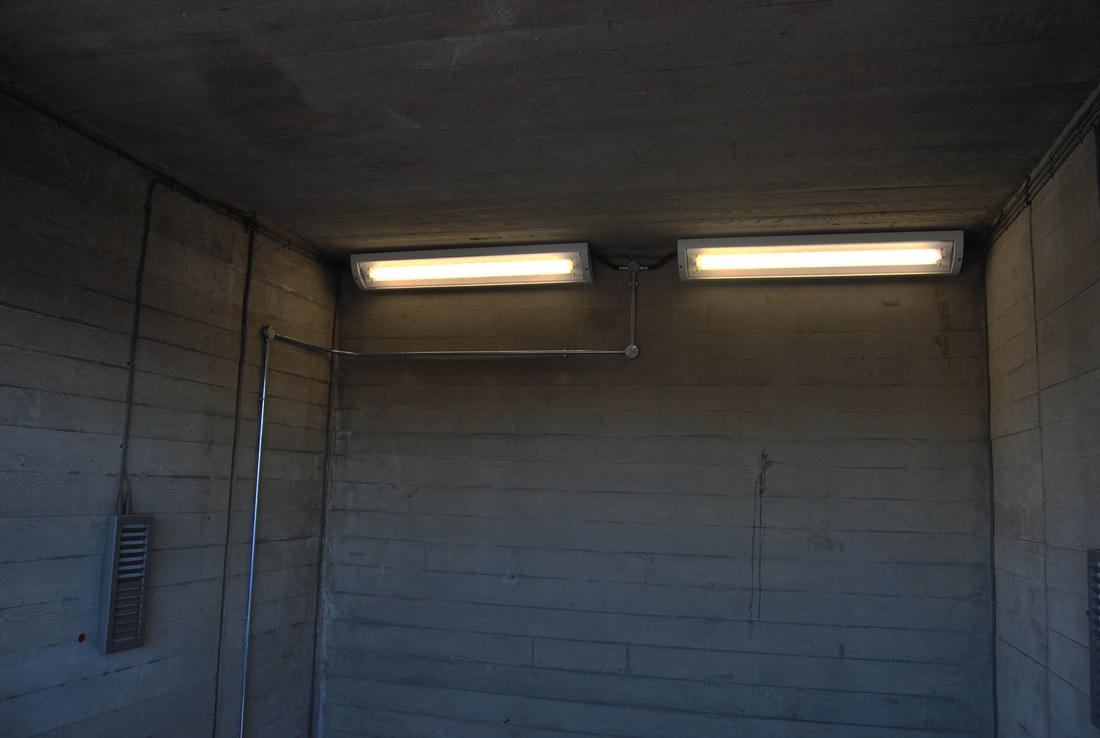
In this task, I captured images of the exterior and interior of North Wing focusing on the formal elements. This term is commonly used by artists/art critics traditionally within the fine arts, to make references to the elements occurring in a composition. Below is my examples of the formal elements.
Scale
|
Pattern
|
SECOND RESPONSE:
In order to improve my photographic skills, I took these photos in a different environment I don't typically associate myself within, enabling me to experiment with different types of formal elements.
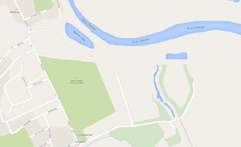
I chose to photograph my response in Maldon, Essex. Here is a map to illustrate where I captured these images.
SELECTED EDITS:
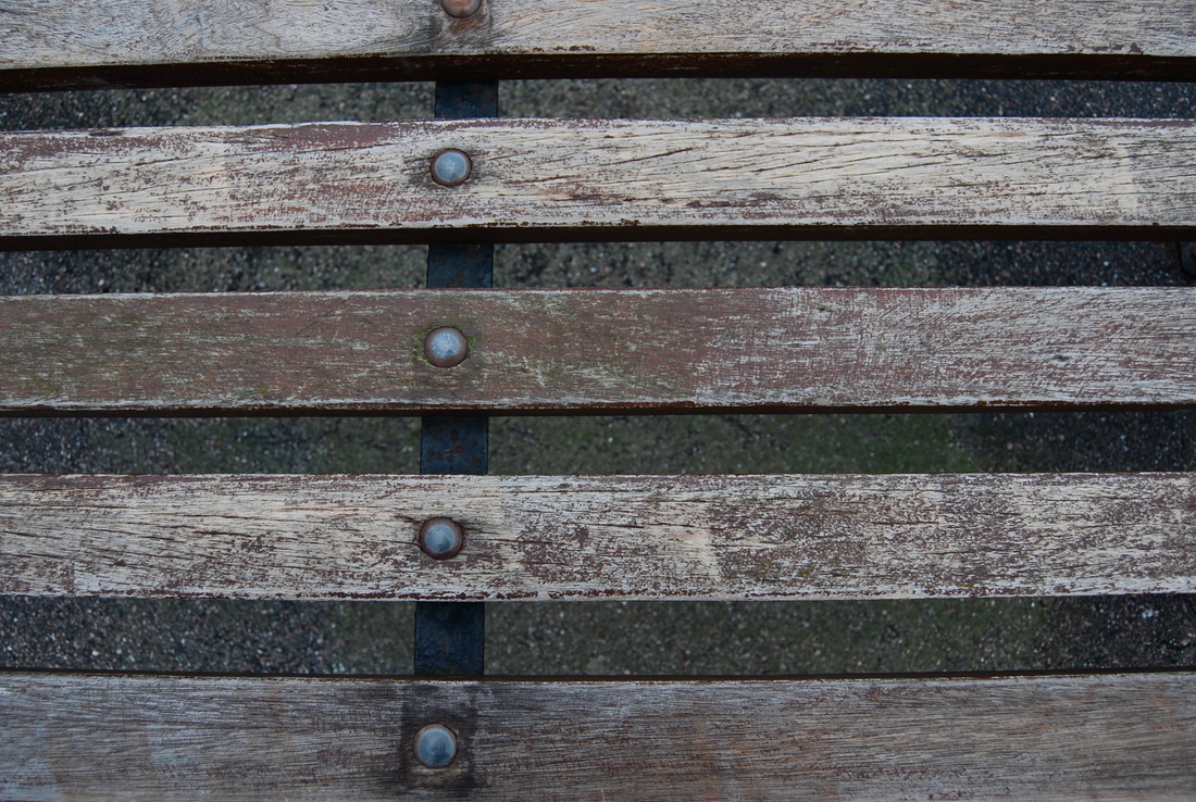
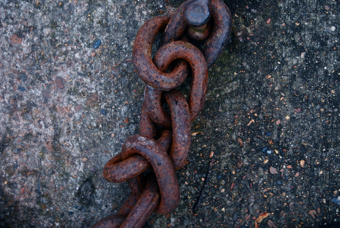
Texture
|
Perspective
|
Contrast
|
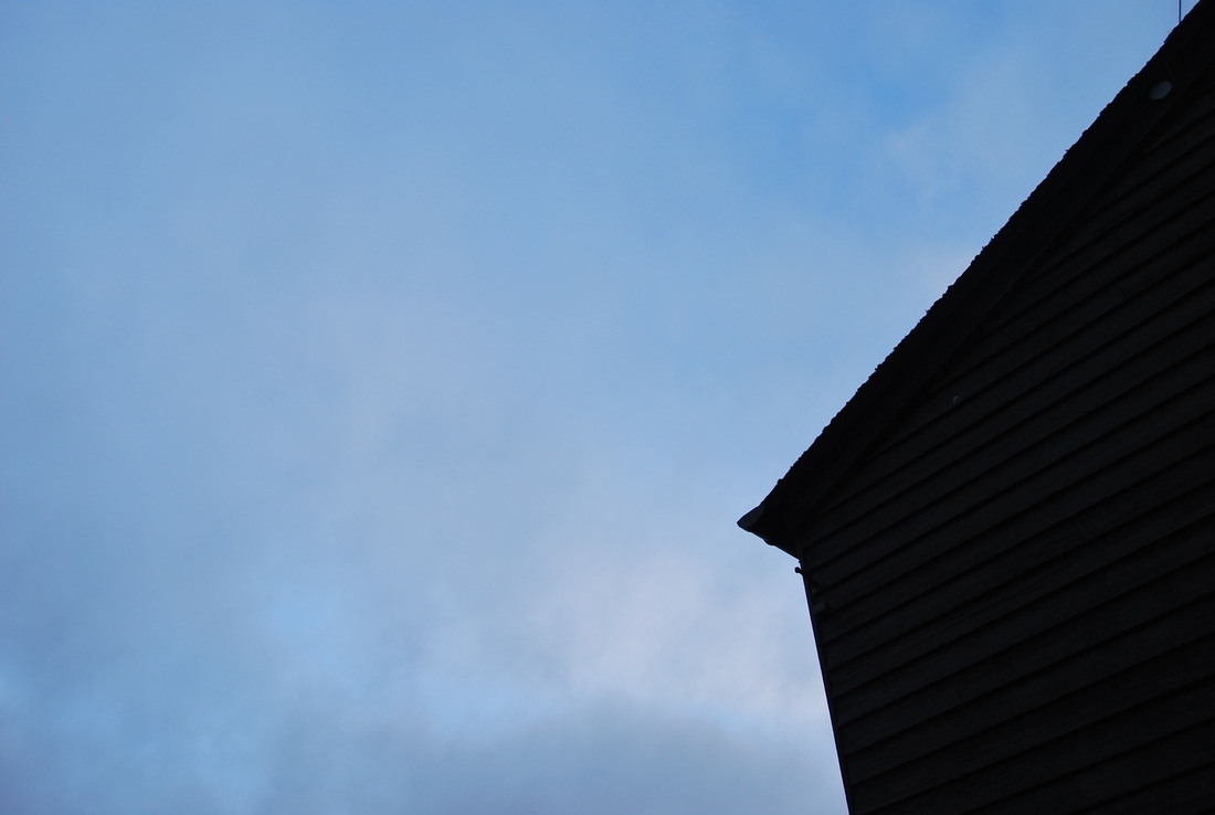
THIRD RESPONSE:
I then decided to expand another response focusing on capturing images that incorperated more than one formal element. Below are my selected images in which I have attempted to present images of perspective, contrast, texture and negative space.
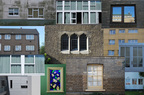
LANDSCAPE DEVELOPMENT:
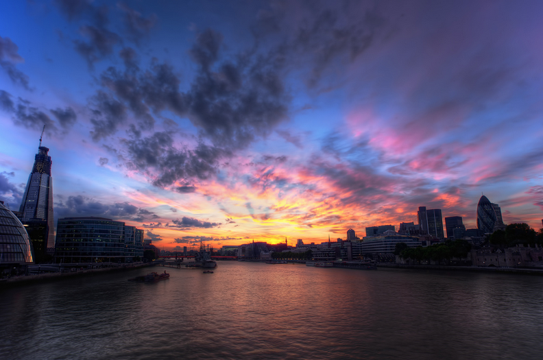
MY LONDON
For this part of my Landscape project, this is all about how I personally perceive London and the way I wanted to capture it through my photography. Below is a spider diagram explaining my immediate thoughts and ideas I could possibly expand upon during this development.
TASK 1
For this first task we had to chose several pictures that inspired us to capture the way we see London. I chose nine pictures that i particularly liked, to show how I would like to portray London with my photographs. Here I focused on the architecture, movement, colour and symmetry.
TASK 2 : ANALYSIS
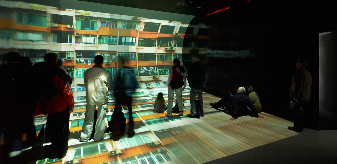
I have chosen to analyse this photograph as I feel it inspires me and is relevant to what i would like to capture in my own photography.
Name : David Churchill.
Title : The Crystal London.
Date : unspecified.
Country : unspecified.
Describe : The movement of the man in the centre of the image makes him seem transparent, which creates an interesting effect against the projected image. The photo presents itself with a mysterious atmosphere due to its consistent dull tones and throughout the image you cannot see the peoples faces or expressions. It also gives the impression that it is art imitating art to create an interesting effective image. It almost like the film, Inception; the person looking at the photograph, of people looking at another photograph with the people in the image looking back at both sets of viewers, showing layers. The fact that the viewers are literally standing on the image of the run-down, poorer housing estate shows a wider issue of wealth and poverty, and how wealth has more importance and control currently in our society. The curve could represent that the viewers are being pulled and mesmerised into this different world or that there is hope within poverty and the rise of this curve suggests this.
History : The date is unspecified so the influence of historical events can not be identify.
Social : unspecified.
Cultural :unspecified.
Colour : Contrast of the red/orange colour with the grey/black and also shows a variety of colour shades.
Process : The photographer has used a tripod to capture this image, he has also used a small aperture which is a high f-stop (e.g f/18 or f/22) which is why the image is darker because the setting has allowed more depth-of-field.
Composition : The whole image is generally quite dark and mysterious. There is a consistent dash of orange which has been projected in the image, balancing out colour and shape.
Formal Elements : This could be either Contrast or Shape.
Issues : I feel the photographer has attempt to address the difference of rich and poor and how wealth gives you control and importance in this world.
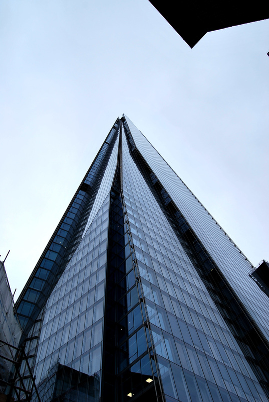
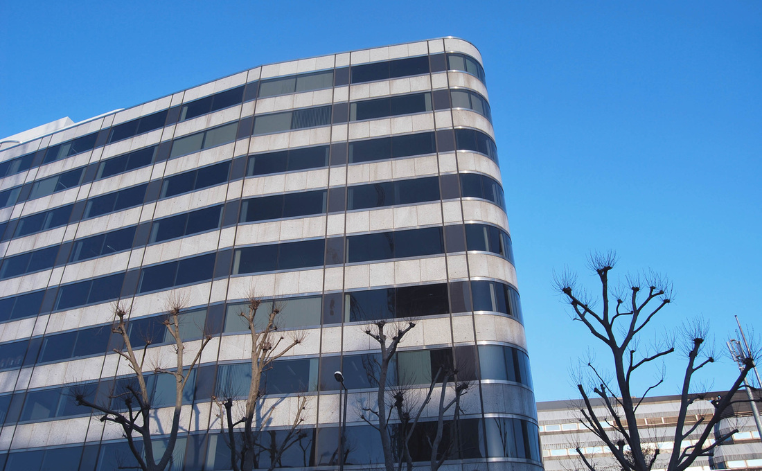
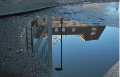
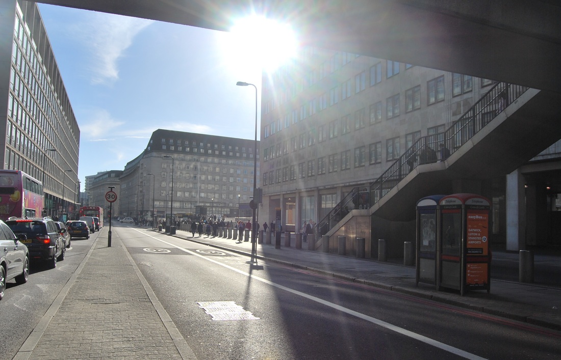
TASK 3 - MY LONDON
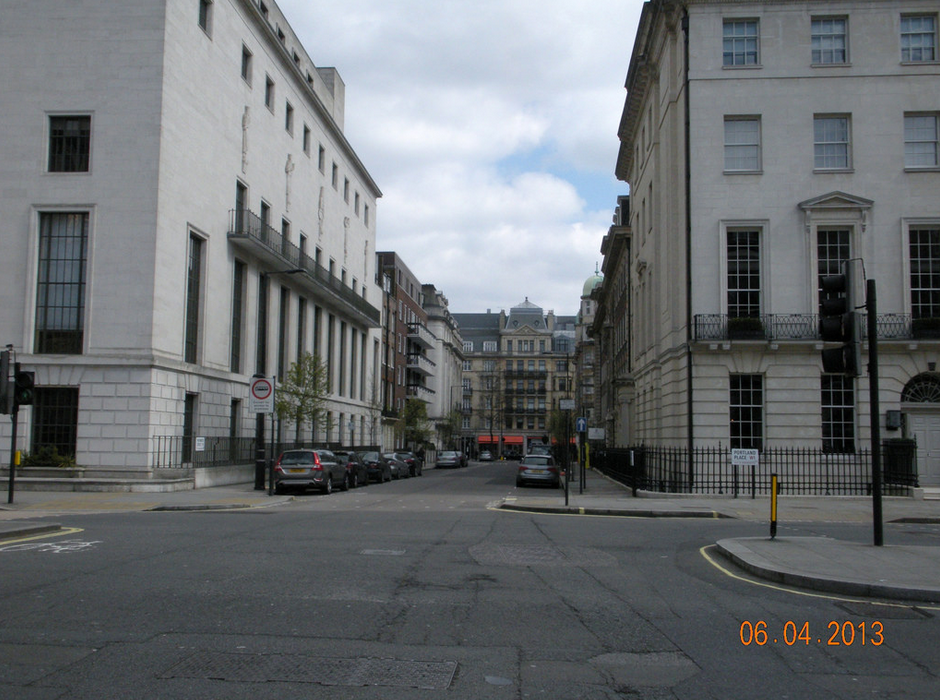
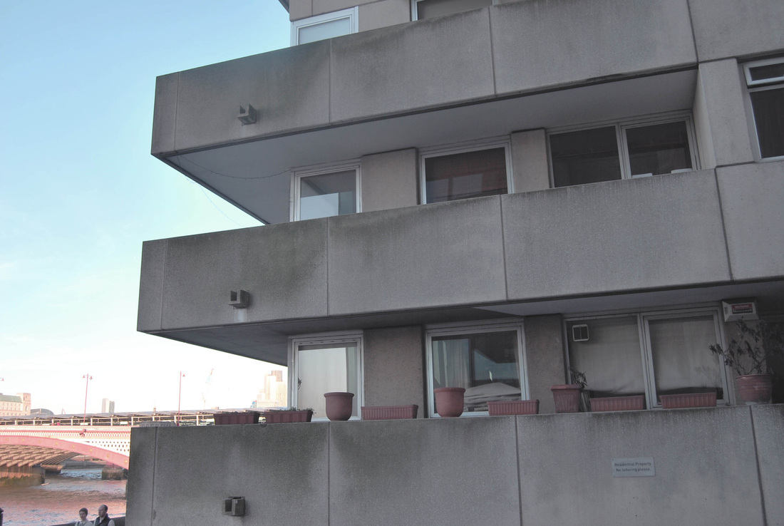
During this photography project I focused on capturing buildings, places, and focused on the way I take the photograph, in a less obvious way. If I photographed The Shard or London Bridge, an iconic blatant landmark, a photograph which has been done many times before, this would make my project lack individuality and originality, which is exactly what I did not want. I have attempted to photograph areas of urban, gritty, real landscapes, but also pale, neat, manmade buildings to show how much diversity London has. I began taking images in Euston and from there walked and captured as many different things as I could, to create variation within the project. Below is my outcome.
|
|
|
|
|
|
|
|
|
|
|
|
|
|
DEVELOPMENTS:
Development one:
Behind and under
Development two:
Looking up
Behind and under
Development two:
Looking up
These images below are examples of how I could base my personal development task on. There are two topics I particularly like; Behind and under, and Looking up. Both polar opposites which shows London in a different perspective than the eye usually does and also presents how big the city is, having so much variety in architecture and design.
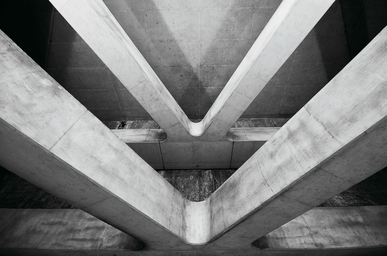
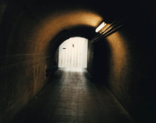
BEHIND AND UNDER
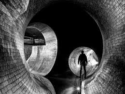
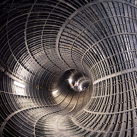
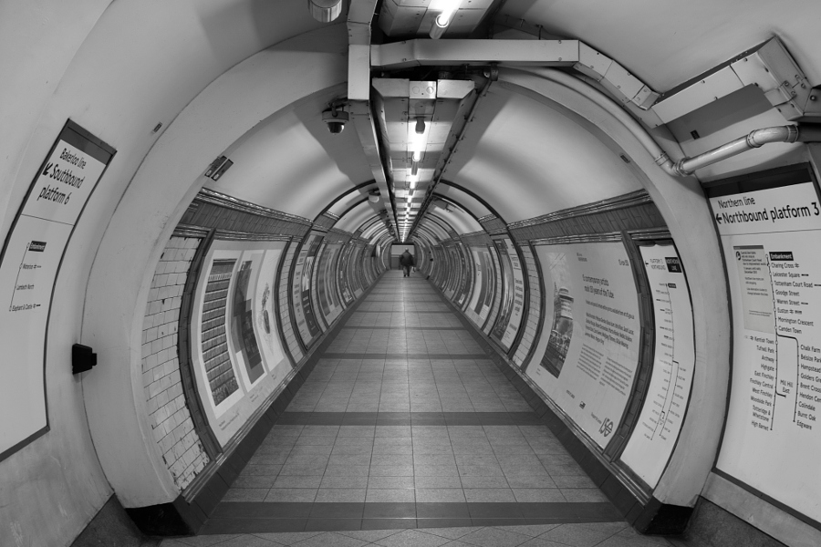
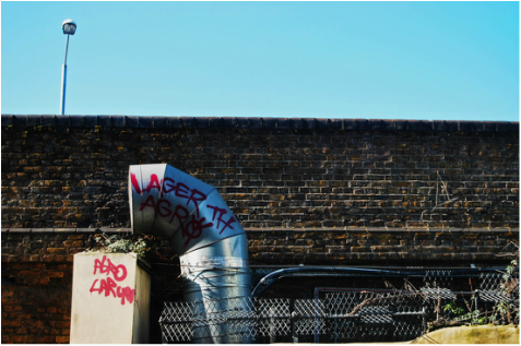
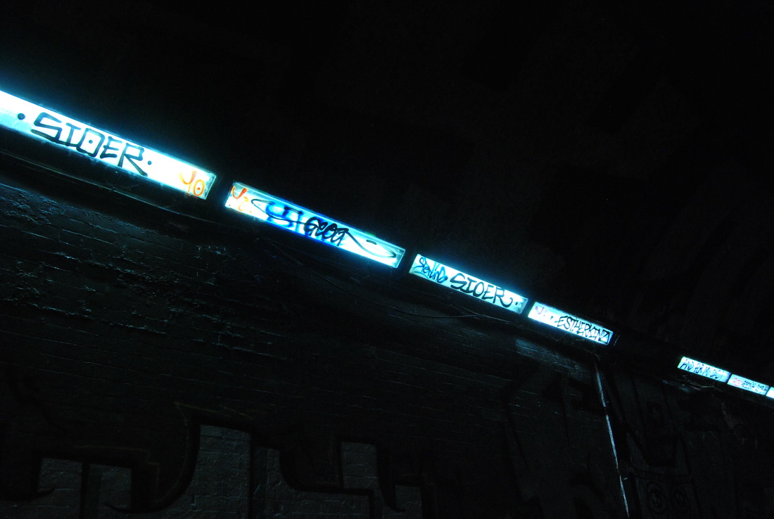
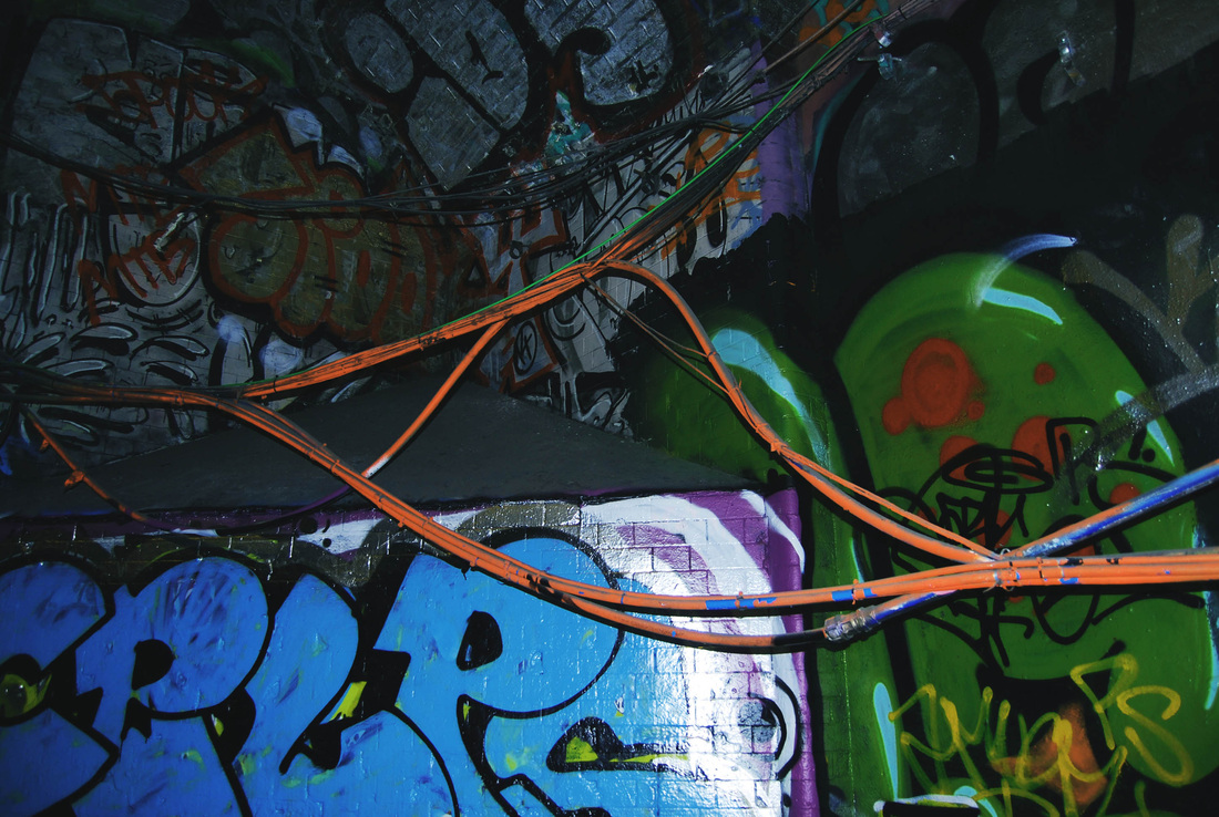
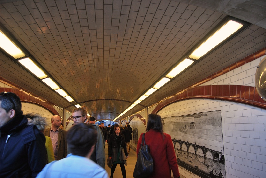
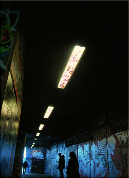
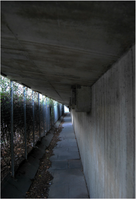
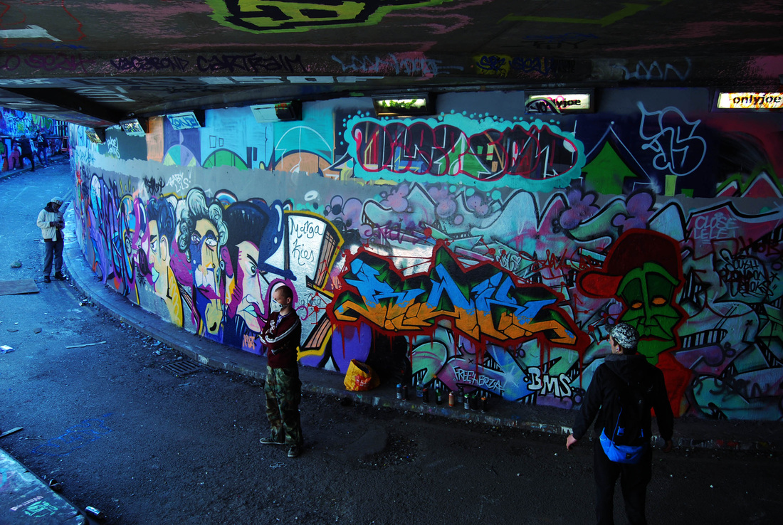
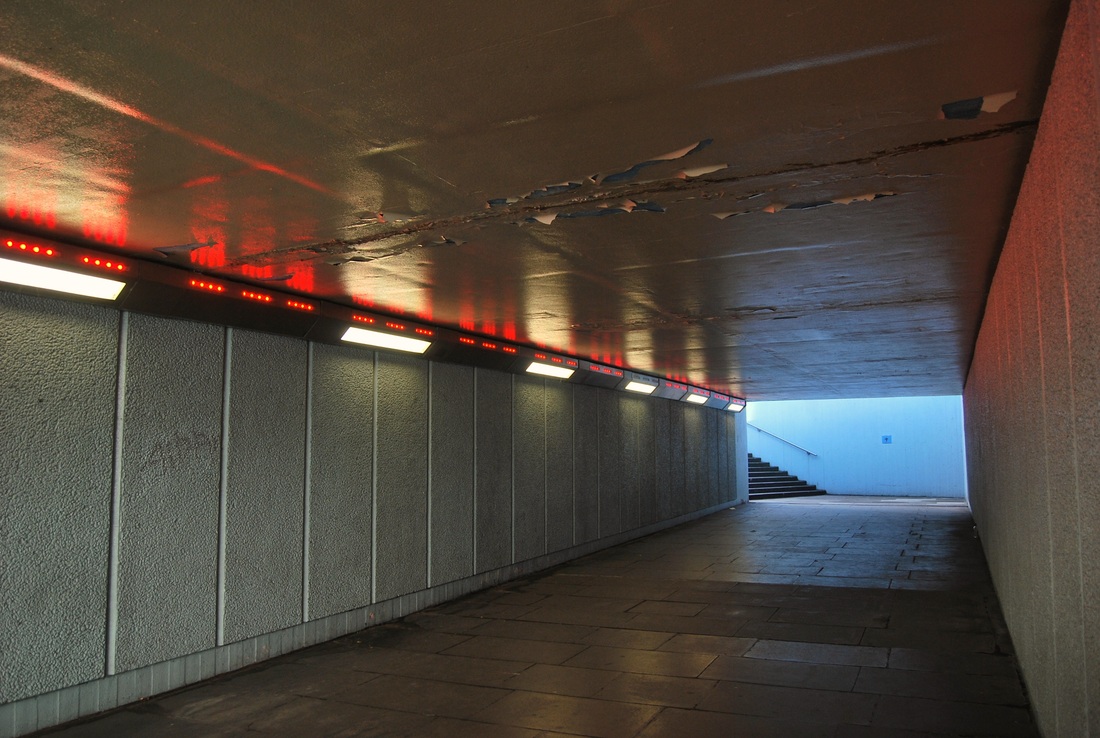
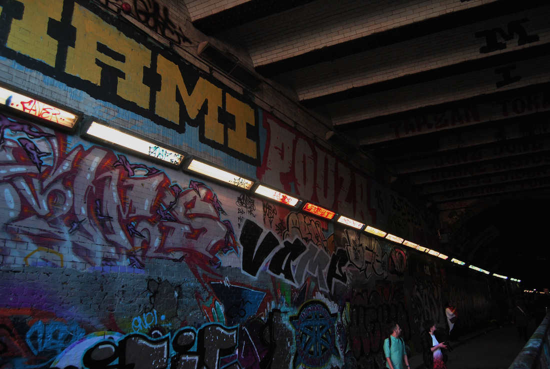
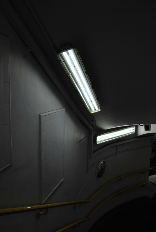
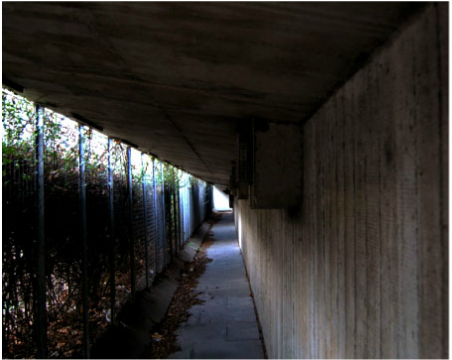
These three images all are Behind and under. I really like this style as it shows interesting shapes and perspectives which I would like to capture with my work on the personal development task. Taking pictures of tunnels allows for an almost claustrophobic aspect. Also, most tunnels in cities are very gritty and are filled with graffiti.
ARTIST INFLUENCE - GILES COULON
Giles Coulon is a french photographer who began his career photographing different facets of French society. He has done many topics during his line of work which include, "White Night" and "Daily Life". "White Night" was a photographic research project on light bulbs and how they could be portrayed around the world in different environments and aspects of life, these were mostly done in hap hazards and situations. The project carried out over a period of four years.
|
|
|
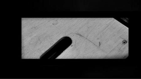
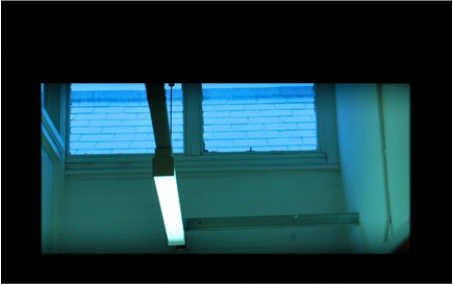
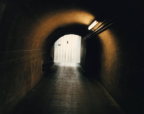
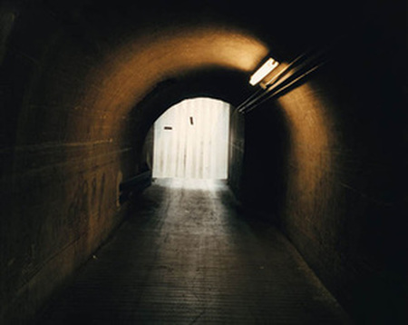
Left- This photograph has a eerie feel throughout, especially with the focus being on the white plain 'shape' at the end of the tunnel. It is hard to make out what exactly is there, due to the way it was captured, however this only adds to its haunting impression. The contrast between the dark brown/ black colours and the bright white light almost present a deathly feel. I think this strongly represents "behind and under" in a effective way, I will try and recreate this in my response and aim to go to locations with the same look/feel.
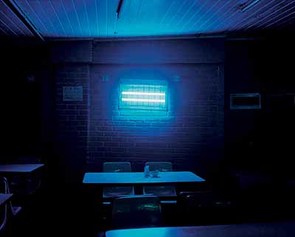
Middle- I particularly like the colours in this image; the tones of blue present an icy lonely scenery. However, this photo has a clear representation of hope when lost in a bleak, desolate place. This is a very simple scenery for such a thought provoking photograph which is why I like it. The focus on the bright light in such a dark room is very effective and is something I would like to include when I respond, to do this I will aim to go to locations with lights and a dark atmosphere.
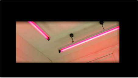
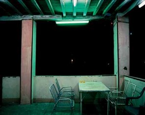
Right- Giles Coulon mentioned that neon was an essential and universal tool, present in South and North areas and gives new life to an image. Here he has captured this with the neon light flooding the photo throughout with its piercing bright colour. I particularly like this photograph as it features basic materials and colours and yet it is so drawing. I liked this image for the fact that it is so simplistic but effective. This is something I will again try to capture in my photography.
Middle- I particularly like the colours in this image; the tones of blue present an icy lonely scenery. However, this photo has a clear representation of hope when lost in a bleak, desolate place. This is a very simple scenery for such a thought provoking photograph which is why I like it. The focus on the bright light in such a dark room is very effective and is something I would like to include when I respond, to do this I will aim to go to locations with lights and a dark atmosphere.
Right- Giles Coulon mentioned that neon was an essential and universal tool, present in South and North areas and gives new life to an image. Here he has captured this with the neon light flooding the photo throughout with its piercing bright colour. I particularly like this photograph as it features basic materials and colours and yet it is so drawing. I liked this image for the fact that it is so simplistic but effective. This is something I will again try to capture in my photography.
MY RESPONSE:
Below are my pictures of Behind and Under. These are all images of tunnels in London. I chose to expand "My London" on this particular style as it shows places I wouldn't typically stop and admire. When paying close attention to these places you really grasp its sheer beauty and understand why adding something as simple as lights to brighten the tunnel adds an interesting aspect to your photograph. I edited these images using photoshop, using curves and hue/saturation to adjust the contrast and the saturation of the images.
|
|
ARTIST AND ME
I think the images below are particularly similar. They both are dark tunnels with a bright light at the end and signify hope within a desolate place. For this comparison I edited my photo to attempt to imitate the colours and contrast.
|
Giles Coulon's work:
|
My work:
|
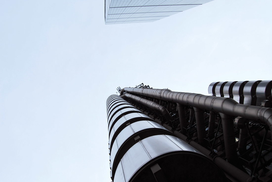
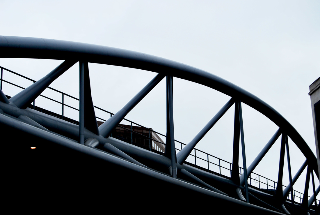
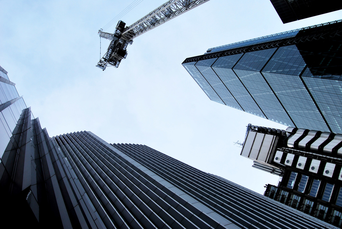
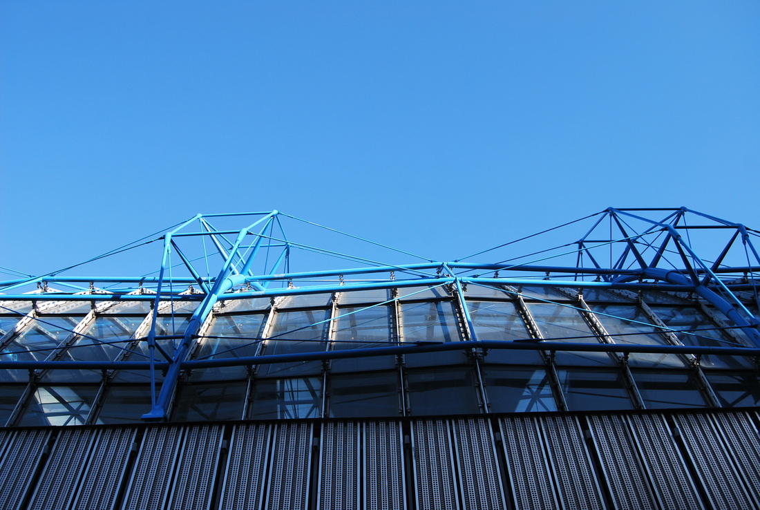
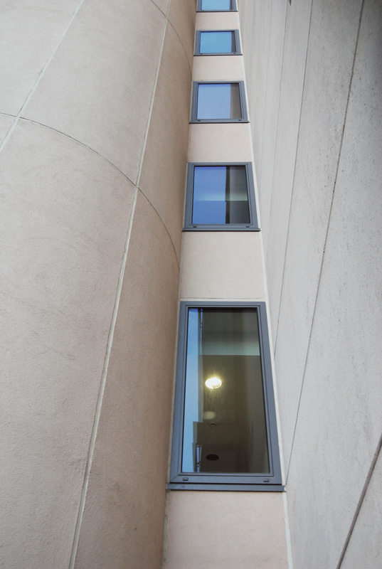
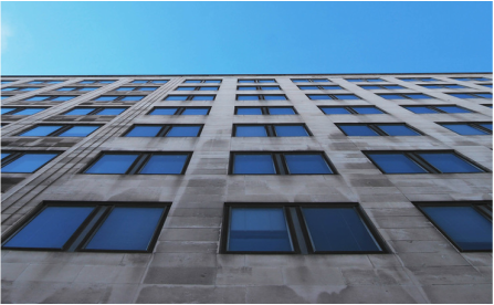
LOOKING UP
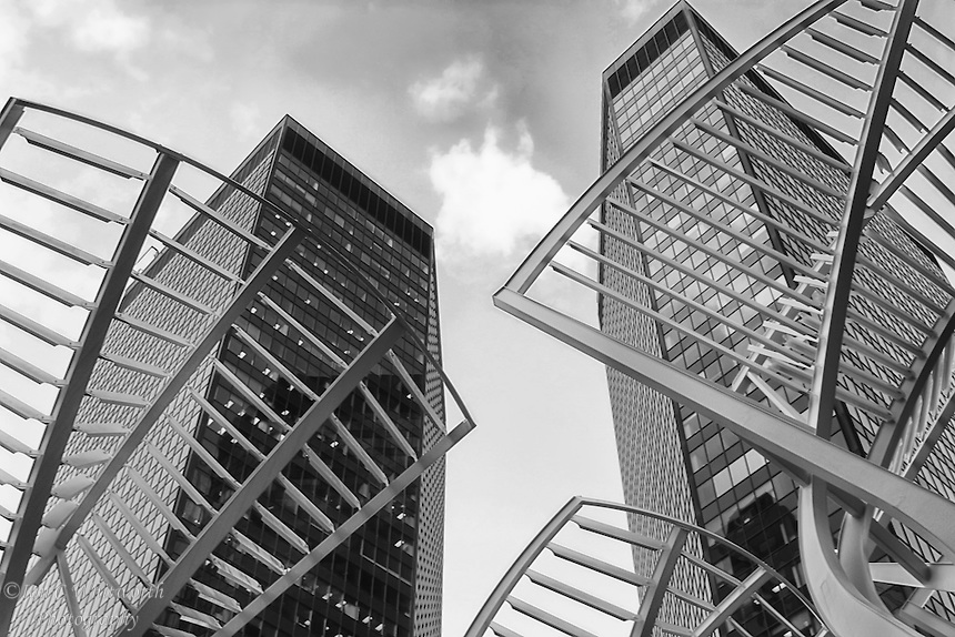
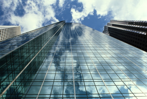
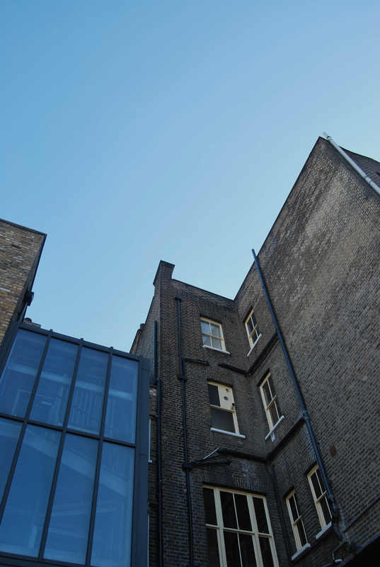
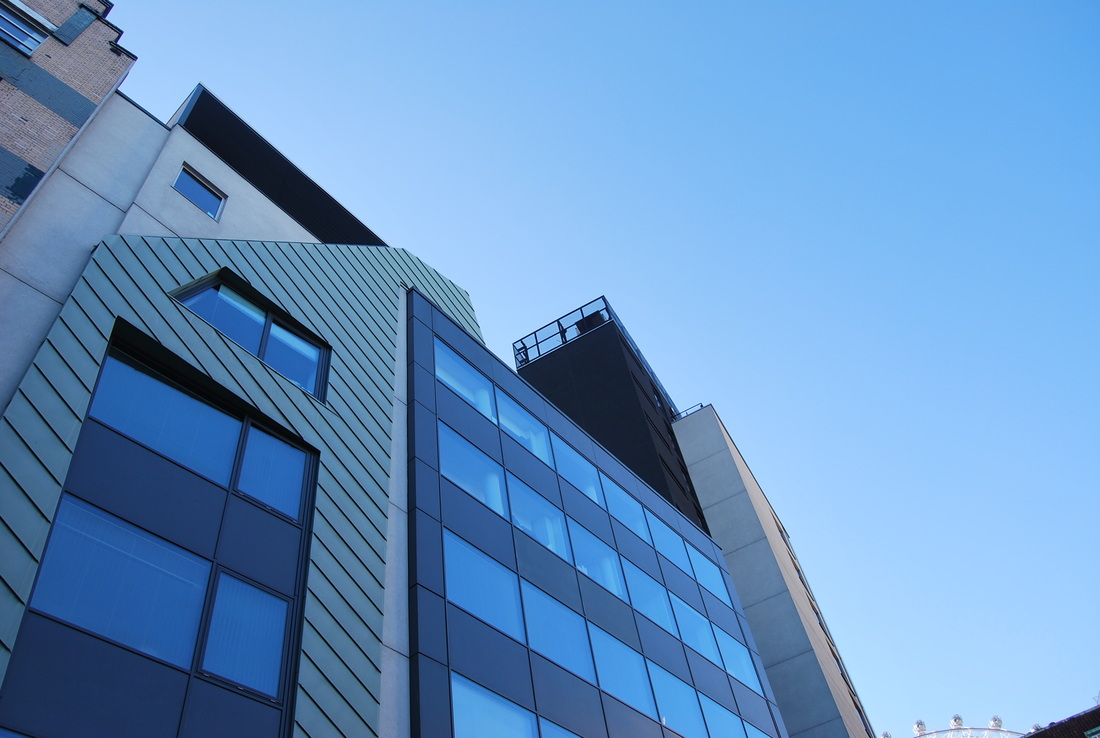
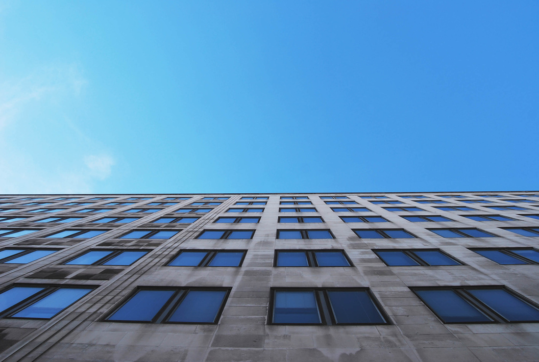
The Looking up images I have chosen are all particularly interesting and show a world I rarely look at. This is an angle I almost never see and shows a different aspect of an area or city that I could photograph. They not only fit their title but shows a variation in shapes and style which really caught my attention.

MY RESPONSE:
The images below this are pictures of Looking up. I also chose to expand on this subject as I had a particular interest in the shape and architecture of buildings and how they are perceived when looking from our view(humans) up at these huge constructions. I decided to take images for this section on two days so that I could get images combining two perspectives of the buildings, how they looked on a summery day vs how they look on a rainy, cloudy day. The results were rather interesting and convered the image into something much more gloomy and gritting and enhanced the concept that London was an urban, concrete filled city acting against nature. Below are the result and once again, these images are all edited using photoshop.
|
|
|
|
I began to experiment more with photoshop and used curves, hue/saturation and black and white to make this whole image on the right. Here I have put before and after to give an example of the effects of the tools I have experimented with.
|
Before
|
After

|
ARTIST AND ME
I think my work responding to "Looking up" is similar to Matt Lively's work. Matt Lively is an architectural photographer based in the UK. His exterior work features many photographs taken in the composition "looking up". Despite their similar compositions, I think they are similar by the fact the building acts as a focus point of the image and enhances its sheer size.
|
Matt Lively's work:
|
My work:
|

VISUAL MINDMAP:
This will outline how I have come to my final piece.
First I responded to My London capturing a variety of photographs of buildings in London. I tried to capture less obvious buildings to create a more interesting response.
|

|
Google images:

|
Giles Coulon's work:
|
Development 1: I then looked at google images and Giles Coulon of "Behind and under" themed photographed to create a focus for my work.
|

|

I then responded with my own images of "Looking up."
|

|
Development 2: I then looked at google images and chose specific images representing 'Looking up" to respond to. This would then contrast to "Behind and under" and show how different a city can be.
|

|

|

I then responded with my own photographs for "Behind and under."
|
When developing my original photos I came to "Looking up." I really liked the outcome to this and thought that photographing images from this angle presented a whole new unique photo, a photo that looked like the building, full of windows, was never ending. This was where I then got the concept of my final piece.

FINAL PIECE
THINKING OUTSIDE OF THE BOX
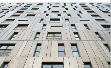
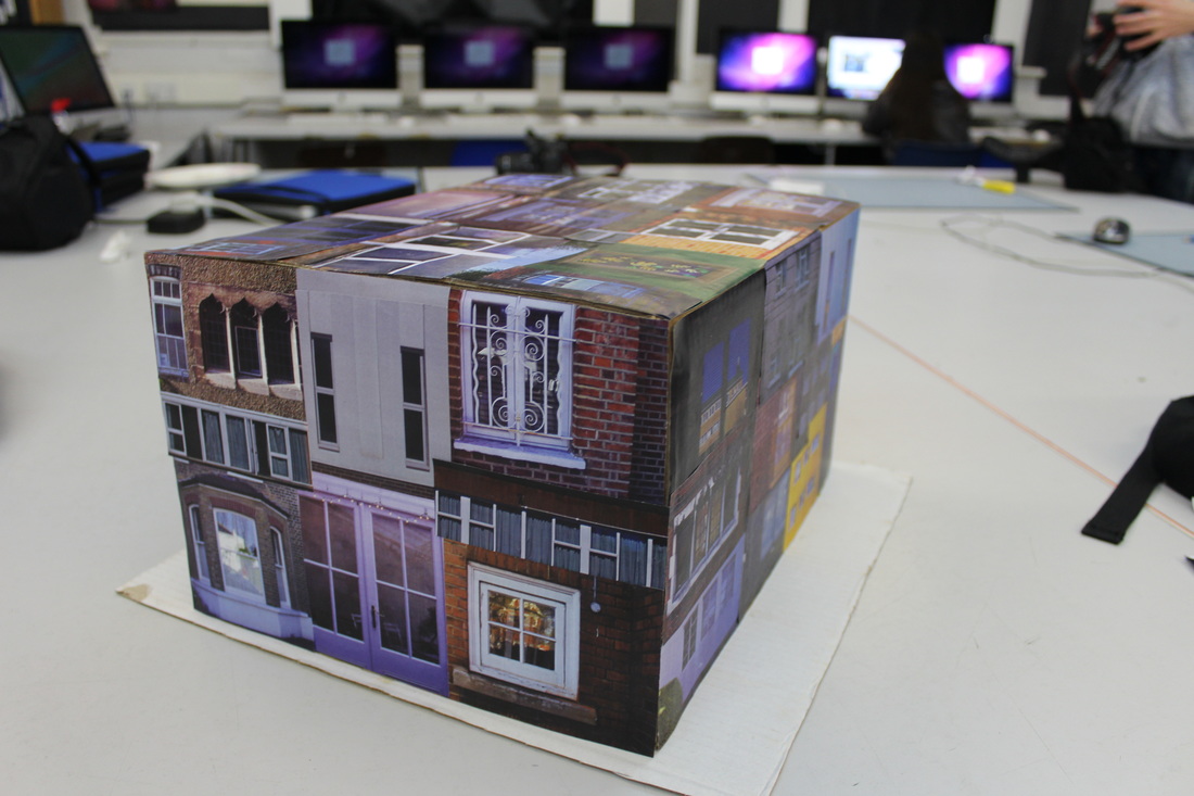
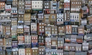
For the final piece, I noticed that during my, My london project I took a particular interest to architecture. In particular buildings and the way they are formed and what about them makes them so unique. So, whilst pondering on this thought, I discovered that I was going to expand My London even further by taking lots of pictures of windows and creating a whole montage of them. In doing so, this shows you a small glimpse on the condition of the building, the type of person that lives inside the 'window' ( if they have any decor around or on the window shelf and what type it is ect ) and what design the building was presenting itself with. I decided to do this because I believe that people in a city/town don't particularly pay attention to the structure or style of a window, they use it simple to view an interior or exterior of either views and by taking pictures and creating a whole college of them, gives them some attention and allows you to view their individuality. I also got inspiration from this from my developments and from Micheal Wolf, who photographs big expanses of buildings, including windows. Looking back at the images he took and I included at the start of my project, I thought that the surrounding environment to these buildings and windows gave a direct indication of the condition/ economic state the person living in it is was in and the condition of the area it was located in. This is something I would like to also include in my final piece as I think this is very interesting and something I would like to incorporate.
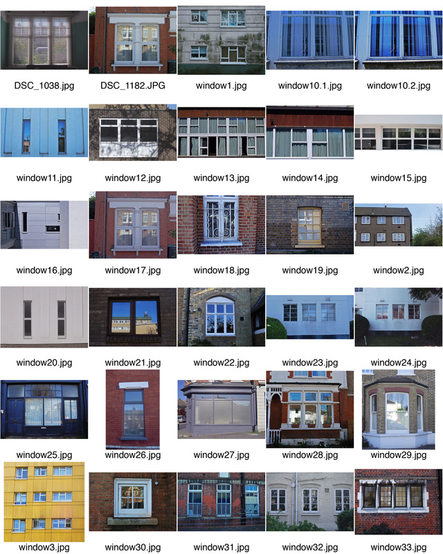
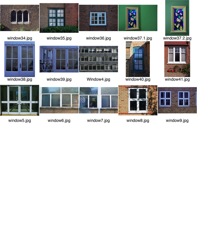
Here are all the windows I have used to make this college:
Here are all the windows I have used to make this college:
|
|
MY RESPONSE:
First I began my response by creating a college of all the windows and their environment in photoshop. However, I don't think this was very effective and thought I could expand it.
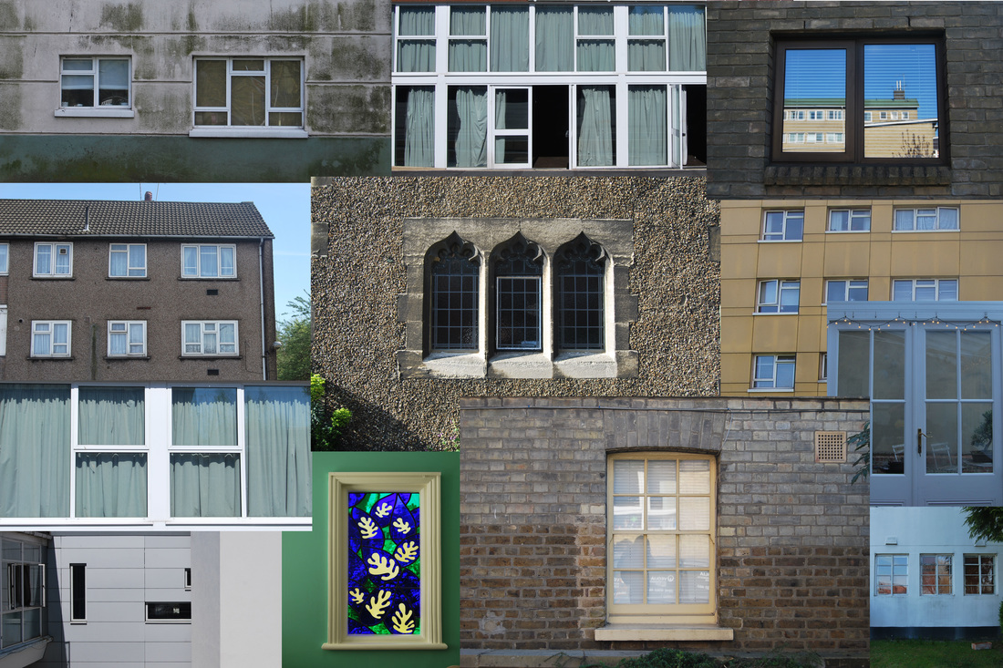

Then on photoshop i removed the background by using the magnetic lasso tool and inversely selecting the background to remove it. I then arranged the windows in different ways experimenting with different sizes and angles.
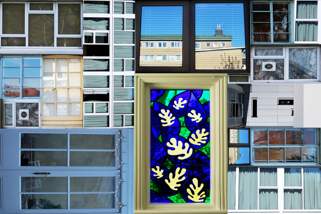

SECOND RESPONSE:
BEFORE
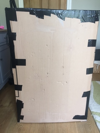
I decided to develop this idea further, and although wanting to keep it simple, I decide to make my own 'building' of windows to make them more seen, rather than simply taking a photograph and printing it. This then gives a sense of a three dimensonal element, and also gives you chance to really view the contrast between each window, as they are positioned next to each other.
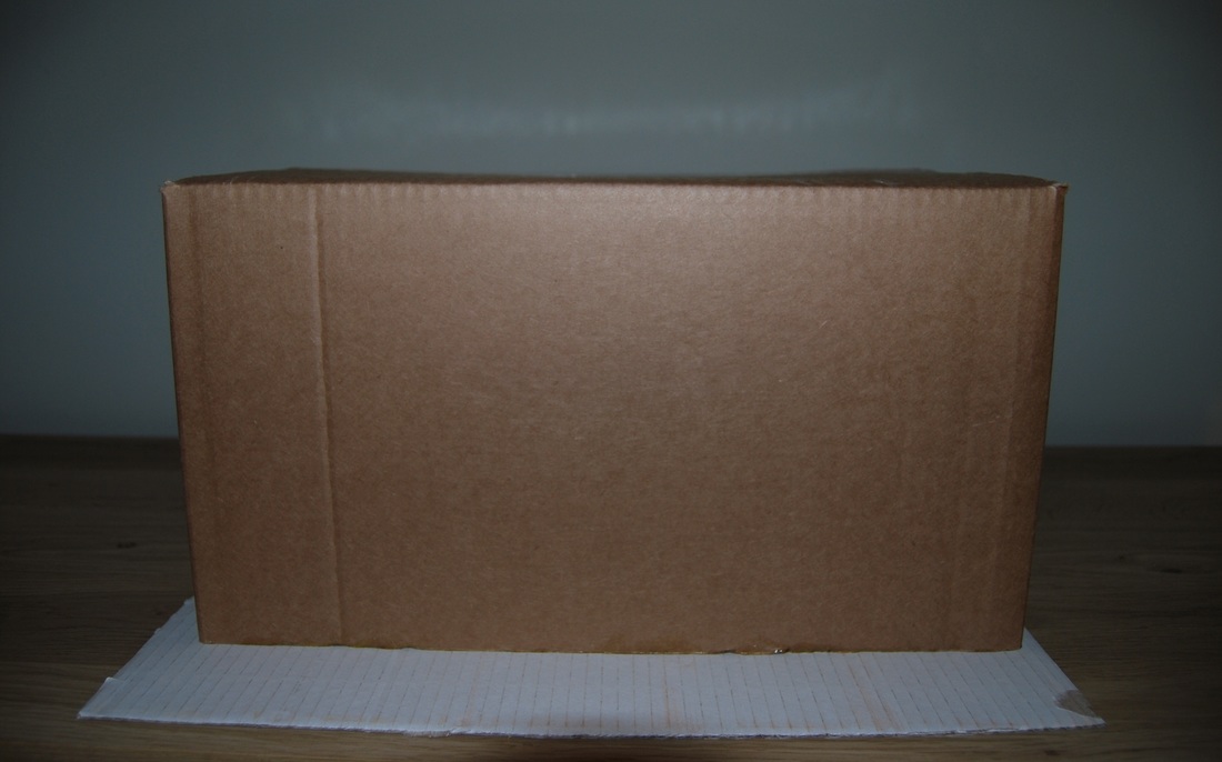
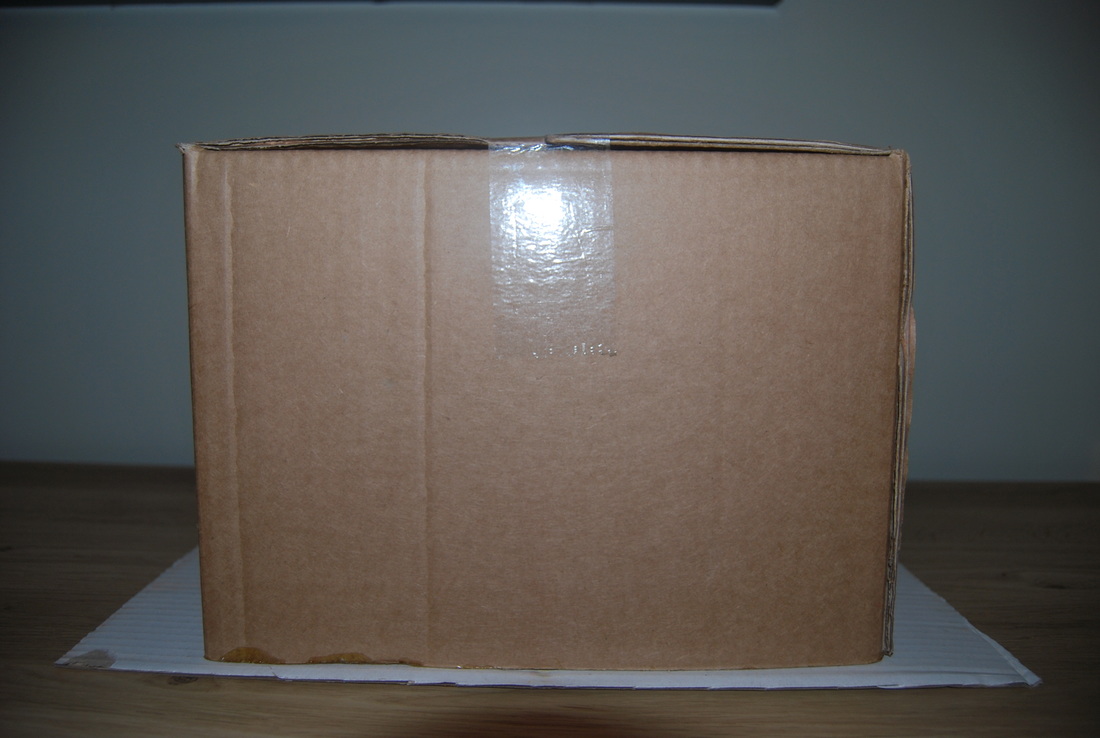
So, by doing this, I began with a simple structure: I made a cardboard complex secured to a plain white cardboard piece, like presented below:
So, by doing this, I began with a simple structure: I made a cardboard complex secured to a plain white cardboard piece, like presented below:
|
|
AFTER
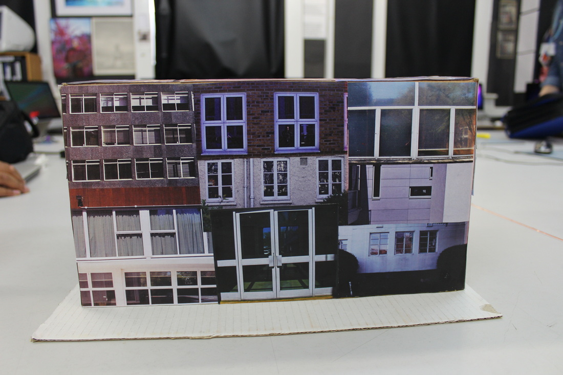
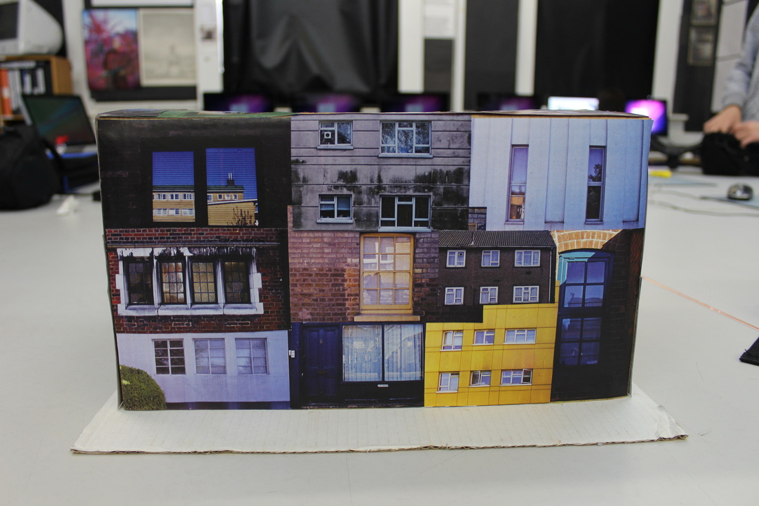
Then during the mock exam, I glued the pictures of the windows to the structure to create my own 'building' of different windows.
|
|
|
FURTHER DEVELOPMENT
After having this result of the box of windows, I decided i want to improve it further to make it bigger and better and stress my subject matter in more depth.
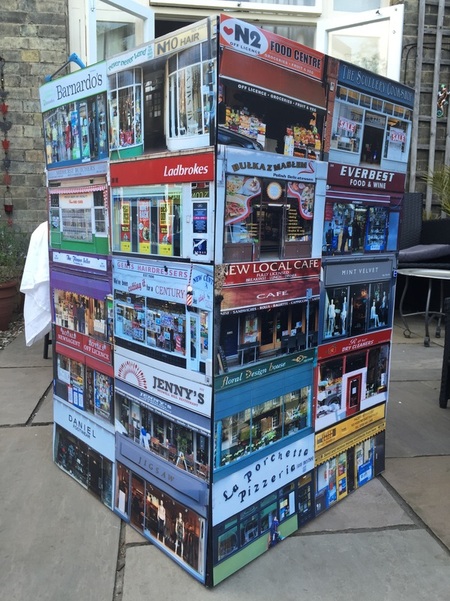
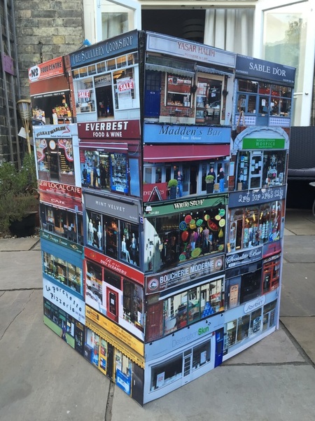
ARTIST INFLUENCE - BARNABY BARFORD
Barnaby Barford is a photographer who commonly works with ceramics to create narrative pieces. His work focuses on all aspects of society, in attempt to recreate a portrait of modern life. His work has been displayed at various exhibitions and he has received multiple awards for his creative work. Below is a piece called "Towel of Babel" which i think is something i aim to imitate with my work.
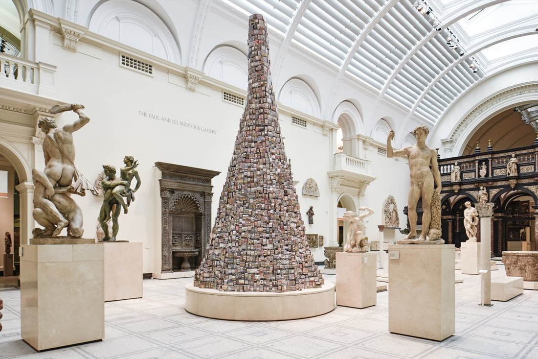
Above, is Barnaby Barford's "Tower of Babel" piece. It is around six meters tall with 3000 china shops each one unique in its own form presenting the variety of shops available for consumers to spend their money on. The piece tells an array of stories about London, it's societal values, economic situation and about the people who live and consume within the capital city. Barford has very cleverly displayed the shops in a particularly order, the derelict and shops with less value at the bottom while London's more exclusive boutiques and galleries are featured at the summit, almost presenting a parallel to their social status and basing its' value on this. The precarious tower represents how consumers find fulfilment through retail but confronts the choices we make as consumers through necessity or desire. I think these images are particularly effective, the fact that there are so many buildings also includes the evermore prominent issue of overpopulation. Also, i think this gives an accurate representation of globalisation and how diverse London has become with an increasing rate of immigrants integrating and influencing British culture. I will try and recreate the shop aspect as an expansion, I will also try to recreate the three dimensional aspect by creating a giant box and attaching the photographs.
MY RESPONSE:
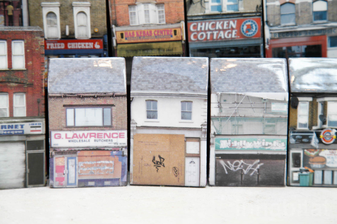
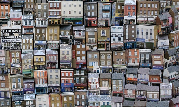
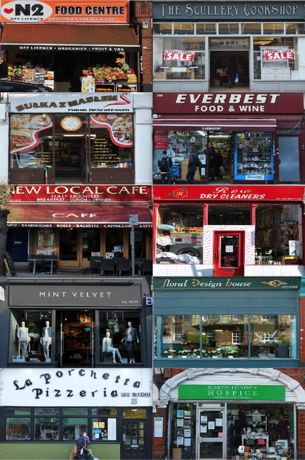
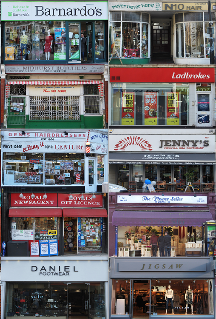
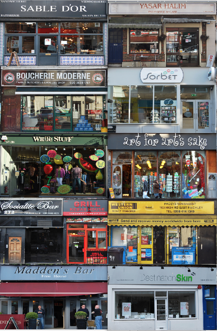
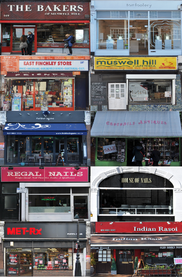
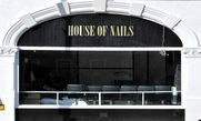
For this response I went around Muswell Hill and East Finchley and captured all the different shops. I think this was particualrly interesting as it showed the different types of shops avaliable and what audience it was caturing to, revealing cutural aspects of the areas. Below are all my images. I edited these photographs on photoshop and cropped them to a 30cm by 18cm size then enhanced their colours and contrast so that when they are placed together there is a more overall effective outcome.
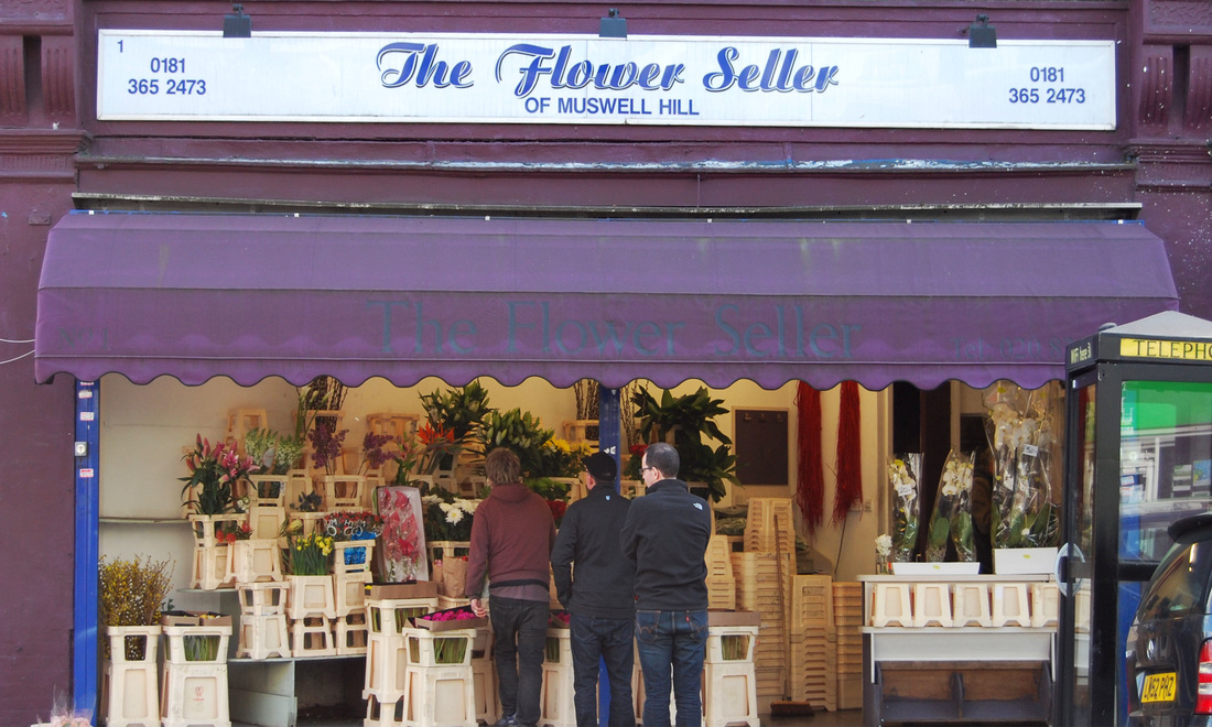
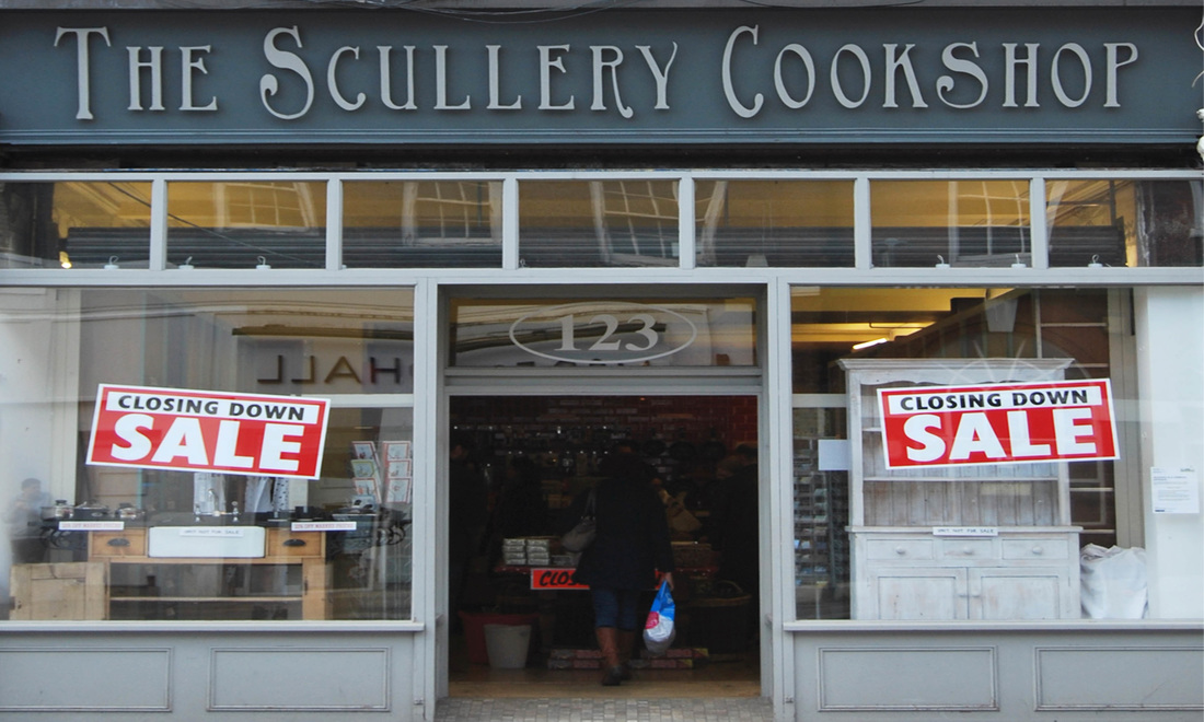
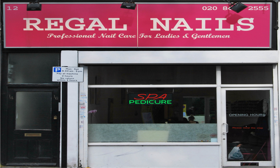
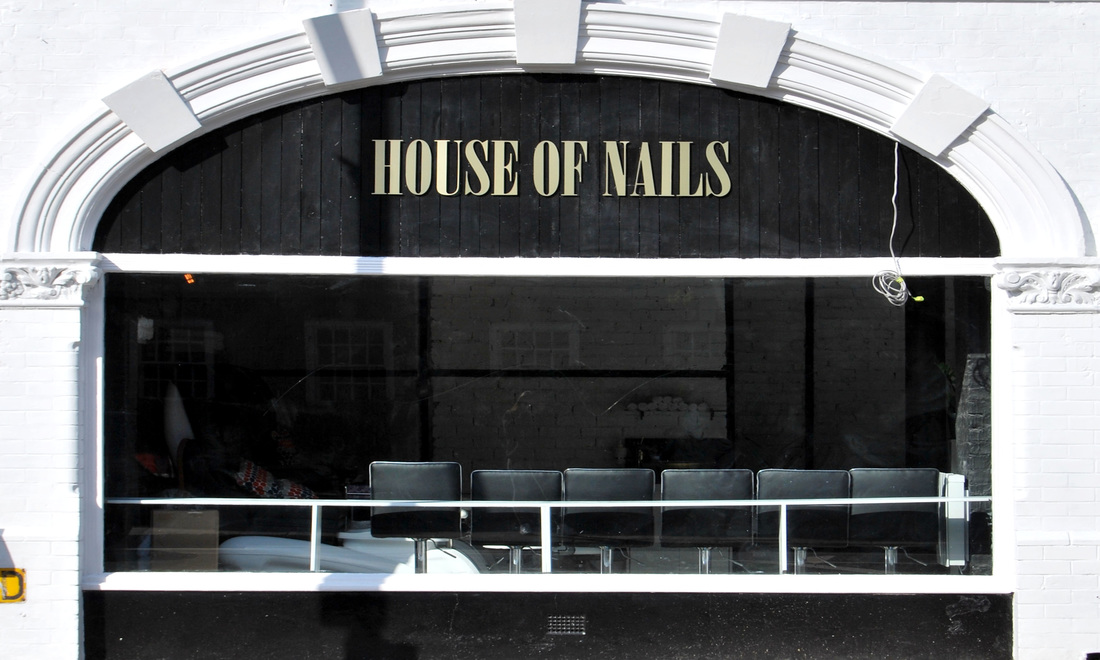
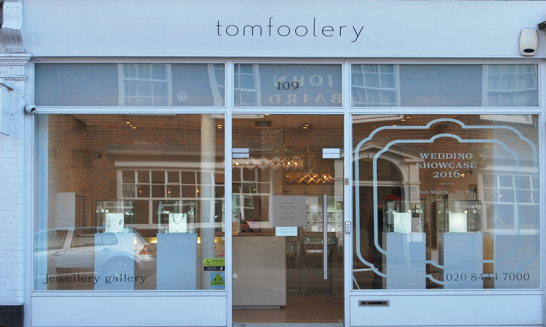
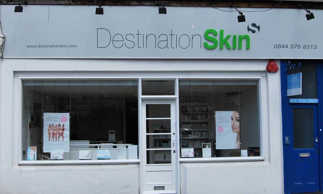
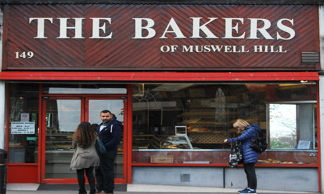
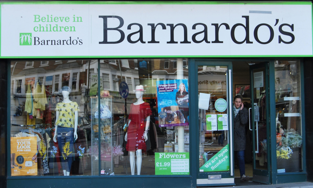
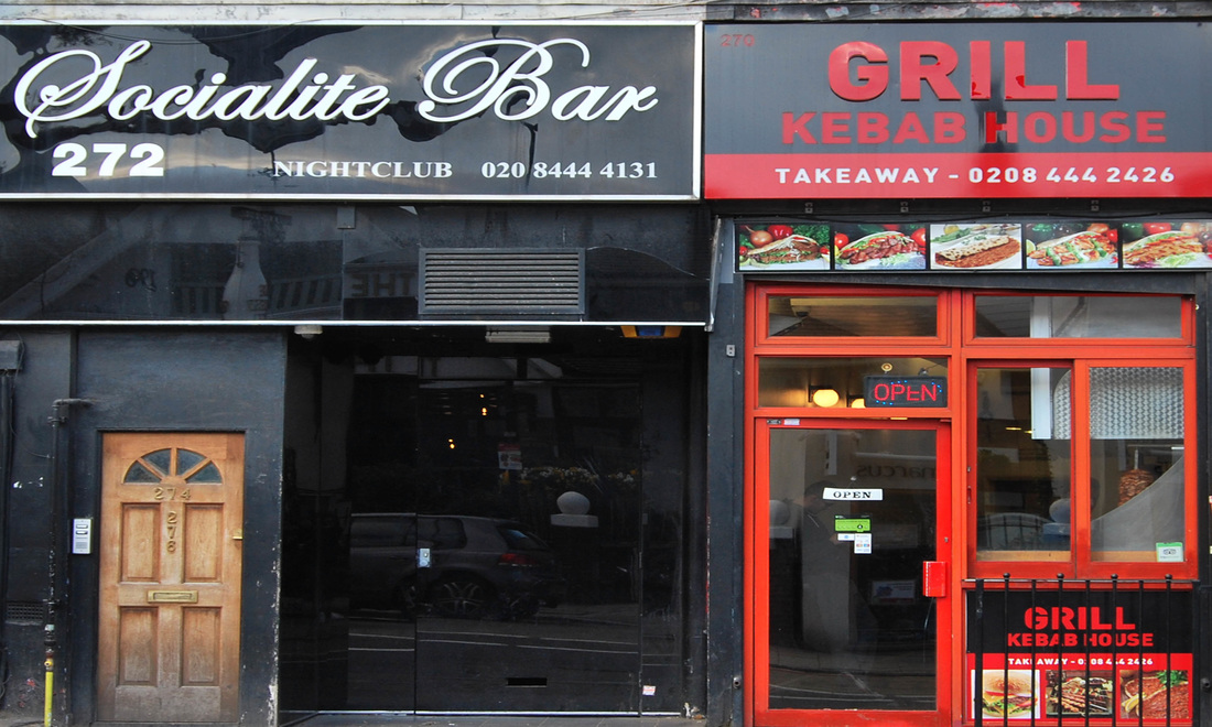
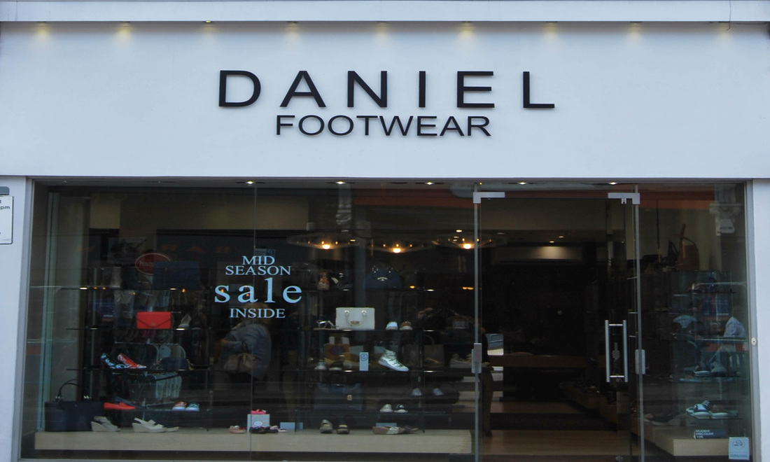
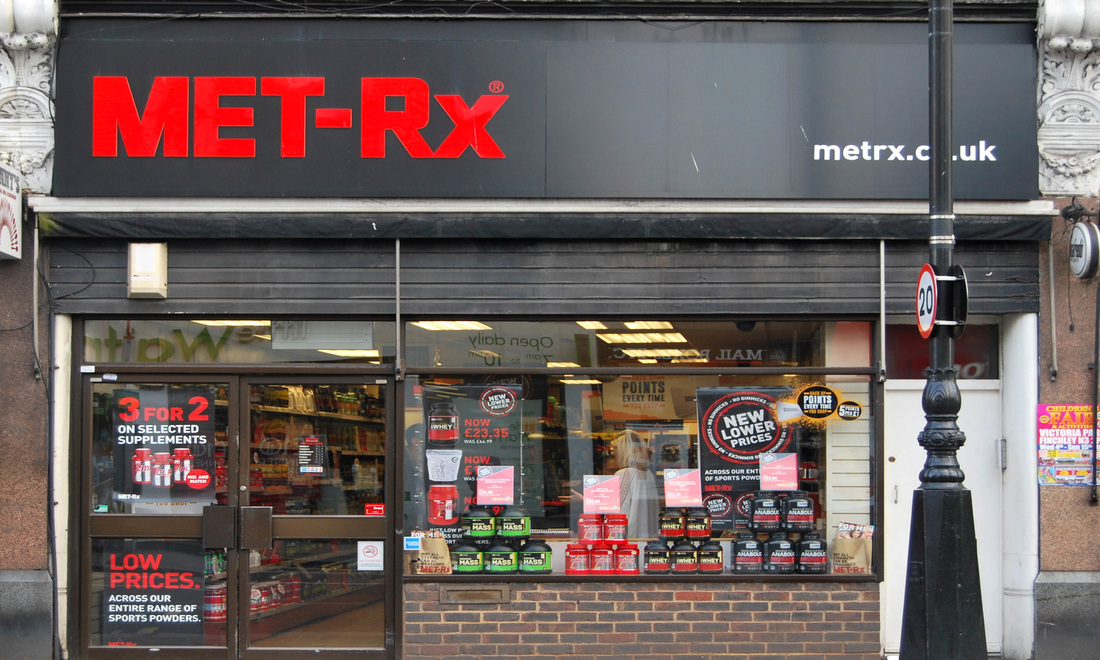
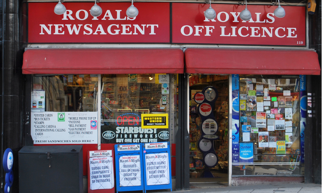
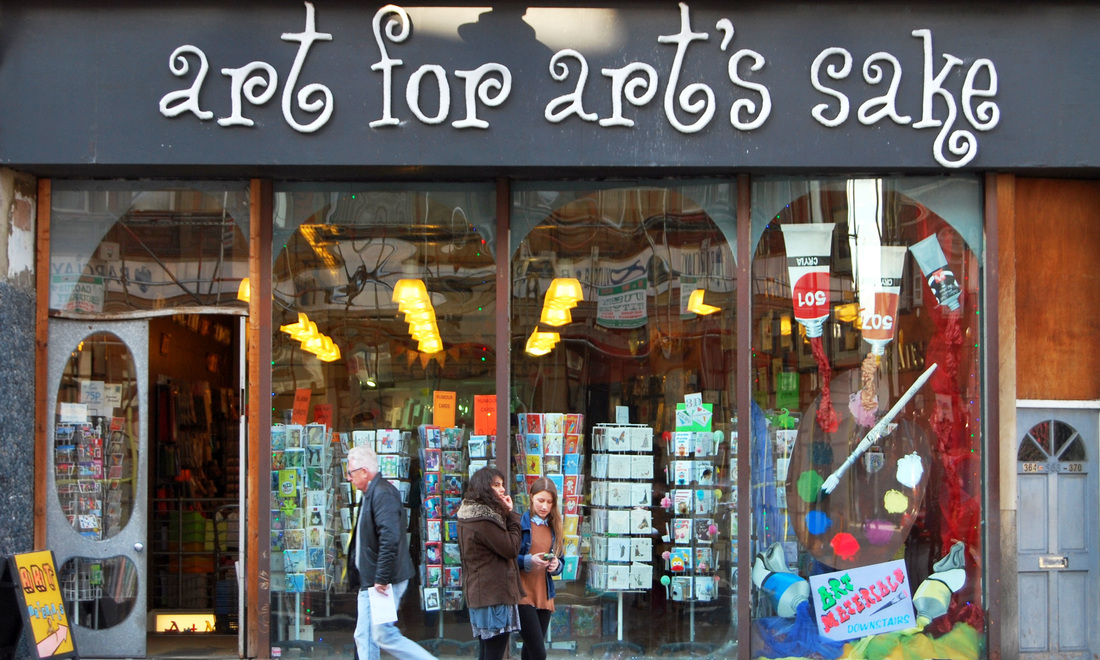
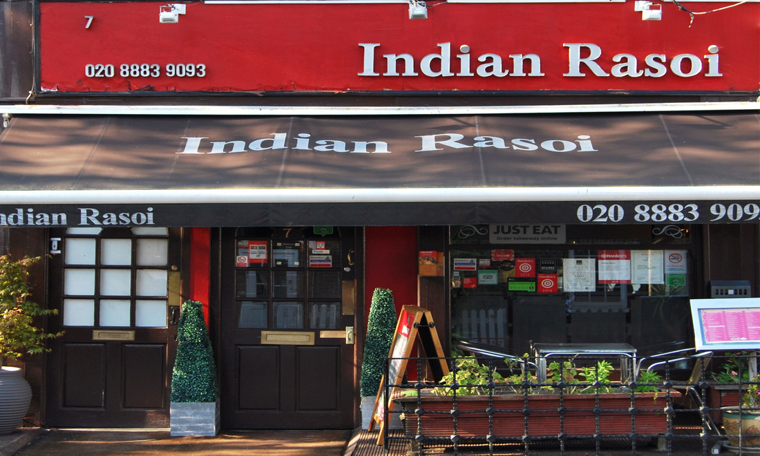
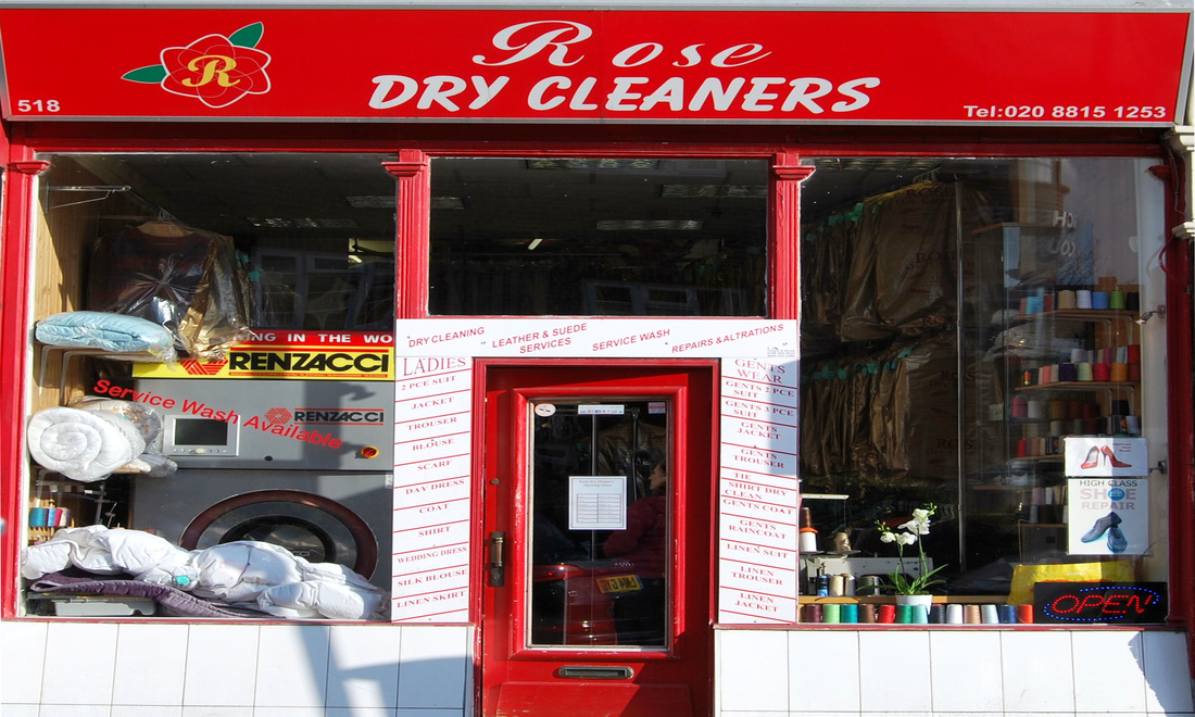
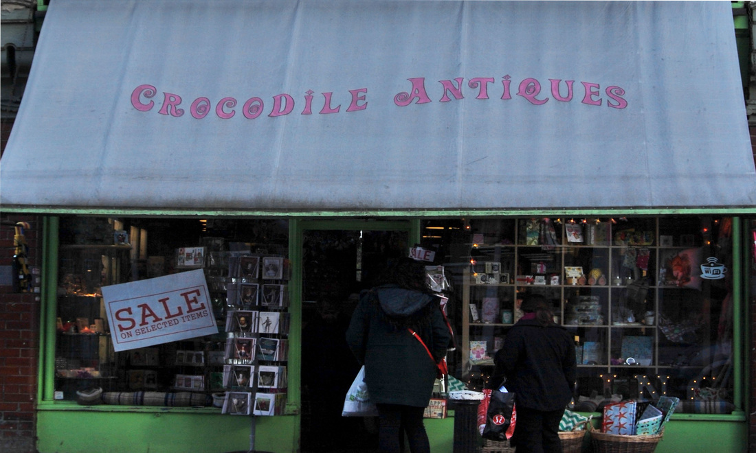
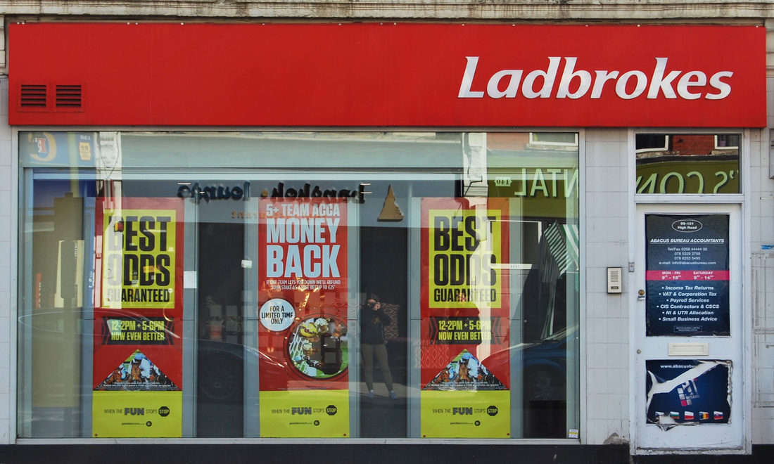
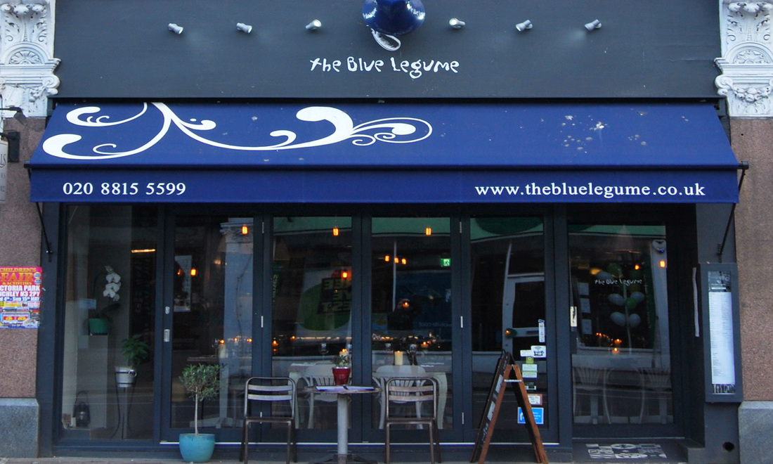
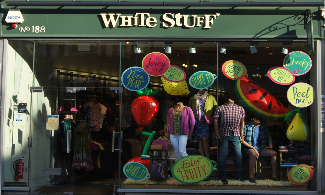
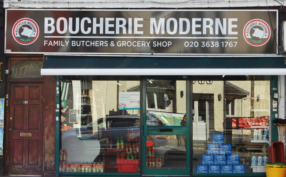
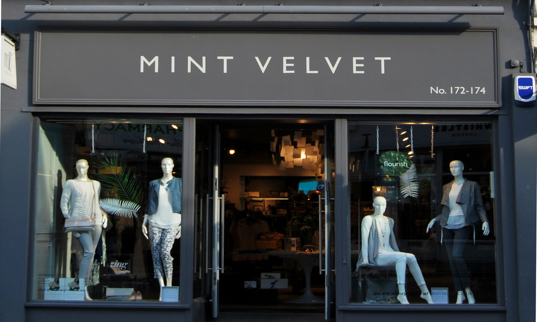
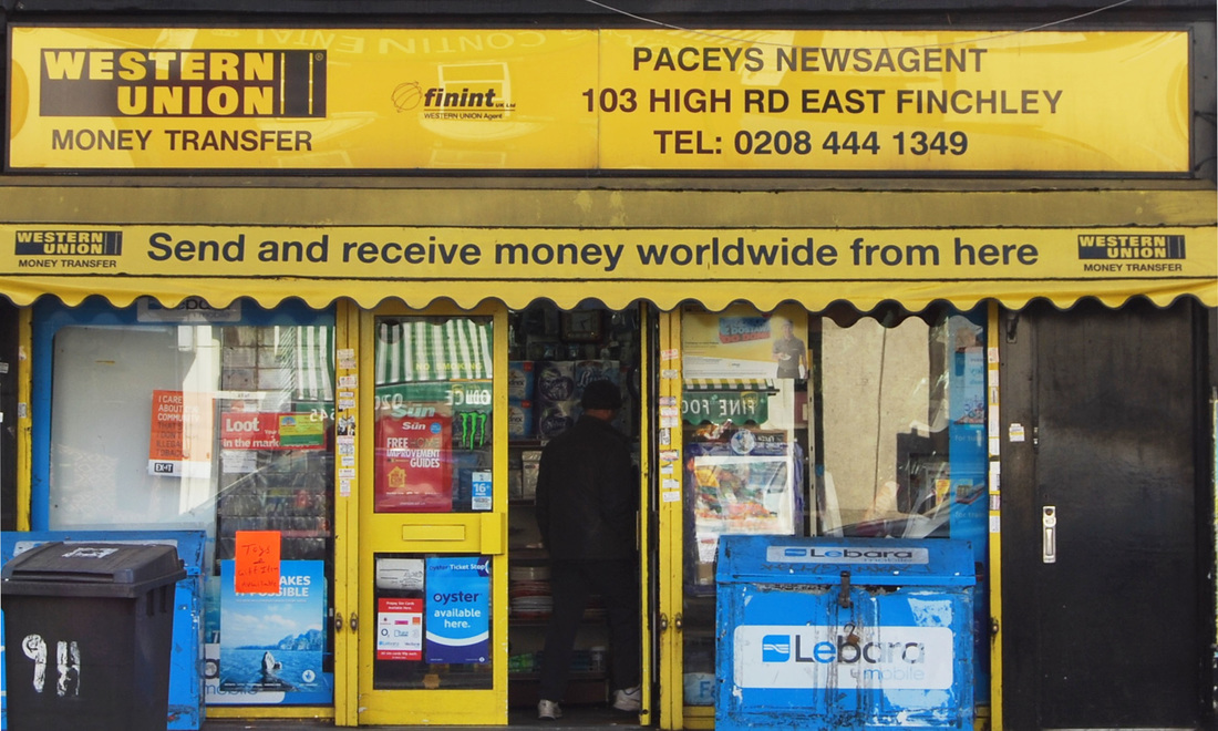
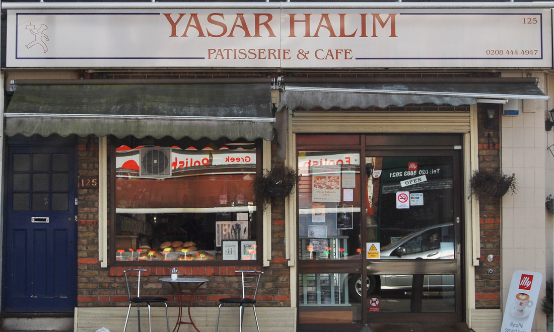
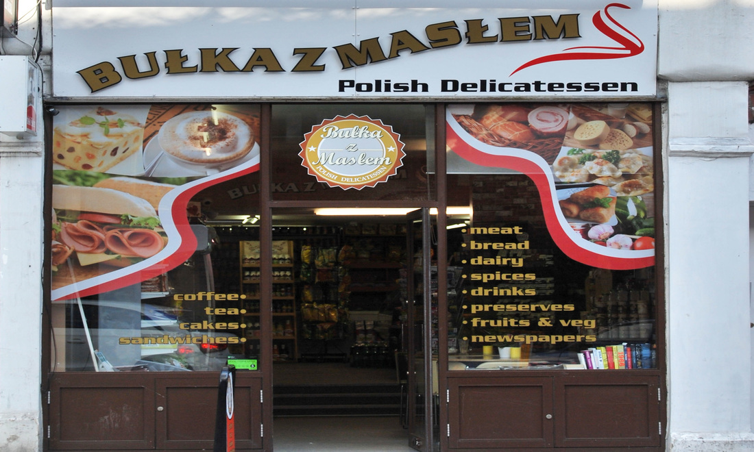
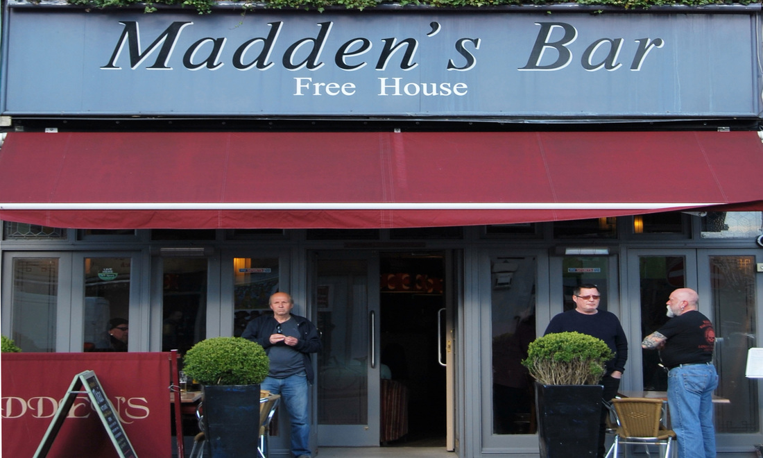
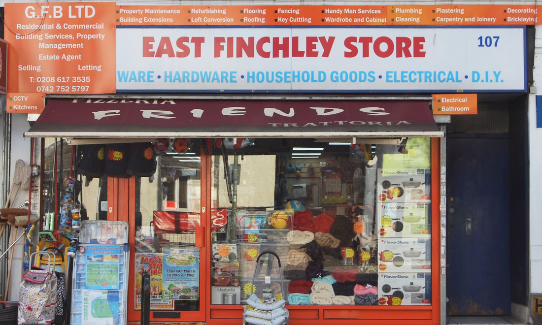
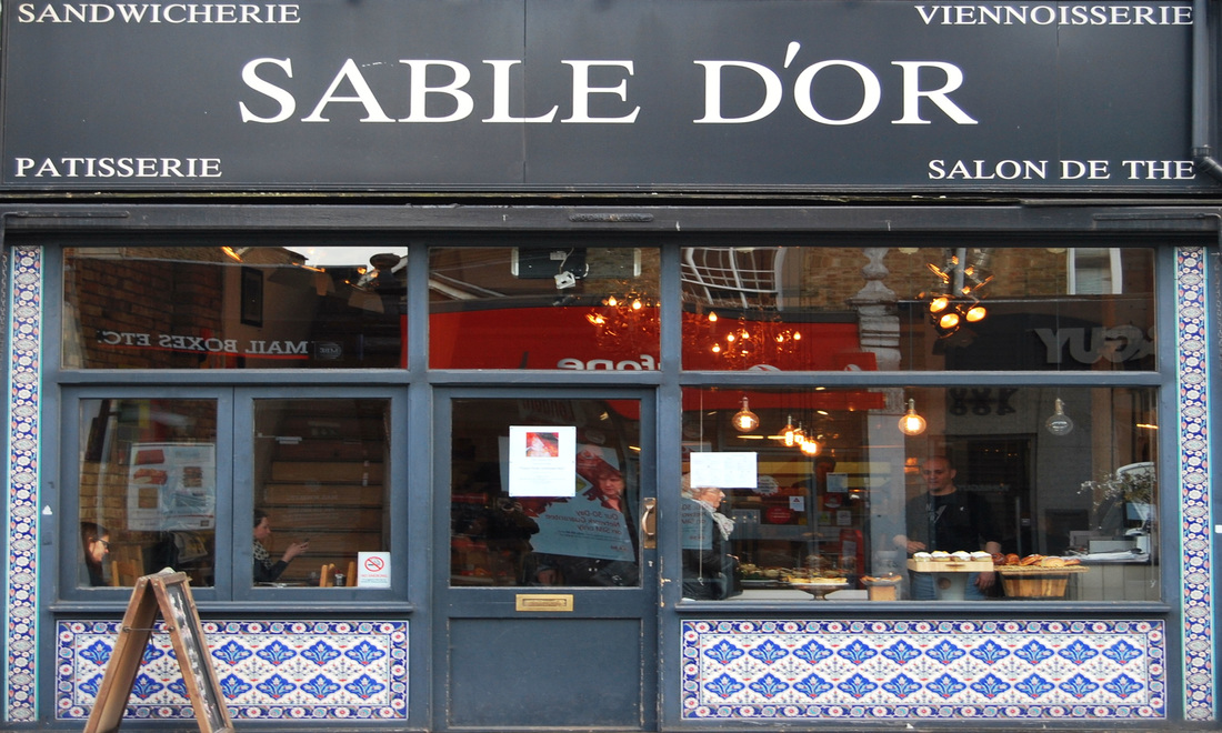
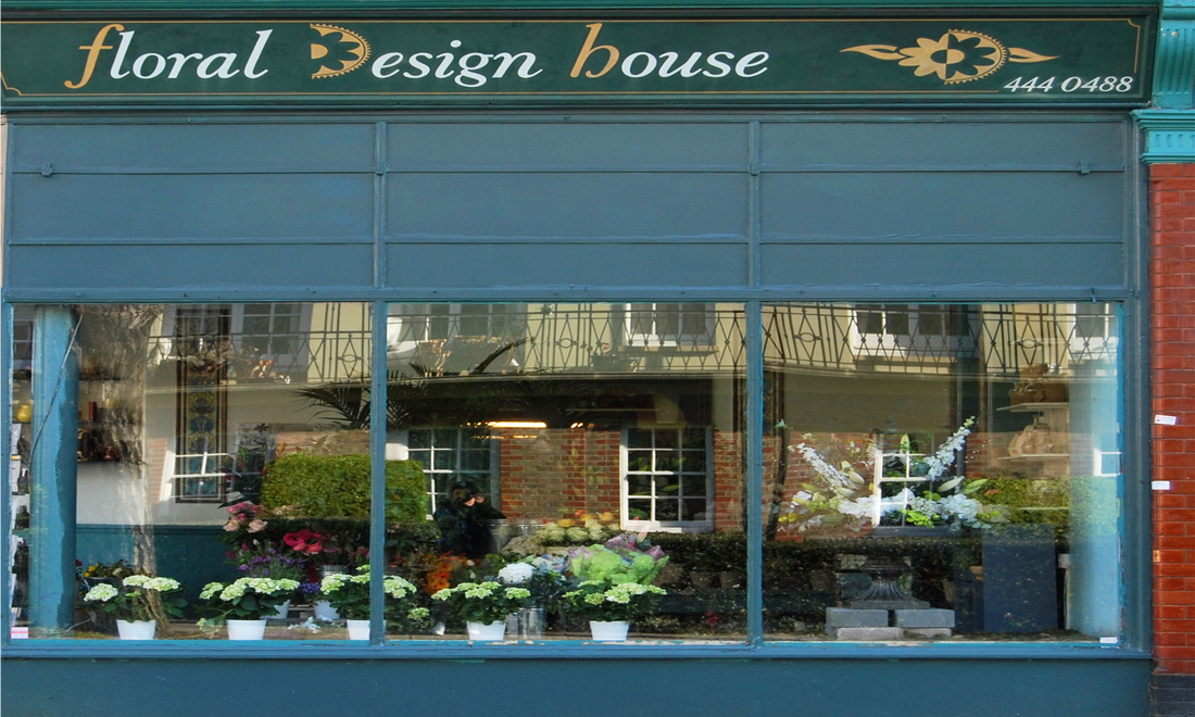
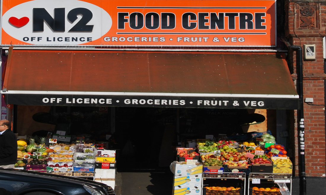
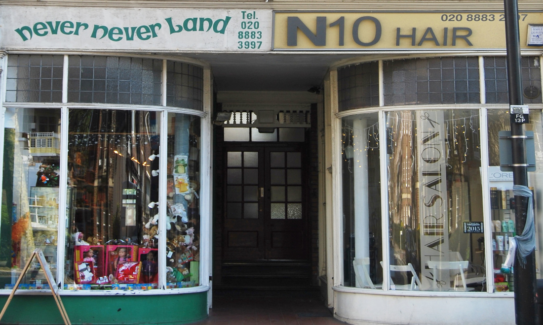
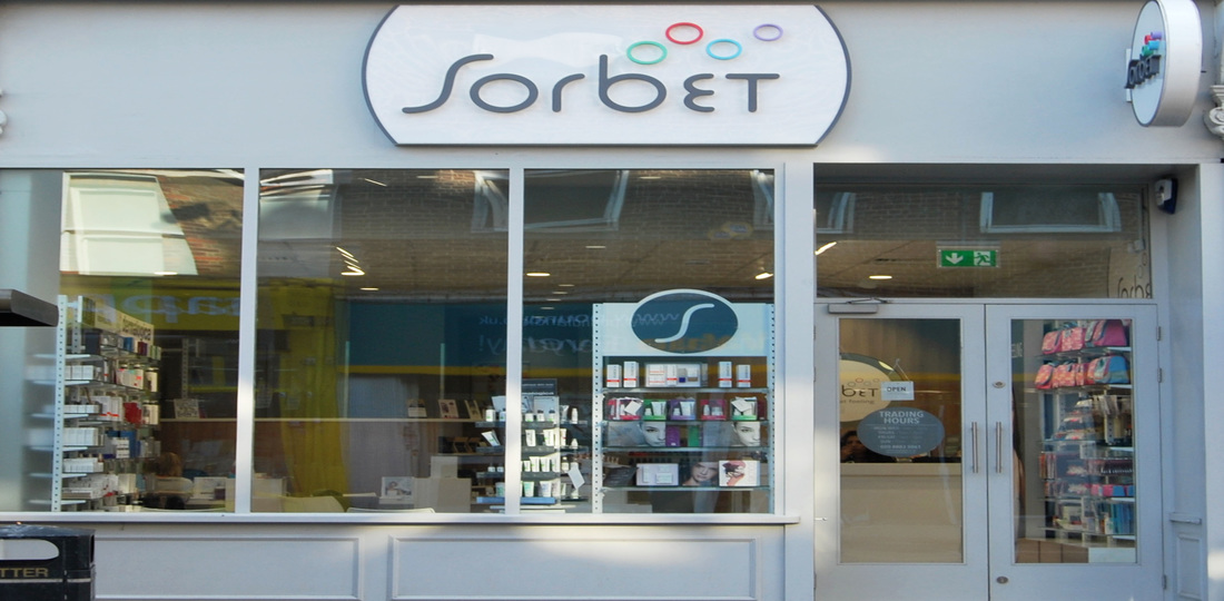
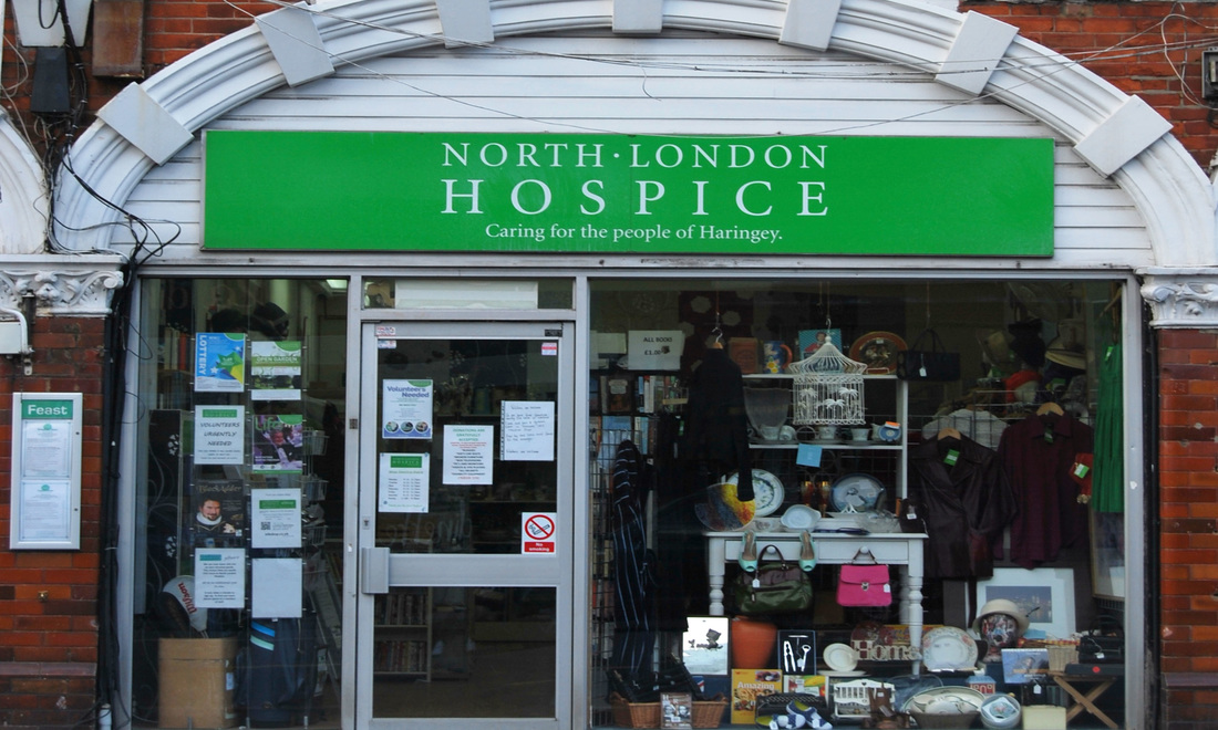
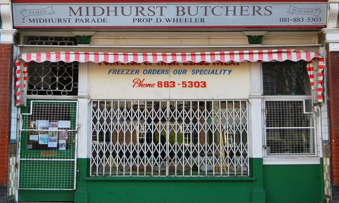
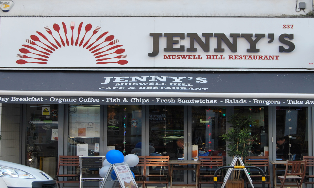
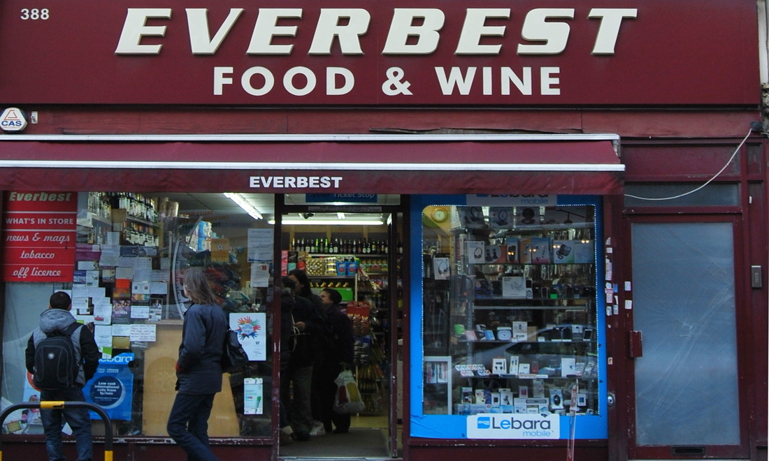
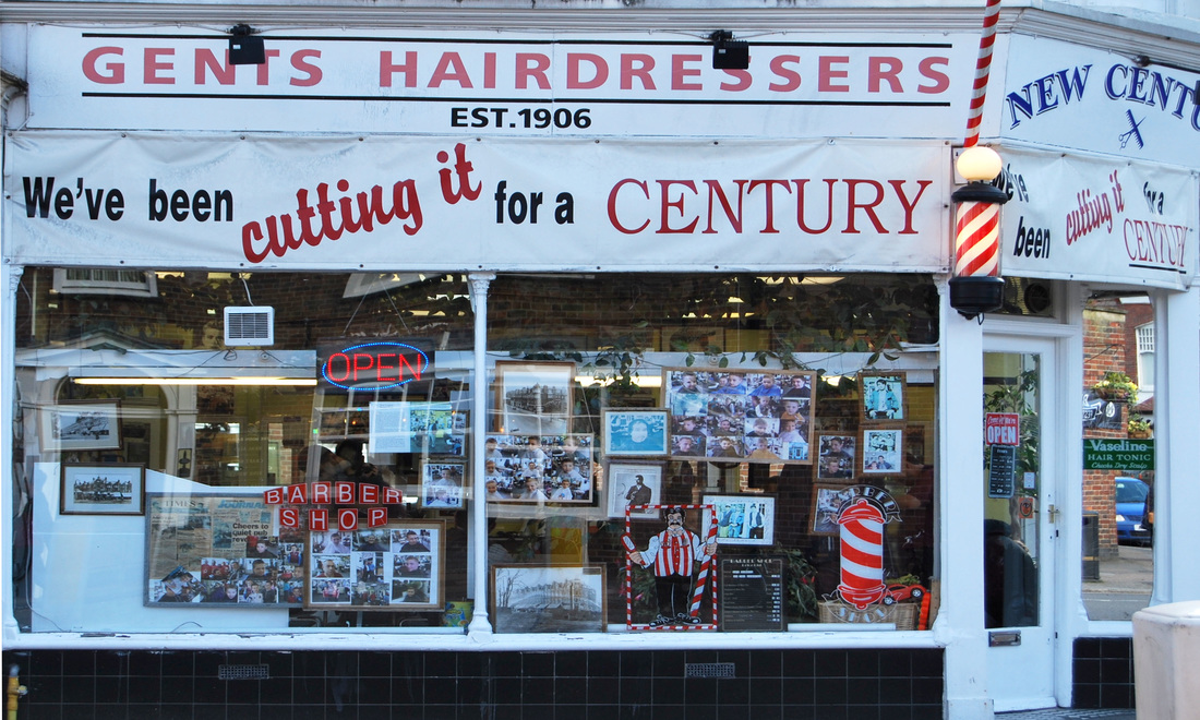
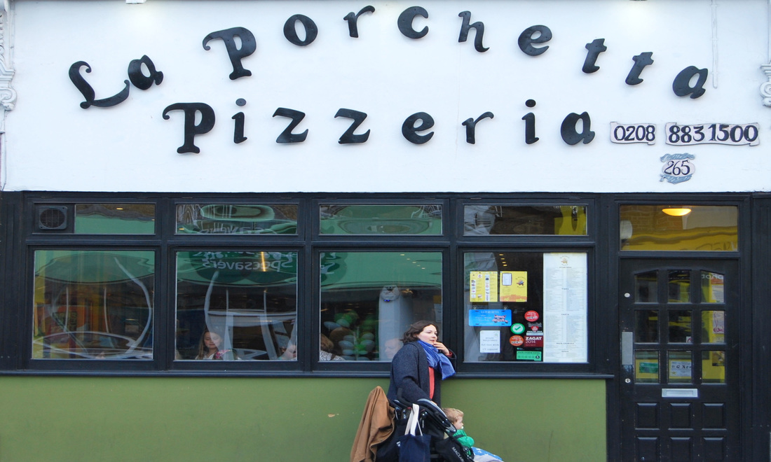
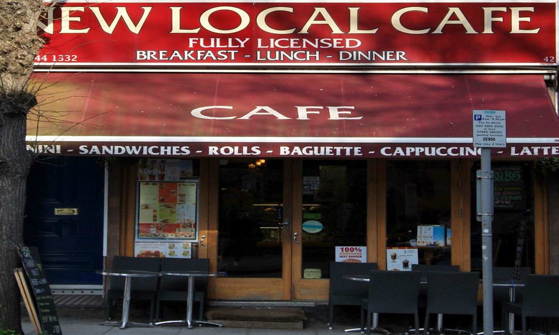
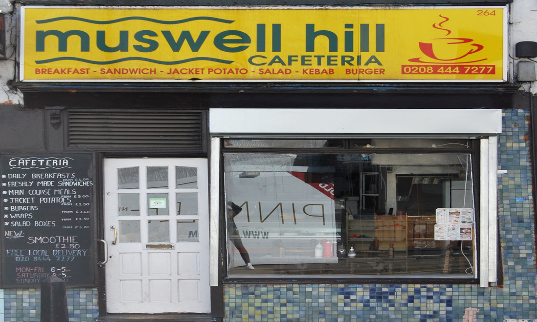
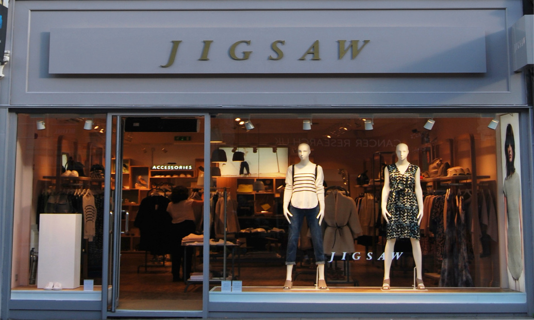

Below i have put the images into four colleges. These four colleges will be the same ones I will be sticking on the 3D version. By doing this allows me to pre-plan the design element and see what colours and types of shops I will be presenting together. I have decided that I will be presenting the shops mixed together as I think this then unites Muswell Hill and East Finchley together and allows for strong contrasts between the shops, showing the difference in target markets. This will also allow for the viewer to guess which shops belong to which place.
|
|
|

|

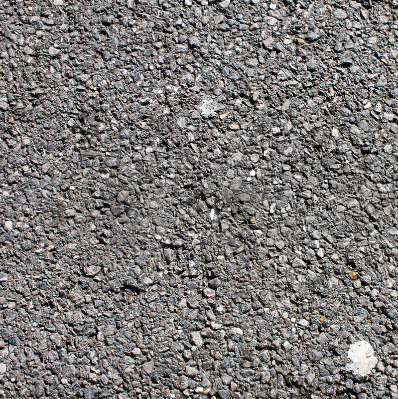
Below is the various options for my roof. I have decided to use the first image, as i think this represents the industrial aspect of London and our local areas. It is also the material used around the shops themselves so thus I think this is most appropriate.

VISUAL INTERPRETATION:
|
I first captured images of windows and created a college of them on photoshop.
|

|

|
I then edited the original college into one that consisted only of the windows.
|

|
|
I then expanded the college and created a 3D version.
|

|
|
I then created a college of all these shops and plan to create a 3D version to fully imitate Barnaby Barford's style.
|

|
I responded to Barnaby Barford by capturing images of shops around my local area.
|

|
Then, i looked at artist Barnaby Barford who created a 3D model of lots of shops.
|

FINAL OUTCOME
For the final outcome, I decided to replicate the three dimensional model of windows and recreate it with the shop fronts. To do this I had to create a three dimensional box in cardboard using a scalpel and duck tape. Each side is 90cm by 60cm so in order to create each side with ten photographs they needed to be 30cm by 18cm.
BEFORE:
AFTER:
|
|
